


Remodel Features Worth Investing In - Part 2: Bathroom Upgrades
Remodel Features Worth Investing In - Part 2: Bathroom Upgrades
Bathrooms are high-moisture, high-traffic spaces where small design problems can lead to bigger maintenance issues over time. After covering kitchen upgrades in Part 1 of this series, we’re shifting focus to bathroom features that improve comfort, function, and long-term durability.
From a contractor’s perspective, the best bathroom remodels are not just stylish. They are designed to handle moisture properly, improve daily use, and stay functional for years to come.
Ventilation and Airflow: The Silent Protector
Moisture is one of the biggest long-term challenges in any bathroom. If your mirror stays foggy long after a shower, your bathroom may not be ventilating moisture effectively.
What to Look For
Exhaust fans sized appropriately for the bathroom
Humidity-sensing switches that automatically run the fan when needed
Timer switches that help remove moisture after showers
Why It Matters
Poor airflow can contribute to peeling paint, moisture damage, and conditions that allow mold to develop over time. Better ventilation also helps bathrooms feel cleaner and more comfortable while reducing the loud “jet engine” noise common in older fans.
Walk-In Showers and Smarter Layouts
Many Utah homeowners are moving away from oversized tubs and toward larger walk-in showers that improve both function and visual openness.
What to Look For
Curbless or low-threshold entries
Frameless glass panels that help the room feel more open
Built-in shower niches for organized storage
Why It Matters
Walk-in showers remain a highly desirable feature in many remodels because they improve accessibility, reduce visual clutter, and make bathrooms feel larger without necessarily increasing square footage.
Lighting and Mirror Upgrades
Lighting is often one of the weakest parts of older bathrooms. A single overhead fixture can create harsh shadows and make the room feel smaller and less functional.
What to Look For
Lighting mounted beside mirrors to reduce facial shadows
Dimmable lighting for better flexibility
Anti-fog mirrors or improved ventilation near mirrors
Why It Matters
Better lighting improves both comfort and functionality. It can also make a mid-range remodel feel far more polished and intentional without dramatically increasing the budget.
Practical Wisdom for Your Remodel
When planning a bathroom remodel, prioritize the features behind the walls before focusing on finishes and décor. Even a beautiful shower can become a problem if the plumbing, waterproofing, or ventilation is not handled properly.
Good bathroom remodeling is about more than appearance. Better airflow, smarter layouts, and improved lighting help create a bathroom that stays comfortable and functional long term.
Stay tuned for Part 3, where we’ll cover design choices that age well and continue adding value over time.
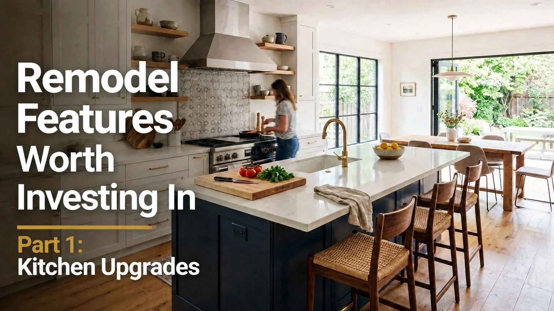
Remodel Features Worth Investing In - Part 1: Kitchen Upgrades
Remodel Features Worth Investing In - Part 1: Kitchen Upgrades
Most homeowners begin a remodel by focusing on aesthetic trends they see online. While appearance matters, focusing only on the "look" can sometimes lead to expensive choices that do not improve daily functionality. From a contractor’s perspective, the best renovations are the ones that solve problems, improve workflow, and make everyday life easier.
A beautiful countertop will not fix a kitchen with poor movement or limited storage. The upgrades homeowners appreciate most are usually the ones they notice every single day.
Better Kitchen Layouts That Improve Movement
Poor layout is one of the biggest reasons kitchens feel frustrating to use. If the path between the sink, stove, and refrigerator is blocked or spread too far apart, the kitchen quickly becomes less efficient.
When planning a remodel, focus on practical movement first.
What to Look For
Many well-functioning kitchens aim for roughly 42 to 48 inches of clearance in busy walkways, depending on the layout.
Prep areas work best when located near the sink, trash, and refrigerator.
Counter space near appliances makes loading and unloading much easier.
Why It Matters
A better layout improves how the kitchen functions every day. Good flow reduces congestion, makes cooking easier, and helps the room feel more comfortable overall.
Storage Upgrades That Reduce Clutter
Storage is one of the most valuable investments in a kitchen remodel. Traditional lower cabinets with fixed shelves are often less efficient than modern drawer-based storage systems because items get buried in the back.
What to Look For
Deep drawers for pots, pans, and larger kitchen items
Pull-out pantry systems that maximize narrow spaces
Storage solutions that keep frequently used appliances organized
Why It Matters
When everything has a designated place, countertops stay clearer and the kitchen becomes easier to maintain day to day.
Lighting Improvements That Make Kitchens Feel Larger
Lighting is often overlooked during remodeling, even though it has a major impact on how a kitchen feels and functions. Many kitchens rely too heavily on a single overhead fixture, which creates shadows and uneven lighting.
What to Look For
Under-cabinet LEDs to brighten workspaces directly
Evenly spaced recessed lighting for balanced coverage
Separate switches or dimmers for task and accent lighting
Why It Matters
Proper lighting can make a kitchen feel larger, brighter, and more welcoming while also improving visibility for cooking and cleaning.
Practical Wisdom for Your Next Kitchen Project
Kitchen remodeling is not about chasing perfection. It is about solving the problems you deal with every day.
Before investing in expensive finishes, focus on the parts of the kitchen that affect how you cook, clean, store items, and move through the room. Better layout, smarter storage, and stronger lighting often have a bigger impact on daily life than trend-driven upgrades.
Before starting your remodel, ask:
Does this make the kitchen easier to use?
Will it improve organization or workflow?
Is it designed to perform well long term?
Good kitchen design is not about showing off. It is about creating a space that works better every day.

Why Good Design Makes Everyday Life Easier
Why Good Design Makes Everyday Life Easier
Most people think home design is about picking out paint colors or choosing between quartz and granite. From a contractor's point of view, that’s only the surface. True design is about how your home functions when you’re running late, carrying groceries, or trying to get three kids out the door in a Salt Lake Valley snowstorm.
Good design quietly does the hard thinking for you. When a space is designed well, you don’t notice it. You only notice when it’s bad, like a kitchen cabinet that hits the fridge or a mudroom that’s too small for actual mud.
Storage That Makes Sense (Everything Has a Place)
In many Utah homes, from newer builds in Herriman to established neighborhoods in Sandy, storage is often an afterthought. Builders give you a closet and call it a day. But "storage" isn't just a hole in the wall; it’s a system to manage your life.
What to look for:
Point-of-use storage: Keeping the things you use exactly where you use them.
Specialized zones: A dedicated spot for the vacuum, a charging station for electronics, or a pull-out spice rack next to the stove.
Vertical space utilization: Using the full height of your walls, especially in laundry rooms and pantries.
Why it matters:
When everything has a specific home, you stop spending mental energy looking for things. It reduces small daily frustrations. A well-designed mudroom with hooks at the right height for kids means shoes and bags don't end up in the hallway. Good design recognizes human behavior instead of fighting it.
Better Movement Paths and Traffic Flow
The way you move through your home dictates your daily rhythm. A poorly planned layout forces you to take extra steps every single day. Over time, those extra steps and awkward movements become surprisingly frustrating.
What to look for:
The "Work Triangle": The distance between your sink, stove, and fridge should be tight and unobstructed.
Clearance zones: Ensuring doors and drawers can open fully without blocking a walkway.
Logical transitions: The path from your garage to your kitchen should be direct and easy to navigate with heavy bags.
Why it matters:
Efficient movement paths prevent "bottlenecks" where family members bump into each other. If you find yourself constantly saying "excuse me" just to get to the coffee maker, your layout may not be working as efficiently as it could. We see this often in cramped kitchens that were designed for aesthetics rather than actual cooking.
Cleaner Layouts and Visual Calm
Clutter isn't just a cleaning issue; it’s often a design issue. A "busy" room with too many competing angles, mismatched floor heights, or poor lighting creates visual noise that makes it hard to relax.
What to look for:
Symmetry and alignment: Lining up door frames, cabinetry, and windows to create a sense of order.
Integrated appliances: Hiding the clutter of small appliances behind specialized cabinetry, sometimes called appliance garages.
Consistent materials: Using a cohesive palette to help the eye move smoothly through the space.
Why it matters:
A cleaner layout helps a space feel calmer and easier to live in. Orderly spaces simply feel easier to navigate and more relaxing to spend time in. This is why a professional remodel often feels "lighter" even if the square footage hasn't changed. It’s about elevating design choices to prioritize peace of mind.
How Your Contractor Pros Handles the Details
At Your Contractor Pros, we don’t just swing hammers. We manage the entire process from the first sketch to the final coat of paint. We’ve seen enough outdated home layout decisions in the Salt Lake Valley to recognize many of the common layout and planning mistakes that create frustration later.
We focus on the longevity of your renovation. We help you decide where to spend vs. save so that you aren't just paying for a "look," but for a home that actually makes your life easier. Good design is an investment in daily comfort, functionality, and peace of mind.

Kitchen Upgrades You Notice Every Single Day
Kitchen Upgrades You Notice Every Single Day
Most homeowners renovate their kitchens for the "wow" factor, like quartz countertops, designer backsplashes, or high-end ranges. But once the novelty wears off, you aren't living in a showroom. You’re living in a workspace. From a contractor's point of view, the most successful remodels aren't defined by what your neighbors think. They’re defined by how much less frustrated you feel during the Tuesday night dinner rush.
In the Salt Lake Valley, where kitchens often serve as the high-traffic hub for large families and frequent hosting, utility often matters more than homeowners expect. Here are the three upgrades that actually change your daily life.
Under-Cabinet Lighting: Beyond the "Mood"
Good lighting isn't just about making the room look pretty. It’s also a safety and efficiency upgrade. Most standard overhead lighting packages in older Salt Lake homes often leave prep surfaces unevenly lit or partially shadowed.
What to look for:
Color Temperature: Aim for 3000K to 3500K. Higher color temperatures can feel harsh in residential spaces, while very warm lighting may make colors and finishes appear dull.
Dimmability: You want bright task lighting for chopping vegetables, but a softer glow for late-night kitchen trips.
Placement: Mount the light strips toward the front edge of the cabinet instead of the back to help reduce backsplash glare and better illuminate the counter surface.
Why it matters:
When you reduce shadows, the kitchen feels easier to work in and often appears larger and cleaner. It’s the difference between guessing whether food is properly browned and clearly seeing texture and color. Avoid common lighting and design mistakes by planning your electrical layout early in the remodel process.
Better Storage Flow: Ending the Cabinet Dig
The "black hole" cabinet, where Tupperware lids and heavy mixers disappear into the back corner, is one of the most common frustrations in older kitchen layouts. A modern kitchen isn't about having more cabinets. It’s about having easier access to the storage you already have.
What to look for:
Deep Drawers vs. Lower Cabinets: Swapping lower cabinet doors for deep, heavy-duty drawers is usually far more convenient than kneeling to reach the back of a shelf.
Pull-Out Pantries: Especially in narrow Salt Lake bungalows, pull-out pantry systems can turn unused narrow space into functional storage for spices, oils, or canned goods.
Task-Based Zoning: Group items by function. Keep prep tools near the island, coffee supplies near the water source, and baking sheets close to the oven.
Why it matters:
Better storage flow means less time searching and less friction in your daily routine. If you're struggling with an outdated layout, strategic storage upgrades can dramatically improve functionality without requiring major structural changes.
Wider Workspace Layout: The Room to Breathe
Nothing kills the joy of cooking like a cramped kitchen where two people can't move around comfortably at the same time. If your kitchen feels tight, the problem is often layout efficiency rather than square footage.
What to look for:
The 42-Inch Rule: Many functional kitchen layouts aim for roughly 42 to 48 inches of clearance between islands and perimeter counters.
Removing Peninsulas: In some layouts, peninsulas create awkward dead ends in the kitchen flow. Replacing one with an island can improve movement and open additional pathways through the room.
Countertop Extension: Even an extra foot of uninterrupted prep space near the sink or stove can make cooking noticeably easier.
Why it matters:
A wider workspace helps the kitchen function better as a shared space. Whether kids are doing homework at the counter or someone is helping cook dinner, layout directly affects how the room feels to use every day. Improving kitchen flow is one of the most noticeable long-term quality-of-life upgrades you can make in a remodel.
Practical Wisdom for Your Remodel
A kitchen remodel shouldn't just follow the latest Instagram trend. It should solve the bottlenecks in your daily routine. Before selecting finishes or tile, spend a week paying attention to the little frustrations in your current kitchen. Is the lighting too dim? Is prep space limited? Does storage feel inconvenient during busy evenings?
Focusing on those daily touchpoints helps ensure your remodel still feels functional and comfortable years later. If you're ready to stop fighting your kitchen and start enjoying it, let’s look at your layout and flow to find solutions that fit your Salt Lake home.
Bathroom Remodel ROI: What Actually Pays Off
Bathroom Remodel ROI: What Actually Pays Off
Most homeowners remodel their bathrooms for two reasons: they’re tired of looking at dated fixtures, or they’re prepping for a sale. If you’re looking at it from a contractor’s point of view, the goal is simple: maximize the impact while minimizing wasted capital.
The reality of remodeling ROI is often misunderstood. You aren't going to get back every dollar you spend. However, a strategic bathroom update remains one of the highest-value projects you can take on in the Salt Lake City market.
The ROI Reality: Mid-Range vs. Luxury
In the world of resale, mid-range remodels almost always outperform luxury ones. Industry reports often show mid-range bathroom remodels recouping a significant portion of their cost, commonly in the 60–70% range depending on the market and timing. High-end, upscale remodels involving imported marble and highly customized features can see lower returns relative to their cost, especially when upgrades become too personalized or luxury-focused.
What to look for: A focus on functional upgrades and clean, modern aesthetics rather than high-ticket custom features.
Why it matters: Many buyers prioritize clean, functional spaces over highly personalized luxury features that may not match their taste.
For a deeper dive into how to allocate your funds, check out our guide on remodel budget spend vs. save in Salt Lake City.
Upgrades That Boost Value Most
Not all updates are created equal. If you want the best return, focus on these specific areas:
Walk-In Showers: Replacing a cramped tub-shower combo with a sleek walk-in shower is often viewed as a desirable modern upgrade. Glass enclosures can also help the room feel larger and brighter.
Double Vanities: If the space allows, adding a second sink is a game-changer for master suites.
Modern Lighting: Good lighting helps a space feel brighter, cleaner, and more polished while highlighting finishes and layout features. It’s also one of the most affordable ways to dramatically improve how a bathroom feels.
Water-Efficient Fixtures
Buyers in Utah are increasingly conscious of utility costs. High-efficiency toilets and showerheads are smart, practical upgrades that can appeal to cost-conscious homeowners.
What to look for: Neutral color palettes and timeless home finishes that age well.
Why it matters: Trendy choices can become material regrets within just a few years, forcing the next owner to factor in the cost of another renovation.
Avoiding the "Over-Improvement" Trap
The fastest way to lose money on a remodel is to ignore your neighborhood's price ceiling. If the average home in your area is valued at $450,000, putting $60,000 into a master bath can be difficult to justify financially. It can be very difficult to recoup that level of investment at resale.
This is what we call an overbuilt space. To maximize ROI, many homeowners aim to keep bathroom remodel spending within a reasonable percentage of the home's value, often somewhere around 5% to 10%, depending on the neighborhood and long-term plans.
Mid-Range is the Sweet Spot
Think of a mid-range remodel as "high-impact, low-risk." It involves replacing the essentials: vanity, flooring, lighting, and tile, without moving the plumbing or knocking down walls.
Move-in ready appeal: Move-in-ready homes are often more attractive to buyers because they reduce the need for immediate repairs or updates.
Efficiency over excess: Focus on better storage and smarter layouts rather than expanding the footprint.
Remodeling for ROI isn't about creating a showroom. It's about removing friction for the next buyer while improving your daily life. Keep it clean, keep it functional, and keep it within the context of your neighborhood. That’s how you actually maximize the value of your investment.
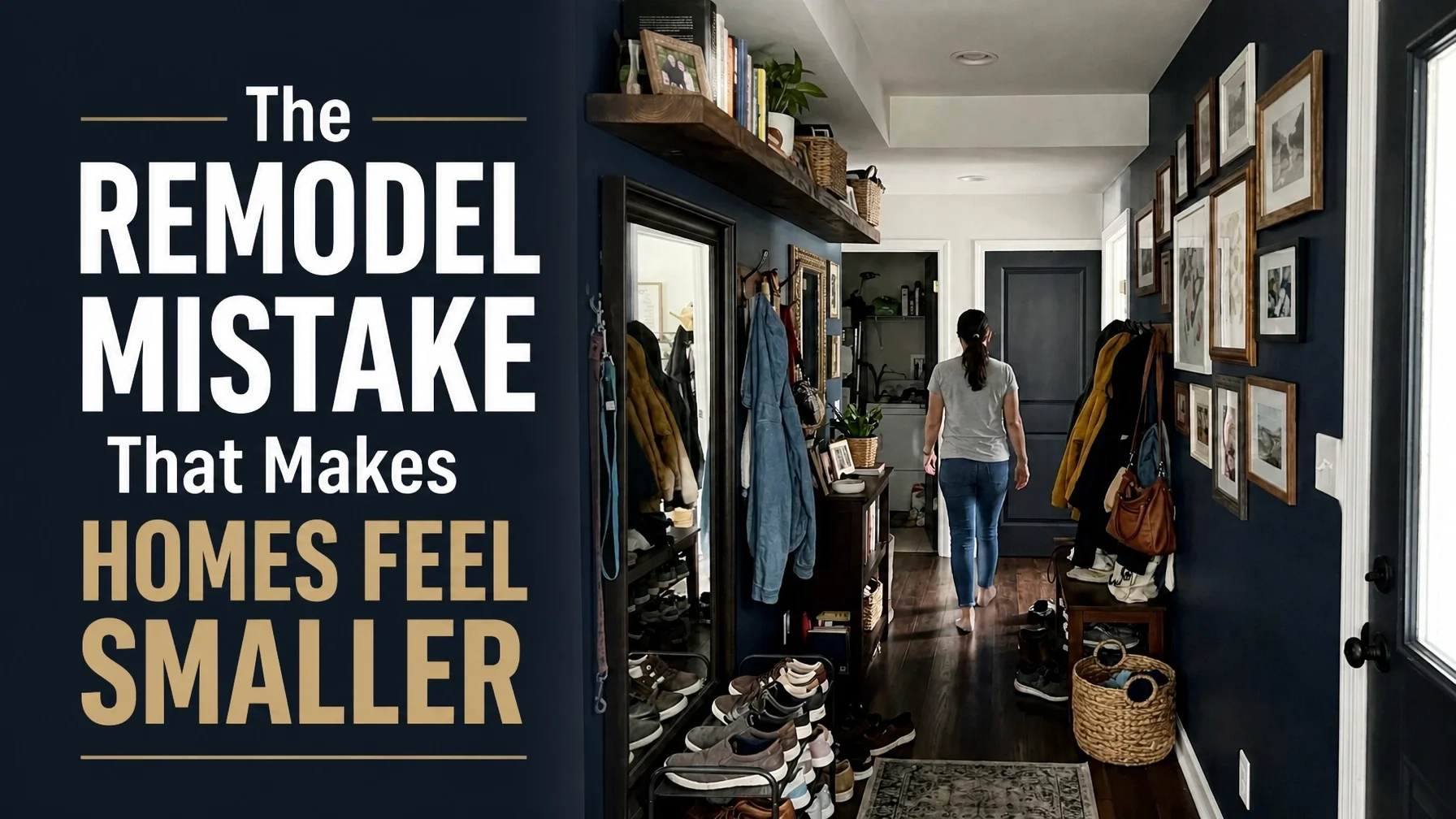
The Remodel Mistake That Makes Homes Feel Smaller
The Remodel Mistake That Makes Homes Feel Smaller
You spend months planning a renovation. You pick the most expensive tile, the trendiest cabinets, and the exact shade of "greige" you saw on Instagram. Then the drywall goes up, the furniture moves in, and reality hits and the room feels half the size it used to be.
It is a brutal realization.
Most homeowners in Salt Lake City think that "bigger" is a matter of square footage. It isn't. Space is a matter of perception. You can add 500 square feet to a house and still have it feel like a series of cramped tunnels if you fall into the common traps of poor design execution. From a contractor’s point of view, we see these mistakes constantly. People focus on the what (the materials) but ignore the how (the scale and flow).
If your home feels like it’s shrinking despite the money you’re pouring into it, you’re likely making one of these five critical mistakes.
1. The Scale Trap: Oversized Furniture
The most common way to ruin a perfectly good remodel is to buy furniture that belongs in a warehouse for a bungalow in Sugar House. When you see a massive sectional in a 10,000-square-foot showroom, it looks proportional. Put that same piece in a standard Utah living room and it swallows the floor plan whole.
What to look for:
Furniture that blocks natural walkways or forces you to walk "around" the room to get through it.
Pieces that dominate the room and leave very little open floor space.
Backs of sofas that sit higher than the window sills, blocking natural light.
Why it matters:
Visible floor space plays a major role in how open a room feels. When you cover the floor with a massive rug and an even more massive sofa, the visible area of the room shrinks dramatically. It creates a sense of claustrophobia that no amount of white paint can fix.
The Action:
Measure twice, buy once. Before purchasing furniture for your newly remodeled space, tape out the dimensions on the floor with blue painter's tape. If you can’t walk comfortably around the perimeter, the piece is too big. You want breathing room between your walls and your furniture.
2. Visual Barriers: Low-Hanging Fixtures
Lighting can either open a room up or act as a visual ceiling. In many Utah homes, especially older ones with standard 8-foot ceilings, homeowners often choose "statement" lighting that hangs far too low.
What to look for:
Pendants over a kitchen island that sit at eye level, blocking the view into the next room.
Chandeliers in the dining room that dominate the vertical space.
Ceiling fans with long downrods in rooms with low clearance.
Why it matters:
Low-hanging fixtures create a false ceiling. Your eyes stop at the light fixture instead of traveling to the back of the room. This effectively cuts the perceived height of your walls by a foot or more. It’s a subtle mistake that makes a space feel heavy and compressed.
The Action:
Stick to recessed lighting or flush-mount fixtures if your ceilings are under nine feet. If you must have a pendant, ensure it is hung high enough to keep the sightline across the room clear. Check out our guide on lighting and color design mistakes for more on how to avoid these common pitfalls.
3. The Mood Killer: Dark Ceilings
There is a trend right now toward dark, moody rooms. While a dark accent wall can add depth, painting a ceiling a dark color in a standard-sized home is a recipe for a cave effect.
What to look for:
Ceilings painted the same dark color as the walls.
Heavy, dark wood beams that feel like they are pushing down on the room.
Inadequate lighting that leaves corners dark, making the ceiling feel lower than it is.
Why it matters:
Light colors reflect; dark colors absorb. A white or off-white ceiling reflects light back down into the room, making the vertical space feel more open. A dark ceiling absorbs that light and draws the eye downward, making the room feel shorter. Unless you have 12-foot ceilings and a massive amount of natural light, keep the ceiling light.
The Action:
If you want drama, use it on the floor or a single accent wall. Keep your ceilings bright. In basement remodels, which are common throughout the Salt Lake Valley, this is non-negotiable. Basements already struggle with height; don't make it worse with dark finishes. We see this often in failed solutions for dark living spaces.
4. The Obstacle Course: Bad Traffic Paths
A remodel should improve how you move through your home, not make it more difficult. A common mistake is a layout that ignores human flow. This is usually the result of trying to pack too many features, like islands, built-ins, or breakfast nooks, into a space that can’t support them.
What to look for:
"The Shuffle": Having to turn sideways to pass between a kitchen island and the counter.
Dead ends: Layouts where you have to backtrack to get out of a room.
Blocked entryways: Doors that can't open all the way because they hit furniture or cabinetry.
Why it matters:
If a room is hard to navigate, it feels small. Period. Your brain registers friction as a lack of space. A 200-square-foot kitchen with a clear 42-inch walkway often feels much more open than a 300-square-foot kitchen where you’re constantly bumping into corners.
The Action:
Prioritize the work triangle and clear walkways. Many building standards use roughly 36 inches as a minimum walkway guideline, but for a high-end feel, aim for 42 to 48 inches. If a kitchen island makes your walkway 30 inches, skip the island. It’s a home layout flow pitfall that will haunt you daily.
5. Visual Noise: Too Many Competing Finishes
Consistency is the secret to making a home feel expansive. When you use different flooring in every room, or five different types of tile in one bathroom, you are creating visual stops.
What to look for:
A transition strip between the kitchen tile and living room wood that cuts the house in half.
Busy wallpaper paired with a busy backsplash and a bold floor pattern.
Too many different metal finishes (gold, black, chrome, nickel) in a small area.
Why it matters:
Your eyes need a place to rest. When there are too many competing finishes, the eye jumps from one thing to another, never taking in the full scale of the room. This visual noise clutters the space just as much as physical mess does. It segments the house into tiny boxes rather than allowing it to feel like one continuous, airy environment.
The Action:
Choose a hero element and let everything else be the supporting cast. If you want a bold, patterned floor, keep the walls and cabinetry simple. Use consistent flooring throughout the main level of your home to blur the lines between rooms. This is a hallmark of timeless home finishes that age well.
The Contractor’s Perspective: Thinking Ahead
Small homes don't have to feel small. We’ve seen 900-square-foot cottages in Liberty Wells that feel more spacious than new-build mansions in Draper because the owners understood scale and light.
Avoiding these mistakes isn't about spending more money; it’s about smarter planning. It’s easier to catch a bad traffic path on a blueprint than it is to move a load-bearing wall after the cabinets are installed. This is why professional oversight matters. A general contractor isn't just there to manage construction; they’re there to spot layout and flow issues before they become expensive problems.
If you’re feeling cramped in your current space, don't jump straight to an addition. Sometimes, the fix is as simple as thinning out the visual noise, raising the fixtures, and fixing the flow.
Smart Planning Tips for Your Next Project
Audit your furniture: Before the remodel begins, decide what stays and what goes.
Lighting layers: Use recessed lights for general illumination and save the pendants for very specific, high-ceiling areas.
Unified flooring: Pick one high-quality material and run it as far as you can. It helps the entire level feel more open and connected.
Consult a pro early: We often see layout issues that could have been fixed in five minutes during the design phase but would cost thousands to fix later.
Ready to stop guessing and start planning? Whether you're dealing with cramped kitchens or just a general sense that your house is closing in, the right layout makes all the difference.
Good remodeling isn't about how much you can fit into a room; it’s about how much room you can create for your life. Keep it simple, keep it consistent, and for the love of your shins, leave enough space to walk through your own kitchen.
This is the reality of smart renovation in Salt Lake City. It’s not just about the square feet; it’s about the sense of freedom you feel when you walk through the front door. Plan for flow, and the space will follow.
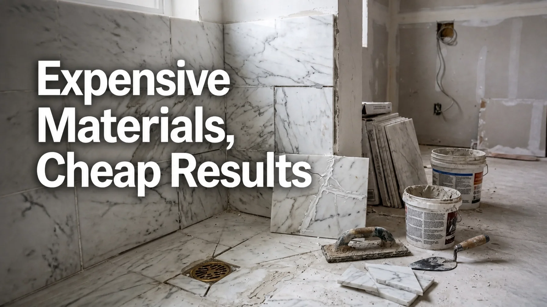
Expensive Materials, Cheap Results
Expensive Materials, Cheap Results
Higher price tags do not automatically guarantee better results.
You can walk into a showroom in Salt Lake City, spend a fortune on Italian marble and custom-milled white oak, and still end up with a remodel that feels underwhelming because the installation quality never matched the materials themselves.
From a contractor's point of view, it’s frustrating to see high-end materials lose their impact because of poor installation or rushed execution.
Luxury isn't just about what you buy; it’s about how it’s installed. When craftsmanship doesn’t match material quality, even beautiful products can fail to deliver the finished look homeowners imagined.
If you are planning a renovation, it’s important to understand where the “cheap” feeling often comes from. In many cases, it isn’t the material itself. It’s the overlooked details during installation.
The Tile Trap: When Premium Stone Falls Flat
Tile is one of the most common places where expensive projects lose their impact.
You may choose beautiful large-format porcelain, handcrafted Zellige tile, or natural stone. But if the installer doesn’t properly prepare the substrate or carefully plan the layout, the finished product can quickly feel uneven or rushed.
What to look for
Lippage: one tile edge sitting higher than the next
Inconsistent grout spacing across the same surface
Poorly planned cuts resulting in tiny slivers of tile at edges or corners
Grout haze left behind on finished surfaces
Why it matters
In high-end work, installers work carefully to minimize lippage as much as possible. Uneven tile surfaces not only affect the appearance of the room but can also collect dirt more easily and create subtle trip hazards in some situations.
Improper substrate preparation or movement accommodation can also increase the likelihood of cracking over time, especially in climates like Utah where seasonal movement and temperature shifts affect homes throughout the year.
When homeowners invest heavily in premium tile, they are usually expecting a clean, intentional, seamless appearance. Inconsistent spacing and poor layout decisions disrupt that effect immediately.
Cabinetry Calamity: Misalignment Changes Everything
Cabinetry is one of the most visually dominant elements in kitchens and bathrooms. Even expensive custom cabinets can feel “off” if installation details are rushed.
What to look for
Uneven gaps between doors and drawers
Misaligned handles or pulls
Visible shims or unfinished gaps near floors and walls
Doors or drawers that drift open on their own
Why it matters
Poorly installed cabinetry can contribute to premature wear on hinges, slides, and hardware over time.
If cabinet boxes are not properly leveled or aligned, stress can build throughout the installation. Over time, cabinetry or finish materials may experience movement, shifting, or visible inconsistencies.
High-end cabinetry is an investment in both function and appearance. Installation quality directly affects both.
Trim and Finish Work: The Details People Notice First
Trim work is what ties a room together. Baseboards, crown molding, door casings, and transition details help create clean visual lines between materials and surfaces.
In a high-end home, those transitions should appear clean, consistent, and intentional.
What to look for
Open miter joints at corners
Excessive caulking used to hide poor cuts
Inconsistent trim reveals around doors and windows
Visible nail holes or unfinished touch-up work
Why it matters
Wood naturally expands and contracts with seasonal humidity changes. If trim joints already have noticeable gaps during installation, seasonal movement can make those gaps even more visible over time.
Professional finish work requires patience, precision, and planning. Even expensive hardwood trim can look unfinished if the details are rushed.
Why Cheap Results Happen on Expensive Projects
Most homeowners don’t intentionally choose a poor result. They often research materials carefully, invest heavily, and hire experienced professionals.
The disconnect frequently happens during the bidding and installation process.
When one proposal comes in dramatically lower than the others, compromises are often being made somewhere. Sometimes those compromises involve rushed timelines, reduced supervision, or less attention to finish-detail coordination.
High-end results often come down to attention to detail and consistency during installation.
The Problem with Poor Coordination
Some contractors rely heavily on subcontracted labor without maintaining close oversight during installation.
In busy construction markets like the Salt Lake Valley, speed and scheduling pressures can sometimes outweigh finish-detail coordination if projects are not managed carefully.
This is where many avoidable errors happen:
Tile layouts approved too late
Cabinet alignments not verified before countertops arrive
Lighting and outlet placement conflicting with final design details
Small mistakes become much harder and more expensive to fix once installation moves forward.
How to Protect Your Investment
If you are investing in high-end materials, it’s important to invest in the planning and craftsmanship behind them as well.
Verify Layouts Before Installation
Before tile or flooring work begins, review layout plans and cut locations carefully. Small layout decisions have a major visual impact once the room is complete.
Check for Level Early
Before countertops are installed, cabinet runs should be checked for flatness and alignment. Uneven cabinet installation can place additional stress on stone countertops and may contribute to long-term issues.
Prioritize the Invisible Work
Wall straightening, floor leveling, framing corrections, and substrate preparation are rarely glamorous, but they are often what separate average remodels from exceptional ones.
Focus on Long-Term Performance
Utah’s climate can be hard on building materials. Dry summers, winter moisture, and seasonal expansion all affect how finishes age over time.
If hardwood flooring is not properly acclimated before installation, gaps and movement may become more noticeable later. Exterior materials that are poorly flashed or improperly sealed may also experience premature wear from moisture exposure.
The Reality of High-End Construction
The difference between an average remodel and a truly refined one often comes down to tiny details most homeowners never consciously notice.
It’s the extra time spent aligning cabinet faces. It’s the carefully planned tile layout. It’s the perfectly consistent trim reveal around a doorway.
Luxury is often found in the things you don’t notice because they were executed correctly.
You shouldn’t be distracted by uneven grout lines or awkward cabinet gaps. You should simply feel like the space works visually and functionally as a whole.
Expensive materials are only part of the equation. Craftsmanship is what brings them to life.
If you’re planning a remodel in the Salt Lake Valley, make sure the execution quality matches the investment you’re making in the materials themselves.
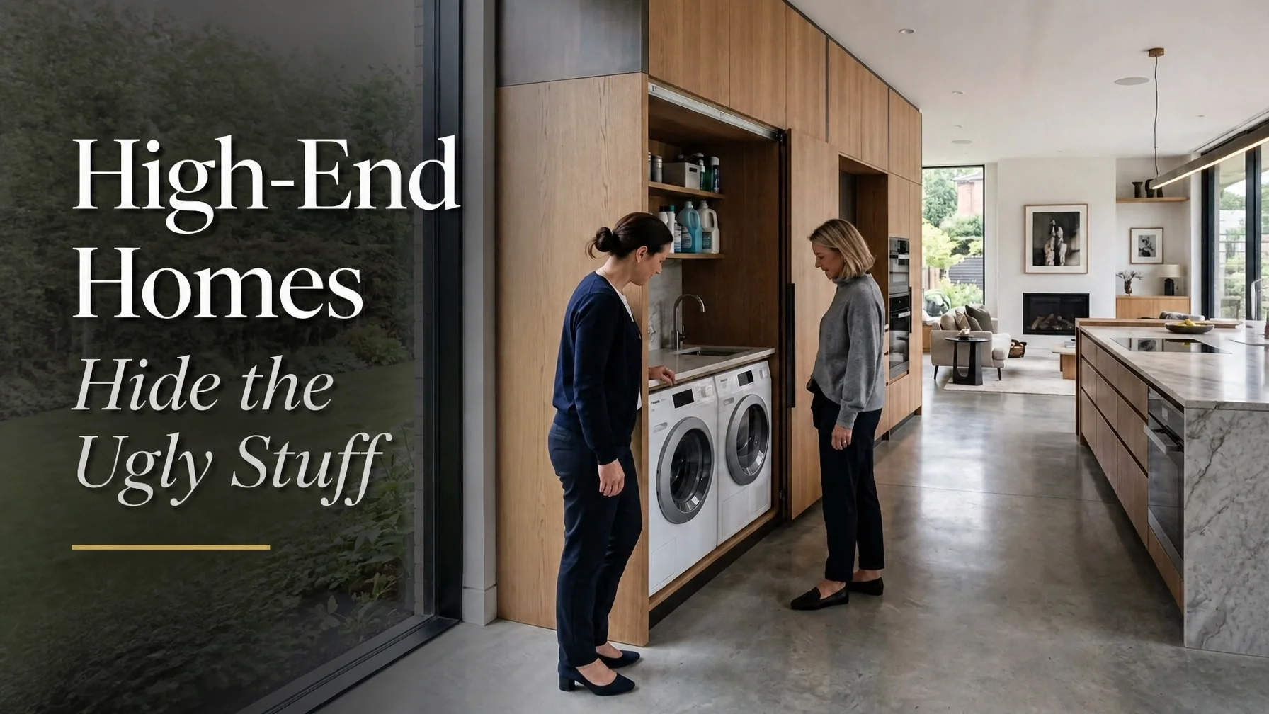
High-End Homes Hide the Ugly Stuff
High-End Homes Hide the Ugly Stuff
A luxury home isn’t defined by how much marble you put on the island. In the Salt Lake Valley, we see plenty of expensive remodels that still feel "off" because the homeowner focused heavily on finishes while overlooking the planning and infrastructure behind the scenes.
True high-end design is often about what you don’t see. It’s the absence of visual noise. It’s the reduction of friction in daily life. When you walk into a professionally designed custom home, your eyes aren't drawn toward tangled cables under the television or a bulky refrigerator sticking several inches past the cabinets.
From a contractor’s point of view, much of what makes a home feel high-end happens behind the scenes. It’s the result of thoughtful planning during the framing, electrical, and rough-in stages. If you want your home to feel elevated, you have to think beyond the visible finishes.
The Kitchen: From Clutter Hub to Integrated Space
The kitchen is one of the hardest rooms in the house to keep visually clean, not just because of cooking, but because of countertop clutter. Coffee makers, mixers, paper towels, spice racks, and charging stations all compete for limited space.
High-end kitchen remodeling contractors address these issues long before the cabinets are installed.
Appliance Garages and Hidden Zones
The goal is to clear the horizontal surfaces as much as possible. Appliance garages, hidden cabinets, and secondary prep areas allow appliances to remain accessible while keeping visual clutter contained when not in use.
Pocket doors, lift-up panels, and concealed storage help kitchens feel calmer and more intentional.
Panel-Ready Appliances
Large stainless appliances can interrupt the visual flow of cabinetry. In many high-end Salt Lake City remodels, homeowners are shifting toward panel-ready appliances fitted with custom cabinet fronts.
When properly integrated, these appliances blend much more seamlessly into the surrounding cabinetry.
What to look for
Counter-depth or integrated refrigerators that sit flush with cabinetry
Hidden outlets or under-cabinet power systems that reduce backsplash clutter
Toe-kick drawers for flat storage items like baking sheets or pet bowls
Why it matters
Reducing visual clutter can make kitchens feel cleaner, calmer, and more spacious. It allows the architecture and material choices to take center stage instead of the appliances and accessories.
Eliminating the “Rat’s Nest”: Advanced Cable Planning
Nothing disrupts a clean living room faster than exposed cords and poorly placed outlets. In higher-end homes, cable management is planned before drywall ever goes up.
As a general contractor in Salt Lake City, we often see homeowners trying to solve these problems after construction is complete, which usually makes the process more invasive and expensive.
The Low-Voltage Plan
Thoughtful low-voltage planning often includes:
In-wall conduit systems that allow future cable replacement or upgrades
Recessed media boxes behind mounted televisions
Hidden speaker wiring integrated into walls or ceilings
What to look for
Excessively visible wires or extension cords
Poorly placed outlets interfering with furniture layouts
Entertainment systems without dedicated cable-routing paths
Why it matters
Technology changes quickly. Thoughtful low-voltage planning can make future technology upgrades much easier and less invasive while helping the space maintain a clean appearance over time.
Integrated Organization: Architecture as Storage
In many homes, storage becomes an afterthought. Plastic bins, exposed shelving, and temporary furniture solutions slowly create visual clutter throughout the space.
In a high-end home renovation, storage is integrated directly into the architecture.
The Hidden Pantry
Hidden pantries and secondary prep spaces have become increasingly popular in higher-end Utah remodels. These areas allow homeowners to move appliances, food storage, recycling bins, and prep messes out of the primary kitchen.
The result is a cleaner, more streamlined main living space.
Built-In Mudrooms
Utah winters are rough on entryways. Wet shoes, coats, backpacks, and sports gear can quickly overwhelm a home’s front entrance.
Built-in mudroom cabinetry helps conceal that clutter through dedicated lockers, hidden storage, and integrated seating.
What to look for
Hidden charging stations near garage entries
Full-height cabinetry with integrated storage
Clean transitions between cabinetry and ceilings or flooring
Why it matters
Clutter creates visual stress. Integrated storage helps create a home that naturally supports cleaner organization and reduced visual noise.
Hiding the Mechanicals: Efficiency Without the Eyesore
The “ugly stuff” isn’t limited to appliances and cables. Furnaces, water heaters, condensers, and electrical equipment all affect how refined a home feels.
Tankless Water Heaters
Replacing a large tank water heater with a properly sized tankless unit can free up valuable space while providing a continuous supply of hot water for many households.
Wall-mounted systems can also allow for cleaner utility room layouts and more efficient use of storage space.
Exterior Planning
Exterior mechanical placement matters too. Air conditioning units, utility boxes, and meters can significantly affect curb appeal if poorly positioned.
During full-service remodel planning, we look carefully at how these systems interact with patios, windows, walkways, and outdoor living areas.
Mechanical equipment may be relocated, screened with landscaping, or integrated more thoughtfully into the overall exterior design.
What to look for
Mechanical equipment placed directly beside outdoor gathering spaces
Utility equipment dominating the front elevation
Noisy systems located near bedrooms or patios
Why it matters
Curb appeal isn’t just about landscaping. Thoughtful placement of utilities and mechanical systems plays a major role in how polished and intentional a home feels.
The Professional Difference: Design and Coordination
Hiding the ugly stuff requires coordination across every stage of construction. It cannot be improvised halfway through the project.
It requires:
A detailed design phase where appliances, outlets, and storage are planned in advance
Pre-construction coordination between trades
Cabinetry and millwork designed around real-life functionality
This is where thoughtful integration and detailing become especially important.
If you are planning a high-end remodel and want to move beyond builder-grade solutions, you need a team that looks beyond surface finishes alone.
At Your Contractor Pros, we focus on the details that make homes feel intentional, functional, and refined. We don’t just build rooms; we help create spaces where modern living feels streamlined and visually calm.
Whether you're looking for a kitchen remodeling contractor who understands integrated design or a general contractor to renovate your Salt Lake Valley home, we can help you create a space that works beautifully behind the scenes as well as in front of them.
Ready to start your next renovation project?
Explore our Remodel Insights or contact Your Contractor Pros today to discuss your goals. We handle the design, coordination, permits, and construction so you can enjoy a finished space that feels organized, intentional, and functional.
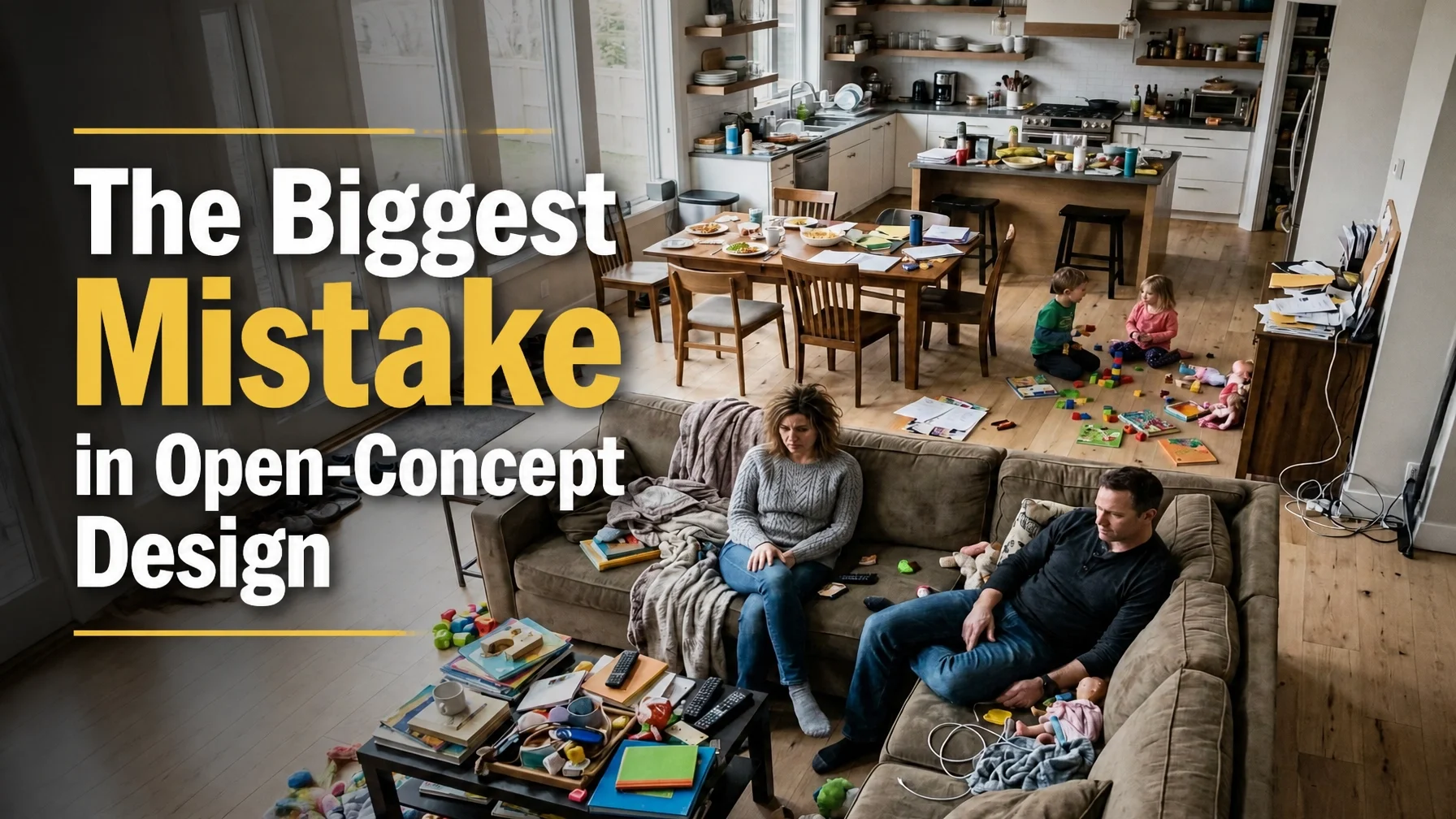
The Biggest Mistake in Open-Concept Design
The Biggest Mistake in Open-Concept Design
For the last two decades, the open-concept floor plan has been one of the most popular trends in home renovation in Salt Lake City. Homeowners want to knock down walls and create the airy, expansive spaces they see online and on television.
But from a contractor’s point of view, there is a major difference between a home that feels open and a home that functions well.
The biggest mistake people make isn't removing a wall; it’s failing to plan for what happens after the wall is gone. When aesthetics take priority over functionality, you can end up with a space that feels noisy, cluttered, and difficult to use comfortably.
Here’s why the "wall-less" dream sometimes falls apart and how a professional general contractor in Salt Lake City can help you avoid the most common pitfalls.
1. The Death of Silence: No Sound Separation
One of the most common complaints we hear after major open-concept remodels is noise. When you remove the barriers between kitchens, dining rooms, and living spaces, sound can travel much more freely throughout the home.
What to look for
Large expanses of hard surfaces like hardwood, tile, and stone
Appliance noise competing with TVs or conversations
Workspaces or reading areas located directly beside active living zones
Why it matters
Without physical separation, sounds from one activity can easily spill into another part of the home. Someone making a smoothie in the kitchen may not seem loud until another person is trying to watch a movie or take a work call nearby.
This can make it more difficult for family members to comfortably engage in different activities at the same time.
The Fix
Strategic "broken-plan" elements can help preserve openness while improving functionality. Instead of removing every wall, homeowners may benefit from features like partial dividers, glass partitions, built-ins, or acoustic treatments, depending on the structure and layout of the home.
It’s about creating quieter, more functional zones without completely sacrificing visual openness.
2. The Disorganized Sea: Awkward Furniture Zones
In a traditional floor plan, walls naturally help define where furniture belongs. Once those walls disappear, many homeowners realize they no longer have clear visual anchors for the room.
What to look for
Furniture floating awkwardly in large open spaces
Walkways cutting directly through seating areas
Oversized "great rooms" that feel undefined or disconnected
Why it matters
A space without clear zones can feel unsettled. If furniture placement doesn’t create structure, the room may lose its sense of scale and comfort. This is one of the most common layout and flow issues we see in open-concept remodels.
Poor zoning can make even an expensive renovation feel less intentional or cohesive.
The Fix
Successful open layouts rely heavily on zoning through design. Kitchen islands, lighting placement, ceiling details, furniture orientation, and area rugs can all help visually define different activity zones without relying on traditional walls.
Oversized pendant lighting, tray ceilings, or subtle floor transitions can also help create separation while maintaining an open feel.
3. The Visual Clutter Hub: Kitchens on Display
In an open-concept layout, the kitchen is no longer tucked away as a utility space. It becomes one of the main visual focal points of the home.
That sounds great in theory, but it also means the kitchen needs to function differently.
What to look for
Dirty dishes visible from the living room or entryway
Small appliances constantly sitting on countertops
Mail, backpacks, and everyday clutter accumulating on the island
Why it matters
When the kitchen is fully exposed to the rest of the home, everyday messes become much more noticeable. Without proper storage and planning, visual clutter can begin to affect how clean and relaxing the space feels day to day.
The Fix
We’re seeing growing interest in secondary prep spaces and walk-in pantry designs throughout the Salt Lake Valley. By relocating coffee stations, dishwashers, appliances, or food prep areas into a hidden pantry or secondary workspace, homeowners can keep the primary kitchen cleaner and more visually streamlined.
How to Do Open Concept the Right Way
Successful open-concept design isn't about removing as much as possible. It’s about balancing openness with functionality.
In many homes, walls also serve structural purposes, which is why open-concept renovations should always involve proper planning and professional evaluation before demolition begins.
If you're planning a remodel, don't just ask your contractor to "open it up." Ask questions like:
How will sound travel throughout the space?
Where will the primary traffic paths go?
How will furniture zones be defined?
What storage solutions will help control visual clutter?
Planning Your Salt Lake Valley Renovation
Open-concept living can absolutely work, but it usually requires more planning, not less. In highly open layouts, every design choice becomes more noticeable.
At Your Contractor Pros, we focus on more than just demolition and construction. We look at traffic flow, acoustics, storage, lighting, and long-term livability to help homeowners create spaces that work in real life, not just in photos.
Whether you're in Salt Lake City, Draper, or Herriman, we help homeowners navigate the balance between beautiful design and everyday functionality.
Thinking about reworking your floor plan? Let’s build a space that feels open, functional, and comfortable for the way you actually live.

Luxury Features That Age Poorly
Luxury Features That Age Poorly
Expensive doesn’t always mean enduring. In the world of high-end home renovation in Salt Lake City, it is remarkably easy to spend a fortune on a feature that can feel dated far sooner than expected. True luxury isn’t just about the price tag of the materials; it is about the longevity of the design and the functional value it adds to your daily life.
From a contractor's point of view, we see the cycle of trends clearly. We are often called in to tear out "luxury" upgrades that were installed only a few years prior because the homeowner is already tired of them or, worse, they have become a maintenance headache. If you want to avoid the "renovation regret" that comes with chasing the wrong trends, you need to understand which features age poorly and why.
Gray-Everything Interiors: The "Millennial Gray" Fatigue
For a decade, gray was the king of the Salt Lake Valley. From "Agreeable Gray" walls to weathered oak flooring and charcoal cabinetry, it was the safe, sophisticated choice. But we have reached a tipping point. What once felt clean and modern now often feels cold, sterile, and increasingly dated.
What to look for
Monochromatic palettes: Every surface, floors, walls, and trim, falling into the same narrow spectrum of cool gray.
Cool-toned LED lighting: Light that mimics an office building rather than a comfortable home.
Faux-weathered textures: Luxury vinyl plank flooring or tile designed to resemble gray-stained wood without natural variation.
Why it matters
The primary issue with the "gray-everything" approach is its lack of depth. When a room is entirely gray, there is little contrast to guide the eye. In Utah’s long winter months, a cool-gray interior can sometimes feel cold or uninviting, especially when natural light is limited.
Furthermore, because the trend became extremely common across many flips and production-built homes, it has lost much of its association with high-end luxury. If you are investing in a premium home renovation in Salt Lake City, you want a palette that feels curated rather than mass-produced.
Hyper-Minimal Kitchens: When "Sleek" Becomes "Stark"
We have seen a massive push toward hyper-minimalist kitchen design. This often involves clutter-free spaces where everything is hidden behind flush panels, hardware is nearly invisible, and open shelving replaces upper cabinets. On Instagram, it can look like a museum. In a functioning Salt Lake City home, it can become frustrating over time.
What to look for
Push-to-open hardware: Cabinets without handles or pulls that rely on spring-loaded latches.
Extensive open shelving: Replacing standard storage with floating shelves that require constant organization.
Monolithic islands: Oversized, single-material blocks with little visual or functional separation.
Why it matters
As a kitchen remodeling contractor, we focus heavily on workflow. Hyper-minimalism can sometimes work against the cook. Push-to-open cabinet hardware can require more maintenance and adjustment over time than traditional pulls and handles. They can also leave fingerprints and smudges on cabinet faces because of the constant contact.
Open shelving is another "luxury" feature that can age poorly because it demands regular upkeep to maintain the intended look. Without careful organization, shelves can quickly begin to feel cluttered or collect dust. A kitchen should function as a workspace first and a showroom second.
When you remove too much texture, hardware, and visual warmth, the room can begin to feel sterile rather than sophisticated.
Overly Trendy Lighting Fixtures: The Fastest Way to Date a Room
Lighting is the jewelry of the home, but just like fashion, lighting trends move quickly. What feels bold and modern today can quickly make a space feel tied to a very specific design era.
What to look for
Niche geometric shapes: Fixtures built around aggressive or highly stylized silhouettes.
Exposed Edison bulbs: While they had their moment, they often provide warmer, dimmer light that may not work well for every task-oriented space.
Low-quality finishes: Gold or brass coatings that appear overly shiny or begin to tarnish and peel over time.
Why it matters
The problem with overly trendy lighting is that it dominates the visual field. A large, hyper-stylized fixture can unintentionally date an otherwise timeless room. Replacing these fixtures often involves more than simply swapping the light itself; mounting changes, drywall repair, or electrical adjustments may also be required.
Instead of chasing the "light of the moment," smart homeowners often focus on layered lighting design: ambient, task, and accent lighting working together to create flexibility and comfort.
The High Cost of "Fast Architecture"
We are seeing a rise in what we call "fast architecture": features that look impressive in renderings but create problems in daily life. This is especially common in high-end remodels where the goal is an immediate visual "wow" factor.
What to look for
Vessel sinks: Stylish statement pieces that can require more cleaning around the base and may increase splashing depending on faucet placement and sink depth.
Barn doors in inappropriate places: Using barn doors in bathrooms or bedrooms where privacy and sound control are priorities.
Non-standard plumbing fixtures: Boutique fixture brands that may have limited replacement part availability compared to more established manufacturers.
Why it matters
Luxury is as much about peace of mind as aesthetics. Features that are difficult to maintain or repair can quickly become frustrating once the novelty wears off. A knowledgeable general contractor in Salt Lake City will usually tell you that the most valuable renovations are the ones that continue to look and function well years down the road.
This is the difference between spending money and investing it.
How to Choose for Longevity
Building timeless value isn't about being boring. It’s about being intentional. If you want a luxury home that still feels refined years from now, follow these contractor-approved principles.
Prioritize Natural Materials
Natural stone, real hardwood, and high-quality metals tend to age gracefully. They develop character and patina rather than simply looking worn out.
Focus on the Bones
Spend your budget on things that are difficult to change later, like layout improvements, insulation, window quality, and lighting infrastructure. These upgrades improve how the home functions regardless of design trends.
Use Trends in Small Doses
If you love a trendy color or fixture, incorporate it in ways that are easier to update later, such as paint, décor, or a single accent fixture.
Think About Daily Use
Before committing to a hyper-minimal design, ask yourself how the space will function during normal life, not just in a staged photo.
Your Partner in Smart Renovation
At Your Contractor Pros, we don't just build what's on the page. We help homeowners navigate the decisions that lead to long-term satisfaction. We've seen too many homeowners regret expensive features that looked impressive initially but failed to stand the test of time.
Our goal is to provide expert project management and construction that results in a home that feels as good as it looks.
If you’re planning a home renovation in Salt Lake City and want to ensure your investment adds true, timeless value, let's talk. We can help you sort through the trends to find the features that truly fit your lifestyle and your home’s future.
Planning a project? Start by exploring our remodel insights to see how we approach design and construction differently.
Real luxury isn't a trend. It's quality that lasts.
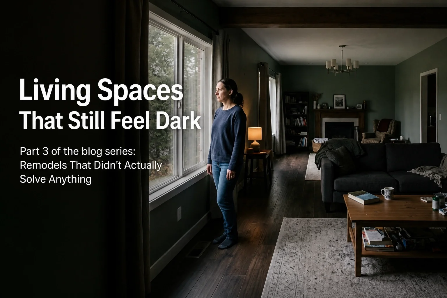
Remodels That Didn’t Actually Solve Anything Part 3: Living Spaces That Still Feel Dark
Remodels That Didn’t Actually Solve Anything Part 3: Living Spaces That Still Feel Dark
A living room renovation should feel like an exhale. It’s the space where you spend the most time, yet it’s often one of the most disappointing results of a home renovation in Salt Lake City. You spend fifty thousand dollars on new floors, fresh paint, and high-end furniture, only to realize you still want to leave the room by 4:00 PM because it feels gloomy.
From a contractor's point of view, "darkness" isn't just about a lack of windows. It’s often the result of multiple design choices working against each other. If your remodel didn't address the layout, lighting strategy, and material choices affecting how light moves through the space, the room may still feel dim even after a major renovation.
Here is why your living space still feels dark after the dust has settled.
1. Lighting Design Wasn’t Layered
One of the most common mistakes we see in Salt Lake Valley remodels is relying too heavily on a single overhead light source. Homeowners often install one large fixture or a series of recessed lights and expect the entire room to feel balanced and inviting.
In reality, relying on overhead lighting alone can create uneven shadows and leave parts of the room feeling flat or underlit. Without a combination of ambient, task, and accent lighting, the space can feel harsh in some areas and dim in others.
What to look for:
Deep shadows in corners even when the lights are on.
Glare on televisions or reflective surfaces while other areas remain dark.
Eye strain or visual fatigue after spending long periods in the room.
Why it matters:
Light interacts with ceilings, walls, flooring, and furnishings differently depending on placement and intensity. Layered lighting helps distribute brightness more evenly throughout the room and creates a more comfortable atmosphere overall.
This is why lighting and color design mistakes can dramatically affect the final feel of a remodel. Planning for sconces, integrated lighting, floor lamps, or accent lighting early in the renovation process usually creates much better long-term results.
2. Natural Light is Being Blocked or Wasted
You can have large windows and still end up with a room that feels dark if the layout and furnishings interfere with how natural light moves through the space.
Heavy window treatments, oversized furniture placement, and obstructed sightlines are some of the biggest culprits. We often see beautiful Salt Lake City remodels where expensive architectural features are unintentionally covered or blocked.
What to look for:
Curtain panels covering part of the glass even when fully open.
Large furniture placed directly in front of windows.
Older window openings that limit how much daylight enters the room.
Why it matters:
Natural light plays a major role in how open and spacious a room feels. In some homes, adjusting layouts, changing window treatments, or improving sightlines can make a noticeable difference without requiring major structural changes.
More extensive renovations, such as enlarging openings or modifying layouts, may also improve how light moves through the home depending on the structure and budget of the project.
3. Finishes Absorb More Light Than They Reflect
This is where trends can sometimes work against the room. Dark, heavily matte finishes may look dramatic in showrooms or online inspiration photos, but in lower-light environments they can make a room feel significantly heavier and darker.
Different materials reflect and absorb light differently. Gloss, satin, and lighter-toned finishes generally reflect more light back into the room, while darker and heavily textured materials absorb more of it.
What to look for:
Large amounts of matte or dark finishes throughout the room.
Dark flooring combined with limited natural light.
Low-contrast color palettes that visually flatten the space.
Why it matters:
Many homeowners run into home remodel material and finish regrets because showroom lighting conditions are very different from real residential environments. A finish that looks warm and balanced under bright commercial lighting may appear much darker in a Salt Lake City living room during winter months or evening hours.
When selecting materials, it’s important to consider how they will perform under the actual lighting conditions inside your home.
The Contractor’s Bottom Line
A living room that still feels dark after a remodel usually means the renovation focused more on surface-level updates than on how the space actually functions and feels.
It often isn’t about adding more light fixtures. It’s about using light more effectively.
It isn’t always about larger windows. It’s about allowing natural light to move through the room.
And it isn’t simply about painting everything white. Material choice, contrast, reflectivity, and layout all play a role.
If you are planning a project and want your investment to genuinely improve the feel of your home, it helps to work with a contractor who understands how lighting, layout, and finishes interact together.
At Your Contractor Pros, we specialize in renovations that solve the underlying challenges of Utah homes. Whether it’s improving sightlines, reworking layouts, or creating a better lighting plan, we focus on making spaces feel as functional and comfortable as they look.
Don’t settle for a remodel that still leaves the room feeling gloomy. Reach out to us today to plan a space that works for your lifestyle and your home’s unique layout.

Remodels That Didn’t Actually Solve Anything Part 2: Kitchens That Still Feel Cramped
Remodels That Didn’t Actually Solve Anything Part 2: Kitchens That Still Feel Cramped
You just dropped forty or fifty thousand dollars on a kitchen renovation. The cabinets are shaker-style, the countertops are a beautiful Taj Mahal quartzite, and the backsplash is a trendy zellige tile. But every time you try to prep a meal, you’re still bumping into your spouse. You’re still digging through the back of a deep corner cabinet with a flashlight. You’re still feeling like the walls are closing in.
This is the "cosmetic trap." From a contractor's point of view, it’s one of the most frustrating phone calls we get. Homeowners call us six months after a DIY or a budget-contractor "refresh" because the room doesn't actually work.
A remodel that doesn't solve the underlying functional issues isn't a success, it’s just an expensive coat of paint. In Part 2 of our series, we’re looking at why your kitchen remodel might have failed to fix that cramped, claustrophobic feeling.
1. The Layout Didn’t Actually Change the Workflow
New cabinets and countertops don’t fix a bad footprint. If your kitchen was designed decades ago, it was likely built around a very different style of cooking and daily life. If you simply swapped out the old cabinets for newer ones in the exact same locations, you may have inherited the same old layout problems.
The "work triangle," the relationship between your sink, stove, and refrigerator, is one of the foundational principles of kitchen design. If movement between those areas is constantly interrupted or feels awkward, the kitchen will continue to feel cramped no matter how expensive the finishes are. It isn’t just about square footage; it’s about how the space functions.
What to look for
The "Hip-Check" Zone: If appliances collide or block movement when opened, the layout may not have enough clearance.
Bottlenecks: Refrigerator placement near narrow walkways or entrances can disrupt traffic flow.
Counter Stalls: Large sections of countertop that are difficult to use efficiently can create wasted space.
Why it matters
Efficiency is one of the biggest factors in how spacious a kitchen feels. When a kitchen flows naturally, the room feels easier to move through and more comfortable to use. A professional kitchen remodeling contractor should evaluate how the kitchen actually functions day to day, not just how it looks in photos.
If you're noticing these flow issues in your current home, you might want to check out our guide on home layout flow pitfalls to see where things went wrong.
2. Storage Was Added, But Not Where It’s Needed
There’s a common misconception that "more cabinets" automatically means less clutter. In reality, poorly designed storage often just creates harder-to-reach places to lose things.
Deep corner cabinets and oversized upper cabinets can create frustration instead of convenience. When storage is difficult to access, frequently used items naturally migrate onto the countertops, which makes the room feel more crowded.
What to look for
Dead Zones: Deep cabinets or awkward corners that are difficult to fully access.
Crowded Uppers: Heavy upper cabinetry can visually overwhelm a smaller kitchen.
The "Counter Pile": Appliances and daily-use items permanently living on the counters due to inconvenient storage.
Why it matters
Modern kitchen remodels in Salt Lake City should focus on practical, point-of-use storage. Frequently used items should be easy to reach and logically placed near where they are used. Pull-outs, drawers, integrated trash storage, and better cabinet organization systems often make a much bigger impact than simply adding more cabinetry.
Poorly planned storage is one of the top home remodel material and finish regrets we see in Utah homes. Homeowners often invest heavily in visible finishes while overlooking the hardware and functionality that determine how the kitchen actually performs.
3. Visual Clutter Wasn’t Addressed
Sometimes a kitchen feels cramped not because of the physical dimensions, but because the design creates too much visual noise. High-contrast finishes, competing materials, and bulky elements can make a room feel busier and smaller than it really is.
Broken sightlines, like oversized cabinetry or appliances extending far beyond the counters, can also visually divide the room and interrupt the feeling of openness.
What to look for
Broken Sightlines: Large visual barriers interrupting views into adjacent spaces.
The Refrigerator Bottleneck: Full-depth refrigerators projecting far past cabinet lines in tighter kitchens.
Too Many Finishes: Multiple competing materials and colors in a smaller footprint.
Why it matters
Good design is about balance and cohesion. In many older Salt Lake City neighborhoods like Sugar House or the Avenues, kitchens simply don’t have massive footprints. While you may not always be able to expand the room physically, thoughtful design choices can make the space feel significantly more open and functional.
Using cohesive finishes, integrated appliances, counter-depth refrigerators, and better lighting can dramatically improve how spacious a kitchen feels without changing the square footage.
If you are worried about your kitchen looking dated or cluttered, it's worth reading up on timeless home finishes that age well in Utah.
How to Actually Fix a Cramped Kitchen
If you are planning a remodel, don’t just focus on inspiration photos. Focus on how you actually use the space every day.
A functional renovation often involves:
Re-evaluating the footprint: Small layout adjustments can completely change how a kitchen functions.
Prioritizing drawers over doors: Deep drawers often provide easier access and more usable storage.
Improving lighting: Under-cabinet lighting and well-planned overhead lighting can make kitchens feel larger and more inviting.
You can learn more about this in our article on lighting and color design mistakes.
The Contractor's Perspective
At Your Contractor Pros, we’ve seen homeowners spend a lot of money only to repeat the same functional problems. A kitchen remodel should improve how the room works, not just how it photographs.
Our approach focuses on the bigger picture. We look at the structural possibilities, the traffic flow, the storage strategy, and the long-term functionality of the space before we ever start talking about finishes.
We help homeowners navigate the remodel budget spend vs. save debate so the investment improves daily life, not just aesthetics.
If your kitchen still feels cramped despite a recent facelift, or if you're ready to do it right the first time, give us a call. We serve the entire Salt Lake Valley, helping homeowners turn frustrating layouts into kitchens that actually work.

Remodels That Didn’t Actually Solve Anything Part 1: Bathrooms That Still Trap Moisture
Remodels That Didn’t Actually Solve Anything Part 1: Bathrooms That Still Trap Moisture
A beautiful bathroom that grows mold is just an expensive science experiment.
From a contractor’s point of view, we see it all the time in the Salt Lake Valley: homeowners spend $20,000 or $30,000 on a stunning bathroom remodel, only to realize six months later that the room still feels damp, the mirror stays fogged for an hour, and a strange musty smell is creeping back. They changed the look, but they didn’t solve the problem.
If you are planning a bathroom remodel in Salt Lake City, you need to understand that the "pretty" parts, the marble, the floating vanity, the rainfall showerhead, are secondary to the systems that manage moisture. If the air doesn’t move and the surfaces aren't prepped for a wet environment, you’re just putting a fresh coat of paint on a sinking ship.
Here is why many bathroom remodels fail to solve moisture issues and what you need to do differently.
1. Ventilation: Treated as Optional, Not Essential
The biggest mistake in bathroom remodeling is treating the exhaust fan like a minor accessory rather than a critical piece of mechanical equipment. A new shower and high-end tile don’t matter if humid air has nowhere to go.
In many older Salt Lake City homes, the original fans were undersized or, worse, vented directly into the attic. If your contractor just swaps an old, loud fan for a new, quiet one without checking the ductwork or the CFM (Cubic Feet per Minute) rating, you haven't fixed anything.
What to look for:
Undersized CFM: A small powder room fan cannot handle a master suite with a walk-in steam shower.
Poor Placement: The fan is located near the door instead of directly over the source of the moisture (the shower or tub).
Venting Issues: Flex-ducts that are kinked, too long, or terminate in the soffit rather than a dedicated roof vent.
Lack of a Timer: Fans that are turned off the moment you leave the room, leaving 80% of the humidity trapped inside.
Why it matters:
When humid air hangs in the room long after you’re done, it finds the coolest surfaces to settle on. This is usually your ceiling and the corners of your walls. Over time, this leads to "surfactant leaching": those yellow, sticky streaks on your walls: and eventually, mold. A professional bathroom remodeling contractor should calculate the volume of your space and install a fan that can cycle the air effectively within 15–20 minutes.
2. Layout Still Creates Dead Zones for Airflow
You can have the most powerful fan on the market, but it won't help if your bathroom layout acts like a series of dams. We see many designs where aesthetics prioritized privacy or "enclosed" feelings over actual airflow.
Tight toilet alcoves, fully enclosed glass shower stalls that reach the ceiling, and blocked pathways prevent air from circulating. When air stays stagnant, moisture collects in corners and behind fixtures where it lingers.
What to look for:
Floor-to-Ceiling Glass: If your glass shower enclosure has no gap at the top and no dedicated fan inside the enclosure, you’ve built a sauna that never dries.
Deep Alcoves: Carving out a "water closet" for the toilet without adding a secondary exhaust source.
Obstructions: Large linen towers or partitions placed directly in the path of the main airflow.
Why it matters:
Moisture that gets trapped in "dead zones" doesn't evaporate. It sits. This is why you might see grout failing or baseboards rotting in a corner that is five feet away from the actual shower. The layout needs to be designed with a "path of least resistance" for air to travel from the door or window toward the exhaust fan.
If you're worried your current floor plan is contributing to these issues, check out our guide on home remodel layout mistakes in Salt Lake City.
3. Materials Weren't Chosen for a Wet Environment
This is the "hidden" failure of many budget-friendly remodels. Not all finishes are built to handle the unique microclimate of a bathroom. In an effort to save money, some contractors or DIYers use materials that belong in a bedroom, not a room that sees 100% humidity daily.
Using standard drywall (even if it's painted with "bathroom paint") is a recipe for disaster. Low-grade grout that isn't sealed or, worse, isn't the right type for the application will absorb water like a sponge.
What to look for:
Standard Drywall: If your contractor isn't using "green board" or, ideally, a cement-based backer board in wet areas, the walls will eventually fail.
Porous Stone without Sealing: Using high-end marble but failing to apply a professional-grade sealer.
Standard Paint: Using flat or matte finishes that aren't designed to repel water.
Poorly Sealed Grout: Grout lines that look "dry" or "chalky" often indicate moisture is being absorbed rather than repelled.
Why it matters:
Standard materials quietly break down over time. You won't see the damage until it’s too late: when the tile starts to feel "squishy" or the paint begins to bubble and peel away in sheets. Investing in premium, moisture-resistant materials is a non-negotiable part of a long-lasting renovation.
The Reality of Salt Lake City Bathrooms
In the Salt Lake Valley, we deal with a dry climate, which often leads homeowners to believe they don't have to worry about moisture as much as someone in a humid coastal city. The opposite is true. Because our outdoor air is dry, the contrast between a steaming hot shower and the rest of the house is extreme. This contrast creates significant condensation on cold exterior walls during our Utah winters.
If your bathroom isn't built to handle that internal moisture load, the dry desert air won't save your walls from rotting from the inside out. Choosing a local bathroom remodeling contractor who understands the specific challenges of our climate is the difference between a five-year bathroom and a twenty-year bathroom.
How to Do It Right
A remodel that actually solves moisture problems isn't about the tile you choose: it's about the infrastructure you can't see.
Over-spec your ventilation: Don't just meet the minimum code. Go higher. If the code requires 50 CFM, install 80 or 100. It's a small price jump for a massive increase in performance.
Use humidity-sensing switches: Take the human element out of it. These switches turn the fan on automatically when they detect a rise in moisture and keep it running until the room is truly dry.
Waterproof beyond the shower: In a high-use family bathroom, waterproofing should extend to the floor and several inches up the walls near the vanity and toilet.
Prioritize Airflow: If you want a floor-to-ceiling glass look, ensure you have a transom window or a mechanical vent inside the shower box.
If you are noticing peeling paint, musty smells, or persistent fog in your recently "renovated" space, it’s time to look deeper. For more on choosing finishes that actually last, read our post on home remodel material and finish regrets in Utah.
Planning a Bathroom Remodel That Lasts?
Don't let your investment go down the drain because of poor planning. At Your Contractor Pros, we don't just make bathrooms look good; we make them work. We specialize in high-performance renovations throughout the Salt Lake Valley that prioritize durability and moisture management.
Whether you're dealing with a failed previous remodel or planning a fresh start, our team is here to ensure your new space stays as fresh as the day it was finished.
Ready to build a bathroom that actually works? Contact Your Contractor Pros today for a consultation on your Salt Lake City bathroom remodel.

Renovations That Don’t Pay Off: Part 3 - Poor Layout Investments
Renovations That Don’t Pay Off: Part 3 - Poor Layout Investments
From a contractor’s point of view, the layout is the skeleton of your home. You can dress it up with the most expensive Italian marble or custom-milled white oak, but if the skeleton is crooked, the whole thing feels off.
In Salt Lake City, we see a lot of older homes, such as charming bungalows in Sugar House or larger mid-century properties in the East Bench. The temptation to "fix" these homes by adding space or tearing down walls is huge. In reality, not all layout changes are upgrades. In fact, some of the most expensive renovations we see are actually layout investments that may not pay off as expected when it’s time to sell.
If you’re planning a major change, you need to think about how people actually move through a house. A pretty room that’s a nightmare to walk through can be more of drawback than an asset.
The "Bigger is Better" Myth: Adding Square Footage Without Improving Flow
The biggest mistake homeowners make is assuming that more square footage automatically equals more value. Not necessarily.
If you add a massive primary suite to the back of a house but the only way to get to it is through the laundry room or a cramped hallway, you've added a maze instead of a meaningful addition to your home's value. Many homes end up with additions that feel "tacked on" rather than integrated.
What to look for:
Dead-end hallways: Long corridors that lead to only one small room.
Disconnected levels: Additions that require a random set of two or three steps up or down because the addition wasn’t properly aligned with the existing structure.
Lost natural light: Adding a room that completely blocks the windows of the existing living space, turning your former "bright" kitchen into a cave.
Why it matters:
A clunky layout can be difficult and expensive to fix later. A buyer can change a backsplash in a weekend, but they typically won’t take on major structural changes like moving load-bearing walls or fixing a disjointed floor plan. When the flow is broken, the house feels smaller than it actually is, regardless of the total square footage.
Ignoring Traffic Patterns: The Path of Least Resistance
Every home has "highways," like paths people take from the garage to the kitchen, or the bedroom to the bathroom. When you renovate, you have to respect these highways.
Ignoring traffic patterns creates "pinch points." This is common in kitchen remodels where someone puts a massive island in the center of the room without realizing it blocks the path between the fridge and the sink. It looks great in a photo, but in practice, it’s frustrating.
What to look for:
Door collisions: Closets that hit bedroom doors, or dishwasher doors that block the entrance to the kitchen when open.
The "Great Barrier Island": A kitchen island that forces you to walk ten extra feet every time you need to grab milk.
Entryway bottlenecks: Renovating a front entrance to look grand but leaving no room for a bench, coat hooks, or space for two people to stand at once.
Why it matters:
Living in a house with poor traffic flow can be frustrating over time. It’s a constant series of small frustrations that add up. If a prospective buyer feels "stuck" while walking through your open house, they won’t be able to envision themselves living there.
Closet Killers: Sacrificing Function for Style
In the quest for a "spa-like" bathroom or a "massive" primary bedroom, many homeowners decide to delete closets. This can be a brutal mistake, especially in Utah.
We live in a four-season climate. People have heavy coats, ski gear, camping equipment, and boxes of holiday decorations. When you remove a hallway linen closet or a bedroom closet to make room for a double vanity, you may be reducing the overall usability of the home.
What to look for:
The Only Tub: Removing the only bathtub in the house to install a massive walk-in shower can be a resale killer. Families with kids need at least one tub, so unless you're establishing a permanent bachelor pad, keep a variety of lifestyles in mind.
The Stolen Closet: Taking 3 feet from a second bedroom's closet to expand the primary suite can create a "half-bedroom" that may no longer meet typical bedroom expectations in a future appraisal.
Pantry Deletion: Removing a pantry to get more counter space. Counters are nice; storage is essential.
Why it matters:
Functionality isn't about how a room looks: it's about how it works. A house with no storage feels cluttered and messy, no matter how high-end the finishes are.
The Open-Concept Overkill
For the last decade, the trend has been "tear down every wall." Recently, we've been seeing a shift. People are realizing that one giant room is loud, impossible to keep clean, and offers zero privacy for Zoom calls or homework.
If you invest $50,000 into structural beams to open up your entire main floor, you might find that buyers actually preferred having a separate dining room or a quiet den. This is especially true in older layouts where the architecture actually calls for defined spaces.
What to look for:
Lack of "Away Space": A home where you can see and hear everything from every corner limits cozy, quiet spots.
Kitchen Mess on Display: When the kitchen is completely open to the formal living room, your dirty dishes are the center of attention during a dinner party.
Structural Over-Engineering: Spending a fortune on steel beams to remove a wall that actually helped define the space nicely might not be the best move.
Why it matters:
The pendulum is swinging back toward "defined" spaces. A layout that offers a mix of open areas for gathering and private areas for working or relaxing is much more valuable than an overly open, single-room style floor plan.
How to Invest in Your Layout Properly
Renovating a layout is more about making smart changes instead of big ones. Before you swing a sledgehammer, you need a plan that accounts for the "boring" stuff, like plumbing stacks, HVAC runs, and electrical hubs. Moving these things is what makes layout changes expensive.
If you're going to change your floor plan, do it because it solves a problem, not just because you saw it on a home renovation show.
Smart Layout Steps:
Audit your daily routine: Where do you get stuck? Where does the mail pile up? Fix those spots first.
Consult a pro early: A contractor can tell you if a wall is load-bearing before you get your heart set on removing it.
Prioritize the "Core": Invest in the kitchen and primary bathroom layouts first, as these offer the highest return, but only if the flow is logical.
Think about the "Next Family": Even if you don't have kids, a future buyer might. Don't remove the bathtub.
At Your Contractor Pros, we know that some homeowners spend significant amounts of money on additions that can make their homes harder to sell. We recommend that homeowners focus on flow, respect the traffic patterns, and never trade a closet for a "vibe."
If you missed the first two parts of this series, make sure to check out our deep dives into overbuilt spaces and trendy but impractical design choices. Your home is an investment: make sure your layout reflects that.
Final Contractor Wisdom:
A good layout is invisible. You don't notice it when it works; you only notice it when it doesn't. If you walk into a room and don't have to think about where to put your keys or how to get to the sink, the layout is doing its job. Focus on the "invisible" wins, and the resale value will take care of itself.
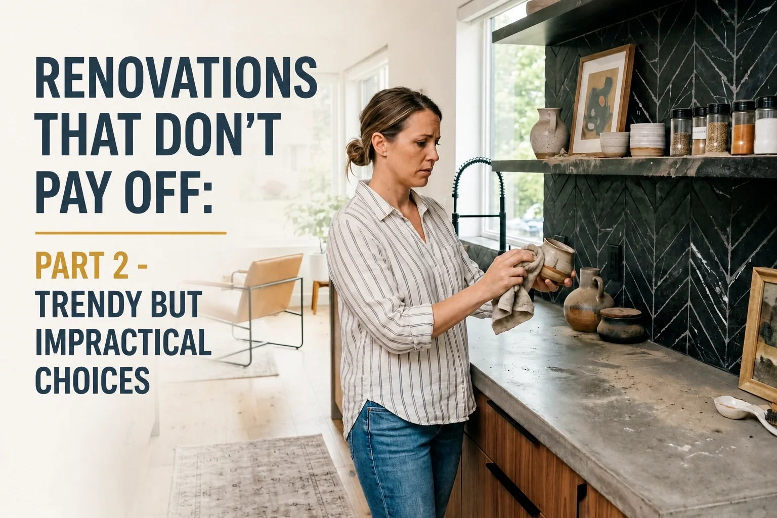
Renovations That Don’t Pay Off: Part 2 - Trendy but Impractical Choices
Renovations That Don’t Pay Off: Part 2 - Trendy but Impractical Choices
Trends can be a trap. From a contractor’s point of view, many homeowners in the Salt Lake Valley spend thousands of dollars on a "look" that feels dated, or can become a maintenance nightmare within eighteen months.
When you remodel, you’re investing your hard-earned money. You expect that investment to improve your daily life and, eventually, increase your home’s value. But many of the most popular design trends today do the exact opposite. They prioritize a specific, fleeting aesthetic over the actual physics of living in a house.
In Part 2 of our series, we’re looking at the trendy but impractical choices that quietly drain your budget and your patience. These are the decisions that look great in a staged photo but fail the "real life" test.
The Open Shelving Trap: Aesthetics vs. Reality
Open shelving is everywhere. It’s the darling of every home renovation show. It makes a kitchen look airy, modern, and open. But once the cameras leave and you start actually cooking in that kitchen, the reality sets in.
What to look for
You’ll see this trend replacing traditional upper cabinets with thick wooden or metal floating shelves. It’s often paired with white subway tile or a heavy stone backsplash.
Why it matters
The primary issue isn't how it looks, it's how it functions. When you remove upper cabinets, you lose a significant portion of your accessible storage. In many Salt Lake City homes, especially older ones in areas like Sugar House, kitchen real estate is already at a premium.
Beyond storage, there is the maintenance factor. Kitchens are grease and dust magnets. Without the protection of a cabinet door, dishes on those shelves are more exposed to grease, dust, and buildup over time.
If you aren't prepared to wash your dishes before you use them every single time, or if you don't have a perfectly curated set of matching stoneware, open shelving will quickly feel like a burden. It turns your storage into a chore. If you're struggling with how to balance style and utility, check out our guide on kitchen remodel design mistakes.
Ultra-Trendy Finishes: The "Expiration Date" Factor
Every few years, the industry settles on a "new" finish. Ten years ago, it was oil-rubbed bronze. Then it was rose gold. Now, we’re seeing a massive surge in matte black and champagne brass. While these look sharp today, they often come with a hidden cost: they can date your home faster than a calendar.
What to look for
Watch out for highly specific hardware colors, bold-patterned floor tiles, or "of the moment" cabinet colors. Right now, there’s a big shift away from the all-white kitchen. In fact, research shows that all-white kitchens can actually have a slight effect on a home's resale price, as buyers move toward more grounded, sophisticated tones like charcoal or graphite.
Why it matters
Finishes are the jewelry of the home, but unlike jewelry, they are expensive and labor-intensive to swap out. If you choose a trendy encaustic tile for your bathroom floor, replacing it when the trend dies in five years means ripping out the vanity, the toilet, and potentially damaging the wall.
The same applies to hardware. Matte black finishes, while beautiful, can show water spots, mineral buildup (which we have plenty of in Utah), and chips in the finish.
If you want your remodel to stand the test of time, you need to focus on timeless home finishes that age well. High-contrast trends are great for accessories, but they’re dangerous for fixed elements like tile, flooring, and plumbing fixtures.
Aesthetics Over Durability: The Fragile Material Dilemma
One of the most common mistakes homeowners make is choosing materials based on a magazine spread rather than their actual lifestyle. The biggest offender in this category? Marble countertops.
What to look for
Materials that are "natural" but physically soft or porous. This includes marble, certain types of limestone, and even some trendy unsealed wood surfaces.
Why it matters
Marble is beautiful, but it is a metamorphic rock composed of calcium carbonate. This means it reacts to acid. A spilled lemon, a drop of wine, or even a ring from a tomato sauce jar can "etch" the stone, permanently dulling the surface.
In a high-traffic Salt Lake City kitchen where families are prepping meals and kids are doing homework, marble can be very high-maintenance. You’ll spend your time policing your guests and family instead of enjoying your home.
The same goes for ultra-trendy flooring like bamboo. While marketed as eco-friendly and "modern," it can be incredibly polarizing for buyers and doesn't hold its value like traditional hardwood. In fact, refinishing existing hardwood floors can offer strong returns compared to many "trendy" alternative materials, which often struggle to recoup their initial cost.
Choosing durability doesn't mean sacrificing style; it means being smart about where you spend your money. For a deeper look at where to splurge and where to save, read our breakdown on remodel budgets in Salt Lake City.
The Luxury vs. Mid-Range ROI Gap
There is a point of diminishing returns in every renovation. Homeowners often think that if a $10,000 bathroom remodel is good, a $50,000 "spa experience" must be better for the home's value. Data suggests otherwise.
What to look for
Over-customization like steam showers, built-in espresso machines, or high-end designer lighting that costs ten times the standard price.
Why it matters
Luxury bathroom remodels often have slightly less return than comparable mid-range remodels, according to industry reports. In many scenarios, you're spending more to get less back.
If you are going to live in the house for 20 years, build it for you. But if you’re looking at this as a financial investment, keep it grounded. Buyers may not pay a premium for a $2,000 faucet when a $300 one looks and works just as well.
Investing in high-end materials for low-visibility areas or rooms that don't drive value is a quick way to lose money. Instead, focus on renovation longevity.
How to Spot a "Bad" Trend Before You Buy
Before you sign off on a design, ask yourself three questions:
Can I maintain this in 10 minutes or less? (If the answer is no, like open shelving, rethink it.)
Will this look "dated" in a photograph from five years ago? (If it’s a very specific color or pattern, the answer is likely yes.)
Is the material suited for the room’s use? (Soft stone may not be the best for a heavy-use kitchen.)
Remodeling isn't about chasing the latest fad. It's about creating a space that works for your life and protects your equity. When you focus on durability and classic design, you aren't just building a room; you're making a smart business decision for your biggest asset.
If you’re worried you might be heading down a path toward homeowner regrets, now is the time to pivot. Real value comes from quality craftsmanship and sensible design, not from chasing the front page of a design blog.
Stay tuned for Part 3 of this series, where we’ll dive into Poor Layout Investments: and why adding square footage doesn't always add value.
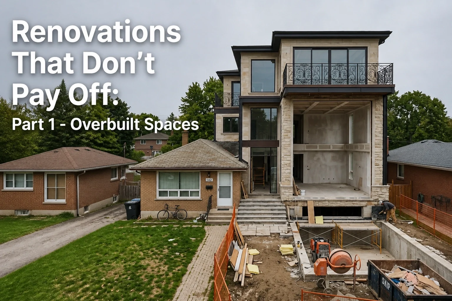
Renovations That Don’t Pay Off: Part 1 - Overbuilt Spaces
Renovations That Don’t Pay Off: Part 1 - Overbuilt Spaces
Everyone wants their home to be the best on the block. It’s a point of pride, especially here in the Salt Lake Valley where we value our property and our neighborhood communities. But from a contractor's point of view, there is a very real danger in making your home too much better than the ones surrounding it.
We call this "overbuilding."
It’s a common trap. You start a kitchen remodel, then decide the pantry needs floor-to-ceiling custom walnut shelving. Then the laundry room needs heated marble floors. Suddenly, you’ve invested $150,000 into a home in a neighborhood where the highest-priced sale in history was $650,000. You might love the result, but when it comes time to sell, the market often won't pay you back for that extra luxury.
This is the first part of our series on renovations that don’t pay off. Today, we’re looking at overbuilt spaces and why they happen, how to spot them, and how to keep your budget focused on projects that actually build equity.
The Neighborhood Ceiling: Why "Best on the Block" Is a Liability
Real estate value is anchored by "comparables." If you live in a neighborhood of 2,500-square-foot ramblers, and you decide to add a second story and a three-car garage, you aren't just improving your home. You’re creating an outlier.
Buyers looking in your specific area usually have a specific budget. If your home is priced $200,000 higher than everything else nearby because of your extensive upgrades, many of those buyers may not even see your listing. They’ve already filtered their search to a lower price point. Meanwhile, buyers who can afford your new price point are looking in neighborhoods where every home has those features.
What to look for
Your planned renovation cost will put your total investment significantly above the highest recent sale in your zip code.
You’re adding square footage that makes your home 30% larger than the average house on your street.
You’re installing "Grade A" luxury finishes in a neighborhood where "standard" or "mid-range" is the norm.
Why it matters
Appraisers focus on comparable sales, not what was spent on your imported Italian tile. They care about what the house next door sold for. If you overbuild, you create a "valuation gap." This means a buyer might love your home, but their their lender may not approve the full loan amount if the appraisal comes in lower than the purchase price. You end up having to drop your price, potentially leaving some of that upgrade value unrealized.
The Hyper-Customization Trap: Specialized Rooms
In Salt Lake City, many homeowners who have a very specific hobby and decide to build a room dedicated entirely to it. Whether it’s a soundproofed podcast studio, a specialized wine cellar, or a built-in "cat room," high customization can significantly reduce resale appeal.
From our perspective at Your Contractor Pros, we want you to enjoy your home, but we also want you to be smart. A room that is perfectly tailored to your specific life is often a "problem" for a potential buyer. They don't see a podcast studio; they see a room they may need to spend thousands to rework.
What to look for
Permanent built-ins that serve only one niche purpose.
Layout changes that remove a closet or a window to accommodate a specific hobby.
Electrical or plumbing configurations that are highly non-standard.
Why it matters
Flexibility sells. A room that can be a nursery today, a guest room next year, and a home office five years from now is worth more than a room that can only be one thing. If you're planning a specialized space, try to keep the "special" parts modular. Use furniture or removable fixtures rather than permanent structural changes.
If you are looking at creating a workspace, check out our guide on home office remodels in Salt Lake City to see how to balance function with future resale value.
Investing in "Invisible" Luxuries
There is a big difference between quality construction and "premium overkill." We always advocate for high-quality materials where they count: like your subflooring, plumbing valves, and attic insulation. These are the bones of the house.
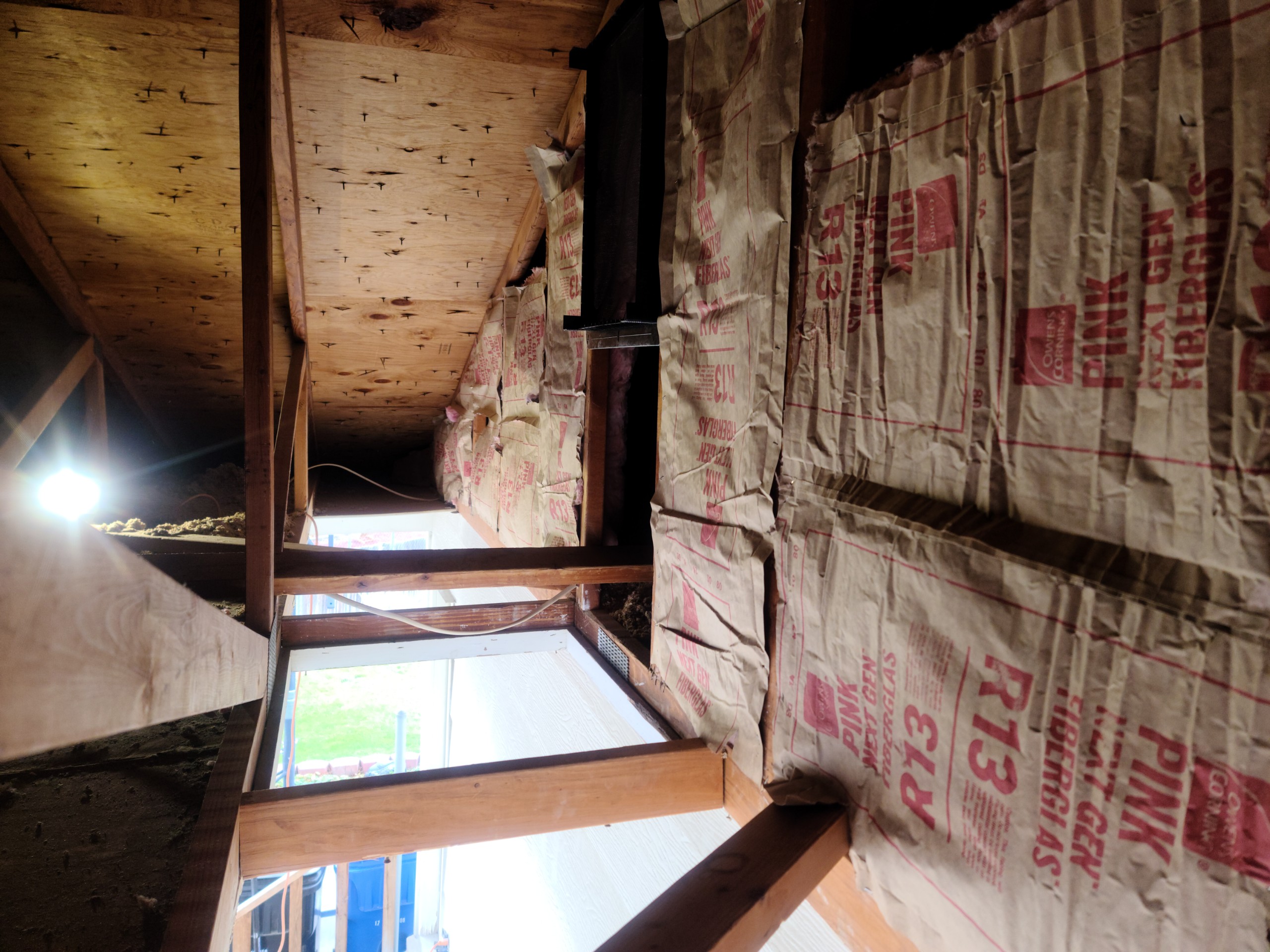
However, overbuilding often happens in low-visibility areas. We’ve seen clients insist on premium granite countertops in a laundry room or high-end designer lighting inside a walk-in pantry.
What to look for
Spending "primary kitchen" money on "secondary utility" spaces.
Using materials that require high maintenance (like natural stone) in areas where durability and ease of cleaning are the actual priorities.
Prioritizing aesthetics in rooms that 90% of your guests will never see.
Why it matters
Perceived value is driven by the areas where people spend the most time: the kitchen, the living room, and the primary suite. If you have a limited budget, every dollar spent on a designer backsplash in the laundry room is a dollar taken away from the kitchen island or the master bath.
When you're trying to decide where to put your money, it helps to understand the remodel budget spend vs. save trade-offs specific to the Utah market. In most SLC homes, a clean, functional laundry room with standard cabinets and a durable laminate or quartz countertop will often return a similar resale value as one with custom cabinetry and marble.
The Cost of "Too Much" Square Footage
Adding square footage is one of the most expensive things you can do. It involves foundations, framing, roofing, and HVAC extensions. In many cases, it’s a great investment: unless you’re already at the top of your neighborhood's size bracket.
If the average home in your part of Sandy or Draper is 3,000 square feet, and you’re pushing yours to 4,500, you’re entering a different market tier. The problem is that the location hasn't changed. A 4,500-square-foot house in a 3,000-square-foot neighborhood can be harder to sell than a 3,000-square-foot house in that same area.
What to look for
Additions that eat up your entire backyard, leaving you with no outdoor living space.
Second-story additions that look out of place with the architectural style of the street.
Expanding "out" instead of "up" when your lot size doesn't support it.
Why it matters
In many cases, improving layout and efficiency delivers better value than simply adding size. Before you commit to a massive addition, look at your existing layout. Often, the problem isn't that the house is too small: it's that the floor plan is outdated or poorly utilized. Fixing the flow can often give you the "feel" of a larger home without the massive price tag of an addition.
You can read more about how to avoid these home remodel layout mistakes to ensure you aren't just adding space, but adding actual usability.
How to Avoid Overbuilding: The Contractor’s Advice
Avoidance isn't about being cheap: it's about being strategic. Here is how we help our clients at Your Contractor Pros stay in the "Sweet Spot" of home renovation:
Check the Comps First: Before we sign a contract, we encourage you to look at what's selling in your area. If you’re planning a $100k kitchen and the nicest house on the block sold for $500k, we’ll have a frank conversation about whether that's the right move for your equity.
Focus on "Universal" Upgrades: Choose finishes that have broad appeal. You might love a specific bold, trendy color, but timeless home finishes are what actually hold value over a decade.
Invest in Infrastructure: If you have extra room in the budget, put it into things that lower your monthly costs or increase the home's longevity. Better windows, updated electrical, or a high-efficiency HVAC system might not be "sexy," but they are never considered "overbuilding."
The 10% Rule: As a general rule of thumb, try not to spend more than 10-15% of your home’s total value on a single room renovation. If your home is worth $500,000, a $50,000 kitchen remodel is usually a safe, high-ROI investment. A $120,000 kitchen remodel in that same house is likely overbuilding.
Practical Planning for Your Next Project
At the end of the day, your home is where you live. If you plan on staying in your Salt Lake City home for the next 20 years, "resale value" matters a lot less than your personal happiness. If you want a specialized room for your hobby and you have the cash, go for it.
But if you’re looking at your home as an asset: something that needs to grow in value: you have to think like an investor. Smart remodeling isn't about spending the most money; it's about spending the right amount of money in the right places.
If you’re worried your ideas might be pushing into "overbuilt" territory, let’s talk. We’ve seen enough Salt Lake City renovations to know exactly where the ceiling is in your neighborhood. We can help you scale your vision so it fits your lifestyle and your financial future.
Stay tuned for Part 2 of this series, where we’ll dive into Trendy but Impractical Choices: the design fads that look great on Instagram but fail miserably in real life.
In the meantime, if you're ready to start planning a project that makes sense for your home and your budget, reach out to our team. We’re here to help you build something that actually pays off.
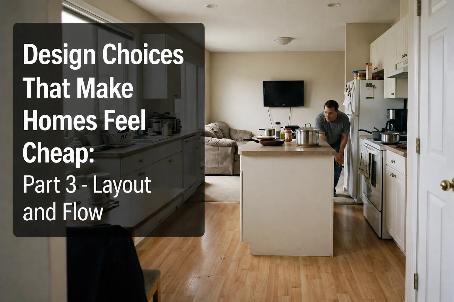
Design Choices That Make Homes Feel Cheap: Part 3 - Layout and Flow
Design Choices That Make Homes Feel Cheap: Part 3 - Layout and Flow
When most homeowners think about a “cheap” home, they picture peeling laminate or plastic hardware. But from a contractor’s point of view, even the most expensive materials can’t fix a bad layout. Layout and flow are the invisible markers of quality. You may not notice them immediately, but you feel them the moment you walk through the door.
A poorly planned home feels disjointed and cramped. It often signals that the renovation was reactive instead of intentional. If you’re planning a remodel in Salt Lake City, getting the layout right is the difference between a home that feels custom and one that feels like a patchwork of decisions.
Ignoring How People Actually Move Through the Space
A layout that looks good on paper but feels awkward in real life quickly lowers perceived quality. Designers call this “circulation,” and it’s one of the first things to break down in a rushed or poorly planned remodel.
What to look for
Watch for choke points where the natural path of travel is blocked by an island, a wall, or a door. Pay attention to rooms where you have to walk through a seating area to reach another space, or kitchens where the refrigerator door interferes with the main walkway.
Why it matters
High-end design is defined by ease. When movement through a home feels natural and unobstructed, the space feels intentional. When it doesn’t, the home feels like it’s working against you. In professional construction, we prioritize the path of least resistance. If the layout forces awkward movement, it immediately lowers the overall experience.
Forcing Open Concepts Where They Don’t Belong
Open concept layouts are still popular, but they’re often misunderstood. Not every wall should be removed. Poorly executed open spaces can feel unfinished instead of modern.
What to look for
Large, undefined rooms where the kitchen, living room, and entry all blend together without any visual separation. These spaces often have echo issues, limited privacy, and no clear purpose for each area.
Why it matters
Well-designed homes balance openness with definition. When everything is open, nothing feels intentional. A space without boundaries can feel incomplete rather than expansive.
From a structural standpoint, removing walls without properly integrating beams or transitions can make a space feel less cohesive. Many homes end up with walls being removed, but ceiling lines, flooring transitions, and sightlines were never resolved. The result feels stripped down rather than thoughtfully opened.
Undersized or Poorly Placed Focal Points
Proportion plays a major role in how a space is perceived. Even expensive features can feel underwhelming if they’re not sized or placed correctly.
What to look for
Small kitchen islands in large spaces, off-center fireplaces, or windows that feel undersized for the wall they occupy. These details may seem minor, but they stand out immediately.
Why it matters
People naturally notice balance and scale. When a focal point is too small or poorly positioned, the entire room feels slightly off. It can give the impression that the space wasn’t fully thought through, even if the materials themselves are high-end.
The Disconnect Between Interior and Exterior Flow
Homes feel more valuable when indoor and outdoor spaces connect naturally. When that transition is abrupt, the home can feel smaller and more confined.
What to look for
Hard stops between interior flooring and exterior surfaces, mismatched materials, or high thresholds that interrupt movement between spaces.
Why it matters
Seamless transitions make a home feel larger and more cohesive. When indoor and outdoor spaces align visually and physically, the entire property feels more intentional.
Coordinating exterior improvements alongside interior work can significantly improve how the home is experienced as a whole.
How to Fix It: The Contractor’s Perspective
Avoiding a cheap feel isn’t about spending more. It’s about planning better. Layout changes are expensive after construction begins, but they’re relatively easy to refine during the design phase.
Walk the plan
Before finalizing a layout, map it out physically. Walk through daily routines. Make sure key paths feel natural and unobstructed.
Focus on the essentials
If you need to prioritize, focus on the kitchen, primary bathroom, and main living area. These spaces have the biggest impact on daily use and perceived value.
Respect the home’s structure
In older Salt Lake neighborhoods like the Avenues or Sugar House, work with the existing architecture instead of forcing a layout that doesn’t fit the home.
A high-end home isn’t defined by individual finishes. It’s defined by how the space functions as a whole. When the layout is intuitive and the proportions are right, the home feels intentional, balanced, and complete.
If you’re planning a remodel and want to get it right from the start, focusing on layout and flow is one of the smartest decisions you can make.

Design Choices That Make Homes Feel Cheap: Part 2 - Color and Lighting
Design Choices That Make Homes Feel Cheap: Part 2 - Color and Lighting
Some design choices can seem cheap, even if they weren’t.
That’s the hard truth about home design. You can pour a massive budget into custom cabinetry, high-end quartz, and premium flooring, but if you fail the “atmosphere” test, the whole project feels like a bargain-bin imitation. In the industry, we see it all the time. Homeowners spend six figures on a remodel only to have the final result feel cold, sterile, or just plain off.
Usually, the culprit isn’t the materials themselves. It’s the way color and light interact with those materials. If you want your Salt Lake City home to feel substantial and high-end, you have to move past the builder-grade mentality of “bright and neutral” and start thinking about depth and temperature.
From a contractor’s point of view, here is why your expensive renovation might still feel cheap, and how to fix it.
1. Flat, Single-Tone Color Schemes (The "All-Gray" Trap)
We’ve all seen the “flipper special.” It’s a home where every wall, every floor, and every cabinet is the exact same shade of cool gray or muddy beige. While neutrals are safe, overusing them without variation is a fast way to create a space that feels lifeless.
What to look for:
A lack of contrast between your walls, trim, and built-in elements. If your eye has nowhere to rest because everything is the same “greige” value, the room loses its architectural definition. This is especially common in kitchen remodel design mistakes where the cabinets, backsplash, and walls all blend into one monolithic block of color.
Why it matters:
Luxury is defined by depth. When a space is entirely monochromatic with no variation in value, it feels flat. High-end design uses contrast to highlight craftsmanship. Without it, even custom work can look mass-produced.
The Fix:
The 60-30-10 Rule: Use a dominant neutral for 60% of the space, a secondary color or a significantly different shade for 30%, and a bold accent for 10%.
Complex Neutrals: Instead of a flat off-white, choose paints with subtle undertones that shift with natural light across the Wasatch Front.
Contrast the Trim: Use a different sheen or a slightly contrasting tone so the room feels built rather than just painted.
2. Harsh, Overly Cool Lighting (The "Hospital" Effect)
If your home feels like a late-night pharmacy or a sterile operating room, your lighting is the problem. Many homeowners assume brighter is better and install high-wattage, cool-toned LED bulbs in every fixture.
What to look for:
Light bulbs with a blue or “daylight” tint, typically 5000K or higher. These are great for garages or workshops, but in living spaces they’re harsh and unforgiving. They wash out warmth in wood floors and can make high-end materials look flat or artificial.
Why it matters:
Harsh lighting exposes imperfections and flattens texture. High-end homes use lighting to create depth, shadow, and mood. When you flood a space with overly cool light, you’re not enhancing the design, you’re flattening it.
The Fix:
Stick to 2700K to 3000K: This warm range makes materials and skin tones look natural.
Layer Your Lighting: Combine ambient, task, and accent lighting instead of relying on a single ceiling fixture.
Dimmers Are Non-Negotiable: Control over brightness is what separates a custom-feeling space from a builder-grade one.
3. Mismatched Light Temperatures
This is subtle, but once you notice it, you can’t ignore it. It happens when different fixtures in the same space use different color temperatures.
What to look for:
One area of the room looking warm and yellow while another looks cool and blue. This often happens when bulbs are replaced over time without matching specifications.
Why it matters:
Visual inconsistency creates a sense of disorder. Your brain reads it as unfinished or unintentional. It breaks cohesion and makes the space feel pieced together rather than designed.
The Fix:
Standardize Your Bulbs: Use the same Kelvin rating across an open-concept space.
Check the CRI: Look for bulbs with a Color Rendering Index of 90 or higher so materials and colors appear accurate.
Even with strong natural light, inconsistent interior lighting will still affect how your materials read.
4. Ignoring the “Sixth Wall” (The Floor and Ceiling)
A high-end home considers the entire space. A cheap-feeling home stops at eye level. If you upgrade your walls but ignore your ceilings and floors, the illusion of quality breaks.
What to look for:
Builder-grade dome lights, dated ceiling textures, or flimsy transition strips between flooring materials. These details quietly undermine everything else.
Why it matters:
Luxury lives in the details most people skip. Clean ceiling lines, intentional lighting, and thoughtful transitions signal that the home was designed, not assembled.
The Fix:
Upgrade Your Fixtures: Replace standard dome lights with something more intentional and visually grounded.
Refine Your Transitions: Ask for flush or more integrated transitions between materials for a cleaner, custom look.
5. The “Sterile” Modern Mistake
In an effort to look modern, many homeowners strip away too much. They remove trim, use stark white everywhere, and choose furniture with no texture.
What to look for:
A space that feels like a gallery where nothing should be touched. Clean lines are good, but when everything is cold and minimal, the space can feel temporary and uninviting.
Why it matters:
True high-end design feels permanent. It has weight and warmth. Without texture and natural elements, a space feels thin and staged.
The Fix:
Introduce Texture: Use materials like wood, stone, wool, and linen to add depth.
Warm Up the White: Choose whites with subtle warm undertones. Stark white often reads blue or gray in Utah’s winter light.
Making the Right Call for Your Remodel
Lighting and color are the invisible drivers of how your home feels. Before committing to paint or lighting, think about how those choices interact with your materials.
If you’re planning a project in the Salt Lake Valley and want your investment to actually look high-end, start with your lighting plan. Don’t let a cheap choice in bulb temperature or a “safe” color palette undermine everything else.
This isn’t just about picking pretty colors, it’s about understanding how light works in your space. If you want to move beyond the builder-grade look and create something that feels intentional, it starts here.

Design Choices That Make Homes Feel Cheap: Part 1 - Materials
Design Choices That Make Homes Feel Cheap: Part 1 - Materials
Expensive doesn’t always mean high-end. You can drop six figures on a renovation and still end up with a space that feels uninspired, flimsy, or, worst of all, cheap.
Even if they weren’t.
From a contractor’s point of view, "cheap" isn't a budget; it’s a lack of intentionality. In Salt Lake City, where the housing market is competitive and homeowners are looking to maximize ROI, the materials you choose dictate the entire narrative of your home. If the materials look like they were pulled off a shelf in a bulk-buy warehouse, the home feels like it was built by a machine, not designed for a person.
This is Part 1 of our series on the design choices that undermine your home's value. We're starting with the foundation: the materials.
1. Overusing Builder-Grade Finishes Everywhere
The "contractor special" is a real thing. It’s the set of finishes, including faucets, light fixtures, cabinet pulls, and trim, that are bought in bulk because they are the least expensive option that still meets basic functional requirements. Individually, these items are fine. Collectively, they flatten your home’s aesthetic.
What to look for:
Matching polished chrome hardware in every single room.
Basic white wire shelving in every closet.
Standard 4-inch laminate backsplashes that come attached to the countertop.
Flush-mount dome lights in every hallway and bedroom.
Why it matters:
When every finish in your home matches at the lowest tier, it creates a flat, mass-produced look. It signals to guests, and potential buyers, that no thought was put into the design beyond what was cheapest and easiest to install. A home that feels "high-end" is one that feels curated.
The Action Plan:
You don’t have to replace everything at once. Mixing in even one or two upgraded materials changes the entire feel of a space. Swap out the hardware on your kitchen cabinets for something with weight and a unique finish, like brushed brass or matte black. If you're planning a larger project, check out our remodel insights for better alternatives to standard finishes. One "hero" material, like a unique stone backsplash or custom lighting, can carry the rest of the room.
2. Thin, Hollow-Core Doors and Lightweight Trim
If you want to know if a home is high-quality, close a door. If it sounds like a piece of cardboard hitting a frame, it’s a hollow-core door. If it feels solid and shuts with a satisfying "thud," it’s high-end.
In many Utah homes, builders can see significant savings by installing thin, lightweight trim and hollow doors. They might save money upfront, but they lack presence. They are one of the most common indicators of low-end design.
What to look for:
Doors that rattle or vibrate when closed.
Baseboards that are less than 3 inches tall.
Casing around doors and windows that is thin and lacks any architectural detail.
Trim that doesn't meet flush at the corners, showing visible gaps or heavy caulk lines.
Why it matters:
Weight equals quality. Solid-core doors don’t just feel better; they provide superior sound dampening and a more solid feel. Thicker trim and baseboards provide a visual "anchor" for a room. Without substantial trim, walls look unfinished and thin. It’s a subtle detail that many homeowners overlook, but it’s one of the renovation mistakes homeowners regret most when they realize how much it affects the home's daily "feel."
The Action Plan:
If you’re doing a remodel, prioritize solid-core doors for bedrooms and bathrooms. If your budget is tight, focus on the main living areas first. When it comes to trim, go bigger than you think you need. A 5-inch baseboard is often the "sweet spot" for modern Utah homes, as it looks substantial without feeling overbearing.
3. Low-Quality Flooring with Repetitive Patterns
Flooring is the largest surface area in your home. If the flooring looks cheap, the whole house looks cheap. We see this most often with low-quality laminate or poorly chosen Luxury Vinyl Plank (LVP).
The biggest giveaway of cheap flooring? The "Matrix" effect.
What to look for:
Visible pattern repetition: Seeing the exact same wood knot or grain pattern every three or four planks.
A "plastic" sheen that looks unnatural under LED lighting.
Planks that sound hollow or "clicky" when you walk on them in boots or heels.
Transition strips that don't match the flooring color or texture.
Why it matters:
Natural wood and stone are unique; no two pieces are identical. Cheap manufactured flooring uses a limited number of print patterns. When you see the same "unique" knot repeated across a living room floor, the illusion of quality is shattered. It makes the space feel like a stage set rather than a home. Especially in Salt Lake City’s climate, where Utah’s temperature swings can stress lower-quality materials over time, choosing the wrong flooring can lead to home remodel material and finish regrets.
The Action Plan:
If you’re going with LVP, which is a good pick for Utah’s climate, look for products with a high "pattern variation" count. Look for products with high pattern variation so repeats aren’t obvious across a room. Better yet, look at engineered hardwoods that offer a real wood top layer. It’s about visual depth.
The Cumulative Effect of "Cheap"
Materials are the skin of your home. When you cut corners on materials, the overall perception of quality drops. You could have the most efficient layout changes in your home renovation, but if the doors are hollow and the floors are repetitive, the perceived value drops.
Here is the contractor's secret: Luxury isn't about spending the most money; it's about avoiding the most common mistakes.
Summary Checklist for a High-End Feel:
Mix Your Metals: Don't buy the "all-in-one" hardware pack. Mix finishes strategically to create a custom look.
Embrace the Weight: Choose solid-core doors for better acoustics and a sense of permanence.
Check the Print: Always ask for the pattern variation count on any wood-look flooring.
Upsize Your Trim: Thin baseboards disappear. Thicker trim creates a finished, professional look.
Avoiding these "cheap" material traps isn't about being a snob: it's about smart investing. When you spend money on materials that have weight, texture, and variation, you’re building a home that ages gracefully.
Stay tuned for Part 2, where we’ll dive into how color and lighting choices can either elevate your space or make it look like a sterile office building. If you're ready to start a project that avoids these pitfalls, check out our luxury home upgrades guide to see what really adds value in the Salt Lake City market.
Building a home that feels high-end is about planning for the details that others ignore. It’s about knowing where to save and where to spend so that the final result feels intentional. Don’t let your renovation fall into the ‘builder-grade’ trap. Choose materials that stand the test of time.

High-End Look Without High-End Waste Part 4: Finishes That Age Well Over Time
Looks Fine, Isn't Fine Part 4: Subtle Warning Signs of Bigger Problems
Welcome back to the final installment of our “Looks Fine, Isn’t Fine” series. If you’ve been following along, you know your home in the Salt Lake Valley has a way of hinting at problems before they become obvious.
We’ve covered everything from peeling paint to sticking doors. Today, we’re focusing on the hardest issues to catch. These are the ones you don’t always see right away, but you can often feel or smell.
As a Salt Lake handyman, we know these subtle issues can turn into much larger repairs when they go unchecked.
Here are three warning signs to pay attention to.
1. Musty Smells With No Obvious Source
You walk into a room or open a cabinet and notice a damp, earthy smell. If the space is clean but the odor lingers, it often points to a moisture issue.
While Utah generally has a dry climate, moisture can still build up in enclosed areas like bathrooms, under sinks, crawl spaces, or behind walls.
A persistent musty smell can indicate:
Hidden moisture from a slow leak
Poor ventilation in enclosed spaces
Conditions that may allow mold growth over time
This does not always mean there is widespread damage, but it does mean moisture is present where it should not be.
Tracking down the source early can help prevent more extensive repairs and protect indoor air quality.
2. Uneven Floors or “Soft” Spots
If a section of your floor feels slightly uneven or has a bit of give underfoot, it is worth paying attention.
In some cases, minor unevenness can be related to normal settling. However, in areas near bathrooms, kitchens, or laundry spaces, a soft spot can indicate moisture exposure affecting the subfloor.
Over time, repeated moisture exposure can weaken materials beneath the surface.
Watch for:
Areas that feel spongy or less firm than surrounding flooring
Changes near tile, grout lines, or fixtures
Transitions between rooms that no longer sit evenly
Catching these signs early can limit the scope of repairs. Left alone, the affected area may require more extensive work.
3. Unexplained Spikes in Utility Bills
Sometimes the warning sign shows up in your monthly bill rather than on a wall or floor.
If your energy usage suddenly increases compared to previous months or the same time last year, your home may be losing efficiency.
Common causes include:
Air leaks around windows and doors
Insulation that has settled or degraded
Leaks or inefficiencies in ductwork
In areas like Herriman and Riverton, wind and seasonal temperature swings can make small gaps more noticeable in your energy usage.
Addressing these issues can improve comfort and reduce strain on your HVAC system.
Final Thought: Small Signals Matter
The biggest takeaway from this series is simple. Most major home repairs start as small, easy-to-miss signals.
A smell, a soft spot, or a higher utility bill might not seem urgent, but they are often worth investigating before they grow into larger issues.
We help homeowners across Magna, Sandy, West Valley City, and the entire Salt Lake Valley identify these problems early and fix them the right way.