


6 Ways to Boost Curb Appeal (Part 1)
Curb appeal is not just about making your home look good. It is also about protecting one of your biggest investments. In Utah, the exterior of your home faces intense sun, temperature swings, snow, and moisture throughout the year.
When we evaluate a home's exterior, we are looking beyond paint colors and landscaping. We are looking at durability, drainage, and the condition of the materials protecting the structure.
Here are three exterior improvements that can make a noticeable difference in both appearance and long-term performance.
1. Consider Durable Siding Upgrades
If your siding is showing signs of deterioration, it may affect both appearance and long-term maintenance costs. Warping, peeling paint, and moisture damage can all make a home look older than it is.
What to Look For
Modern siding profiles that complement the home's architecture
Durable materials designed for local weather conditions
Proper installation with effective moisture management systems
Why It Matters
Fiber cement is one option many homeowners consider because of its durability and resistance to rot and pests. Vertical board-and-batten styles have also become popular because they can create a stronger sense of height and visual interest.
Choosing durable materials and proper installation practices can help maintain curb appeal for years to come.
2. Improve Concrete Surfaces
Cracked walkways, uneven steps, and aging driveways can have a major impact on a home's appearance. Beyond aesthetics, damaged concrete can also create maintenance and safety concerns.
What to Look For
Walkways and driveways in good condition
Proper grading that directs water away from the home
Finishes that complement the overall design of the property
Why It Matters
Well-installed concrete provides a clean, finished appearance while helping manage drainage around the property. If water consistently collects against the home, it may increase the risk of moisture-related issues and should be evaluated.
A well-maintained driveway or walkway can also contribute to a stronger overall impression of the property.
3. Refresh the Entryway
The front entry is one of the first things visitors notice. A worn or outdated entry can affect the overall appearance of an otherwise attractive home.
What to Look For
A well-maintained front door
Coordinated, high-quality hardware
Adequate lighting around the entrance
Signs of wear or movement in porches, steps, or stoops
Why It Matters
A refreshed entryway can make a home feel more welcoming and polished. Updated lighting, a freshly painted door, and modern hardware are relatively simple improvements that often have a noticeable impact.
If a porch or stoop is showing signs of structural movement or deterioration, addressing those issues should take priority before cosmetic upgrades.
Looking Ahead
Exterior improvements often involve multiple systems working together, including siding, drainage, concrete, lighting, and entryway design. Planning these projects together can help create a more cohesive and durable result.
Stay tuned for Part 2, where we'll look at decks, architectural accents, and finishing touches that can further enhance curb appeal and help your home stand out for the right reasons.
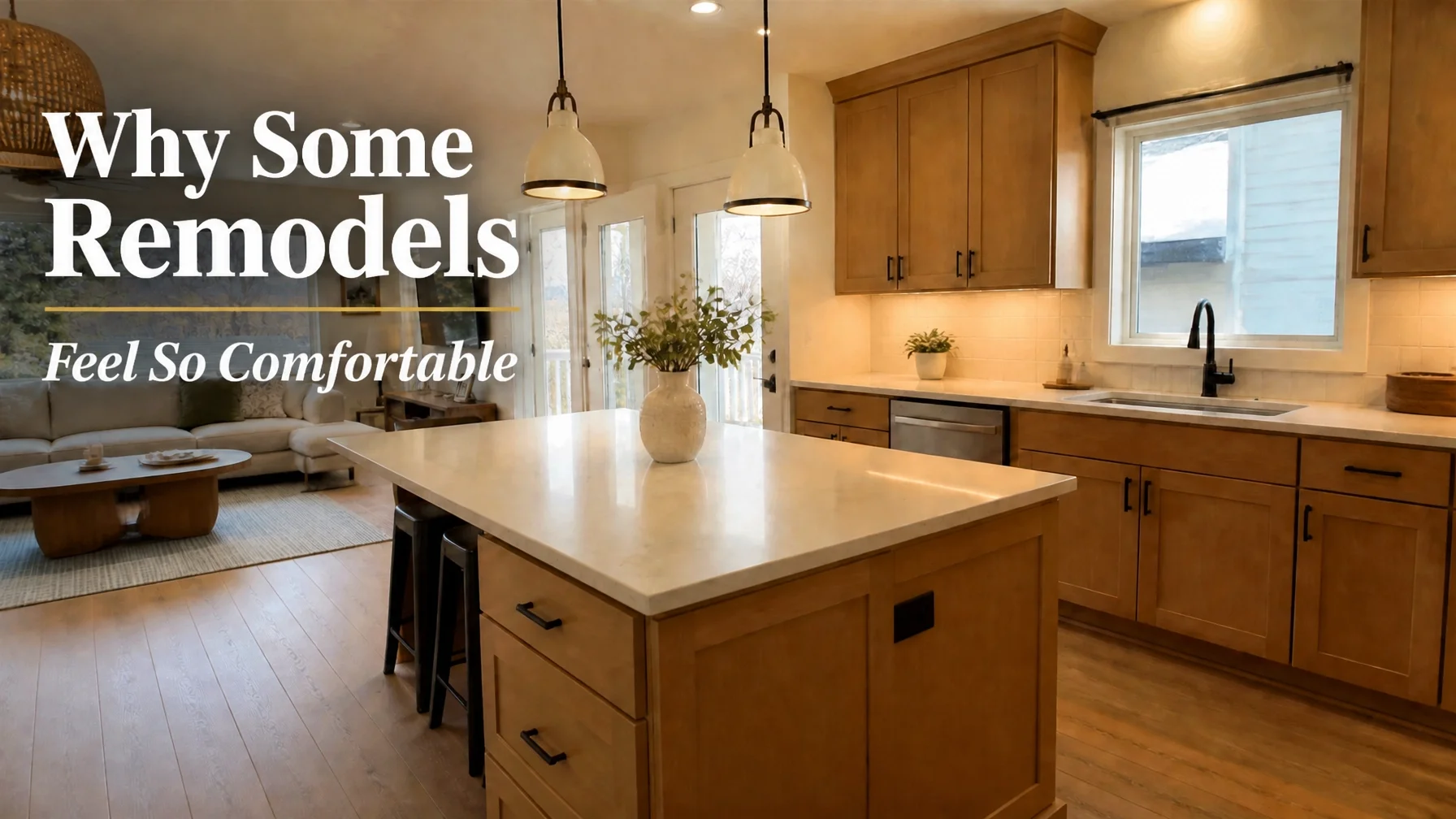
Why Some Remodels Feel So Comfortable
Walking into a freshly remodeled home can go one of two ways. Sometimes the space looks impressive but still feels cold or awkward. Other times, it immediately feels comfortable and welcoming. From a contractor’s perspective, that feeling usually comes from thoughtful planning rather than expensive finishes alone.
Most homeowners focus on tile, paint colors, and appliances. Those details matter, but comfort is often created by balanced proportions, warm materials, and lighting that supports everyday life.
Balanced Room Proportions
People often respond positively to rooms that feel balanced and appropriately scaled. When a space feels uncomfortable, it is frequently because too much has been crowded into the room or the layout feels visually uneven.
What to Look For
Furniture and fixtures sized appropriately for the room
Repetition of shapes, materials, or lighting to create visual balance
Larger architectural features balanced throughout the space
Why It Matters
Balanced rooms tend to feel calmer and easier to move through. Even smaller spaces can feel comfortable when proportions are handled carefully and circulation paths remain open.
Warm, Natural Materials
Overly sterile spaces can sometimes feel less inviting, even when the finishes are expensive. Many comfortable remodels use a mix of natural textures and warmer materials to create a more relaxed atmosphere.
What to Look For
Wood tones mixed with stone or tile finishes
Texture variation between smooth and natural surfaces
Neutral colors paired with warmer accent materials
Why It Matters
Natural materials often add depth and softness to a room. Combining warm and cool textures can help spaces feel more grounded, comfortable, and easier to live in over time.
Better Lighting and Layout Planning
Lighting has a major impact on how a home feels throughout the day. Many comfortable homes rely on multiple layers of lighting rather than a single overhead fixture.
What to Look For
Ambient lighting for general illumination
Task lighting near workspaces and seating areas
Accent lighting that highlights architectural features or décor
Layout planning matters just as much. Walkways should feel open and natural without forcing people to maneuver around furniture, islands, or appliances.
Why It Matters
Layered lighting allows spaces to adapt to different activities and times of day. Combined with a thoughtful layout, it helps daily routines feel easier and more natural.
Comfortable Homes Start With Good Planning
Comfortable homes are rarely the result of one expensive feature. More often, they come from thoughtful planning, balanced proportions, warm materials, and lighting that supports how people actually live.
At Your Contractor Pros, we help homeowners throughout the Salt Lake Valley design spaces that feel as good as they look. The goal is not just to create a beautiful remodel. It is to create a home that feels easier and more enjoyable to live in every day.
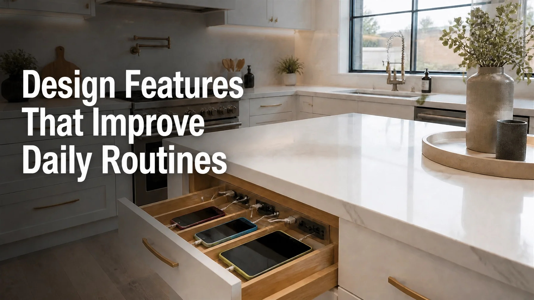
Design Features That Improve Daily Routines
Design Features That Improve Daily Routines
A home can look beautiful in photos but still be frustrating to live in every day. While finishes and colors matter, the most valuable part of a remodel is often how well the space supports your daily routines.
If everyday tasks feel more difficult than they should, your home's design may be contributing to the problem. Here are three features we often recommend during Salt Lake City remodels because they improve how a home functions long after the excitement of new finishes fades.
Better Kitchen Workflow
While the traditional kitchen work triangle remains useful, many modern kitchens benefit from thinking in activity zones as well. Cooking, prep work, cleaning, and storage all happen simultaneously, often with multiple people sharing the space.
What to Look For
Prep space located near the sink and refrigerator
Dishwashers positioned close to cleanup areas
Logical placement of cookware, utensils, and frequently used items
Why It Matters
When tasks are grouped together, the kitchen feels easier to use and less congested. If multiple people regularly struggle to use the kitchen at the same time, improvements to workflow can often make a noticeable difference without increasing square footage.
Dedicated Drop Zones
Many homes lack a designated place for keys, backpacks, mail, purses, and other everyday items. As a result, kitchen counters and dining tables often become catch-all storage areas.
What to Look For
Built-in benches, cubbies, or hooks near primary entrances
Small storage areas near garage entries
Cabinets or drawers that keep frequently used items organized
Why It Matters
Many homeowners find that clutter makes daily routines feel more chaotic and harder to manage. A dedicated drop zone helps keep frequently used items contained and makes it easier to maintain an organized home.
Convenient Charging and Storage Areas
Technology is part of everyday life, but it does not need to dominate the room. Visible charging cables and devices can sometimes create unnecessary visual clutter.
What to Look For
Charging drawers for phones and tablets
Appliance garages that conceal countertop appliances
Interior cabinet outlets for vacuums, mixers, and other devices
Why It Matters
Reducing visual clutter can help a space feel more organized and easier to maintain. Having designated locations for devices and appliances also makes them easier to find and use when needed.
Plan Early for the Best Results
Features like charging drawers, appliance garages, and built-in storage are usually easiest and most cost-effective to incorporate during the design phase. Planning ahead allows electrical layouts, cabinetry, and storage solutions to work together from the beginning.
The most successful remodels do more than improve appearance. They make everyday life easier. Better kitchen workflow, organized drop zones, and thoughtfully planned storage may seem like small details, but they are often the features homeowners appreciate most years after the project is complete.
Don't just build a home that looks good. Build one that works for you every single day.
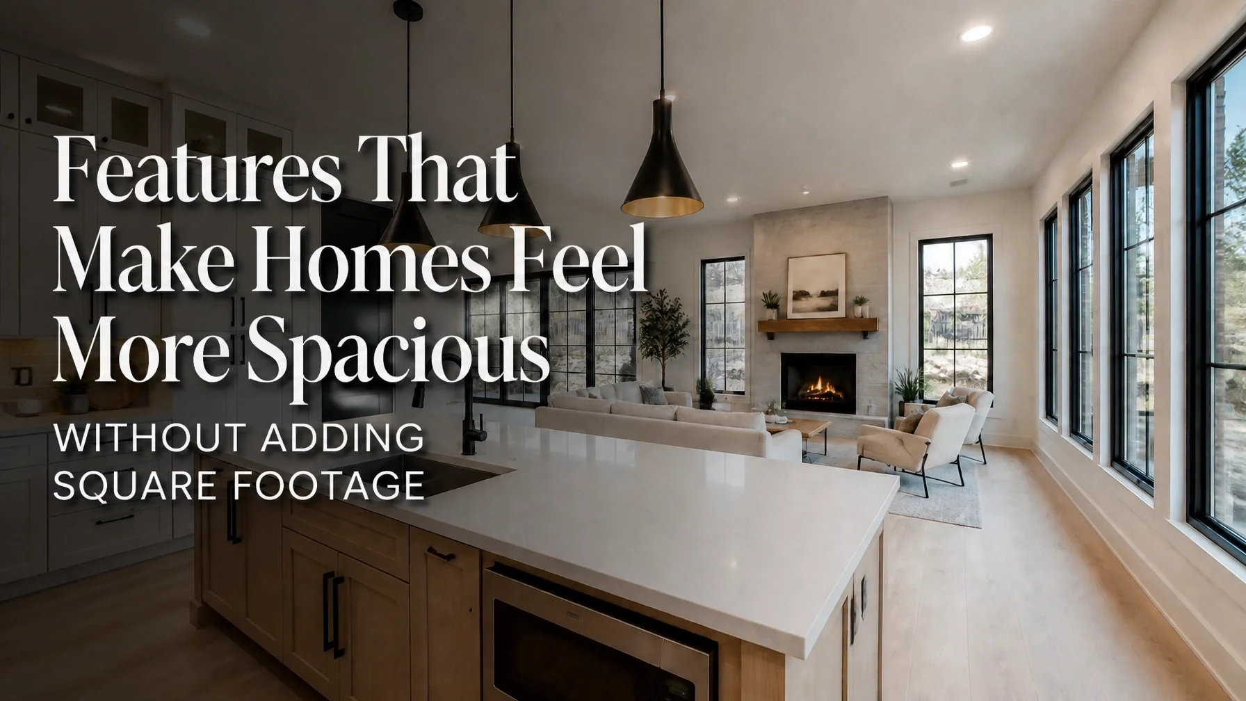
Features That Make Homes Feel More Spacious Without Adding Square Footage
Many homeowners assume a cramped house needs an addition. While expanding the footprint is sometimes the right solution, it is often one of the most expensive ways to make a home feel larger.
In many Salt Lake City remodels, the issue is not a lack of square footage. It is how the existing space is arranged, illuminated, and used. With thoughtful planning, a home can feel significantly more open without adding a single square foot.
Better Sightlines Between Rooms
A sightline is simply what you can see from a particular location in a room. When walls, partitions, or bulky design elements interrupt those views, spaces can feel more confined.
What to Look For
Opportunities to create wider openings between connected living spaces
Non-load-bearing walls that may be candidates for removal or modification
Layout changes that improve visibility between major gathering areas
Why It Matters
Longer views across multiple spaces often make rooms feel more open and connected. When you can see from the kitchen into the living room or toward a window with an outdoor view, the home feels larger and more inviting.
It can also improve interaction between spaces during everyday activities and gatherings.
Larger Windows and Better Natural Light
Light is one of the most effective tools for making a home feel open. Even large rooms can feel smaller when they are dark or unevenly lit.
What to Look For
Larger windows in primary living spaces
Opportunities for skylights or solar tubes in darker areas
Furniture or window treatments that block natural light
Why It Matters
Natural light helps create a stronger connection between interior and exterior spaces. Larger windows can make rooms feel brighter, more open, and more connected to the surrounding landscape.
In Utah homes, thoughtful window placement can also highlight mountain views, mature landscaping, or backyard living spaces.
Eliminating Unnecessary Visual Clutter
Visual clutter is not just about personal belongings. Architectural clutter can also make rooms feel smaller than they are.
What to Look For
Oversized furniture that dominates the room
Multiple flooring transitions within connected spaces
Underused areas where built-in storage could replace freestanding furniture
Why It Matters
When storage is integrated into the architecture, floor space stays more open and sightlines remain clearer. Built-ins, recessed shelving, and thoughtfully planned storage solutions often create a cleaner and more spacious appearance than multiple standalone furniture pieces.
Reducing visual interruptions can also help spaces feel more cohesive and easier to navigate.
The Contractor's Take
Making a home feel larger is not always about adding square footage. In many homes, thoughtful changes to sightlines, lighting, and storage can dramatically improve how spacious a home feels without expanding the footprint.
Before committing to a costly addition, take a close look at how your current space functions. Better views between rooms, more natural light, and fewer visual obstacles can often create the openness homeowners are looking for.
The most successful remodels do more than add space. They help homeowners make better use of the space they already have.
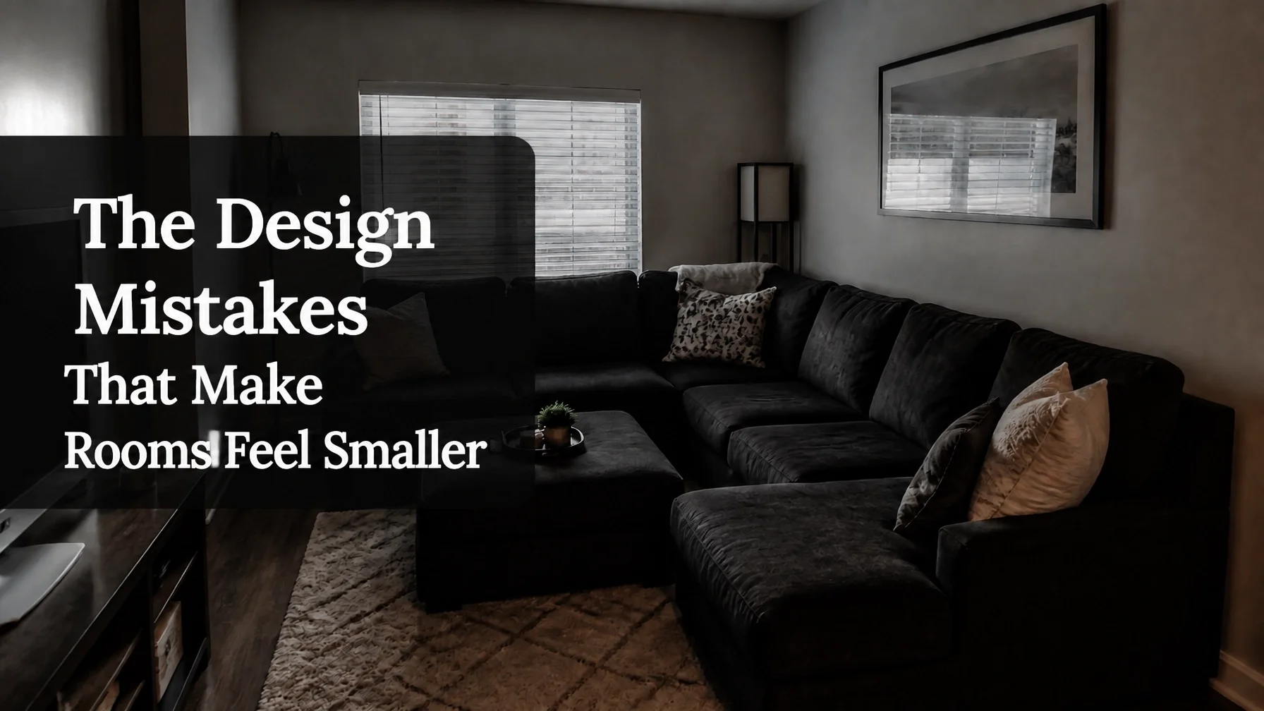
The Design Mistakes That Make Rooms Feel Smaller
The Design Mistakes That Make Rooms Feel Smaller
A room does not always feel small because of its square footage. More often, it feels small because of how it was designed. From a contractor’s perspective, we often see homeowners invest heavily in renovations only to end up with spaces that still feel cramped or cluttered.
Poor design choices can make a room feel less comfortable, less functional, and harder to enjoy on a daily basis. If you are planning a remodel in the Salt Lake Valley, it is worth understanding a few common mistakes before construction begins.
Oversized Furniture and Islands
One of the most common causes of a small-feeling room is poor scale. Furniture and fixtures that are too large for the space can quickly overwhelm a room.
What to Look For
Kitchen islands that leave less than about 36 inches of clearance in major walkways
Sectional sofas that block entryways or restrict movement
Large furniture pieces that dominate the floor plan
Why It Matters
When oversized furniture occupies too much floor space, the room can feel more crowded and less functional. A large island may look impressive, but if it limits movement through the kitchen, the space may feel less comfortable and efficient to use.
Poor Lighting Placement
Lighting is one of the most effective tools for making a room feel open and inviting, yet it is often overlooked during remodeling projects.
What to Look For
A single ceiling fixture serving as the room’s only light source
Dark corners and uneven lighting
Furniture, décor, or window treatments blocking natural light
Why It Matters
Heavy shadows can make a room feel smaller by drawing attention to darker corners and reducing the sense of openness. Layering ambient, task, and accent lighting helps distribute light more evenly and can make a room feel brighter and more welcoming.
Too Many Visual Interruptions
A room can also feel smaller when too many materials, colors, or transitions compete for attention.
What to Look For
Multiple flooring types within the same connected space
Small rugs that do not properly anchor furniture groupings
High-contrast finishes that visually divide walls and surfaces
Why It Matters
Every major change in color, material, or texture creates a visual stopping point. Too many interruptions can make a space feel busy and fragmented. Creating longer, uninterrupted sightlines often helps rooms feel more open and cohesive.
Using consistent flooring throughout a main level or coordinating wall and trim colors are simple ways to create a stronger sense of visual continuity.
The Contractor's Takeaway
Fixing a small-feeling room is not always about removing walls or adding square footage. More often, it comes down to thoughtful planning, proper scale, and smart lighting choices.
If you are planning a remodel in Sandy, West Valley City, or elsewhere in the Salt Lake Valley, pay attention to both the filled space and the empty space. Furniture placement, circulation paths, lighting, and material selections all contribute to how large and comfortable a room feels.
Good design is not a luxury. It is the framework that makes your square footage work for you. When layout, lighting, and scale are handled correctly, even modest-sized rooms can feel open, functional, and comfortable.

Timeless Design Part 3: The Difference Between Trendy and Timeless Homes
Walk into many homes renovated during a specific design era and certain choices are easy to recognize. Whether it is dark cabinetry, heavily themed backsplashes, or once-popular fixture styles, trend-driven designs can make a renovation feel tied to a particular moment in time.
In this final installment of our Timeless Design series, we’re looking at what separates homes that remain appealing for years from those that begin to feel dated more quickly. From a contractor’s perspective, the difference often comes down to where you invest your budget and how much restraint you use in the design process.
Restraint Is a Design Advantage
One common remodeling mistake is trying to make every feature a focal point. Too many competing design statements can make a space feel busy and less cohesive.
What to Look For
One or two standout architectural features rather than multiple competing trends
Neutral flooring, cabinetry, and large-scale finishes
Trend-driven colors and accents in elements that are easier to update later
Why It Matters
When a room has a clear focal point, quality materials and craftsmanship stand out more effectively. Spaces with fewer trend-driven elements often remain visually appealing longer as styles evolve.
Choosing Focal Points That Last
The most durable focal points are often based on architecture, natural light, and craftsmanship rather than novelty.
What to Look For
Well-designed fireplaces and built-ins
Window placements that maximize natural light
Custom millwork and architectural details with clean proportions
Why It Matters
Many people find highly patterned or intensely colored design features become less appealing over time, while balanced proportions, natural light, and quality craftsmanship tend to have broad, lasting appeal.
Investing in Layout and Lighting Over Novelty
Technology, hobbies, and lifestyle trends change constantly. A well-designed layout tends to remain functional even as those preferences evolve.
What to Look For
Comfortable walkway clearances
Logical kitchen work zones
Layered lighting that combines ambient, task, and accent lighting
Why It Matters
Proper lighting improves both functionality and appearance. Likewise, a thoughtful floor plan can make everyday activities easier regardless of changing design trends or technology.
The Contractor's Perspective
Timeless homes are designed for daily living, not just for photographs. While trends can add personality, the strongest remodeling investments are usually the ones that improve how a home functions.
One useful guideline is to devote most of the remodeling budget to durable materials, quality construction, thoughtful layouts, and strong lighting. Trend-driven elements such as paint colors, décor, and decorative fixtures are generally easier and less expensive to update later.
Good design is not about avoiding trends altogether. It is about creating a solid foundation that remains functional, attractive, and adaptable for years to come. When quality construction, practical layouts, and timeless materials lead the project, a home is far more likely to remain enjoyable long after current design trends have changed.
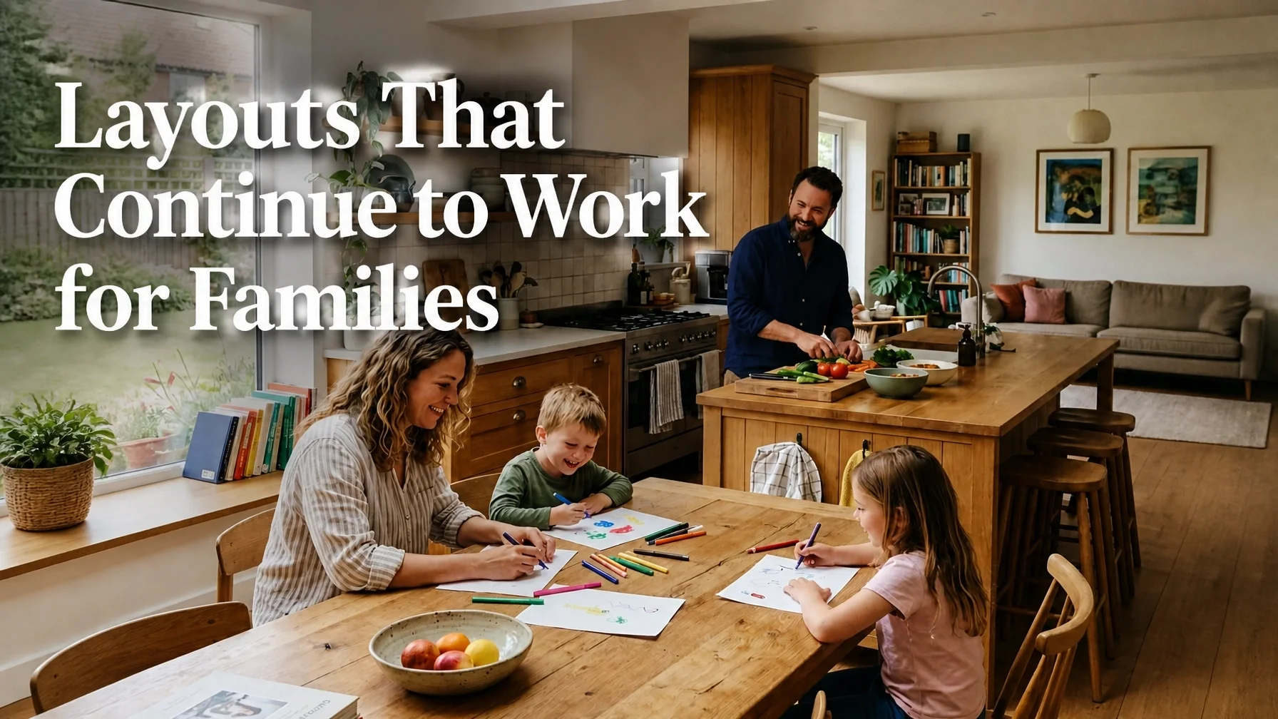
Timeless Design Part 2: Layouts That Continue to Work for Families
Timeless Design Part 2: Layouts That Continue to Work for Families
Most homeowners begin a remodel by looking at paint colors, backsplashes, and finishes. While those choices matter, the layout often has a much greater impact on daily life.
In many Salt Lake City remodels, families feel like they have outgrown their homes when the real issue is not square footage, but how the space functions. A timeless layout is designed to adapt as lifestyles and household needs change over time.
Kitchens Built for Movement
The kitchen is one of the busiest areas in the home. If movement through the space feels awkward, even expensive finishes will not make the room more enjoyable to use.
What to Look For
Clear Circulation Paths
Traffic routes should avoid cutting directly through cooking and prep areas whenever possible.
Thoughtful Island Design
Seating placed away from primary work zones allows family members and guests to gather without disrupting meal preparation.
Efficient Appliance Placement
Keeping the dishwasher, trash pull-out, and sink near one another can simplify cleanup and reduce unnecessary movement.
Why It Matters
A kitchen designed around movement helps reduce congestion during busy mornings, family dinners, and holiday gatherings.
Flexible Shared Spaces That Evolve
One common layout challenge we see is the use of single-purpose rooms. A space that serves only one function may not meet a family's needs as life changes.
What to Look For
Defined Multi-Use Areas
Furniture placement, built-ins, and architectural details can help create separate zones without fully closing off rooms.
Flexible Rooms
A room that works as a nursery today may become a study space, guest room, or home office in the future.
Privacy Options
Pocket doors, French doors, or other separation features can provide quiet space when needed while preserving openness.
Why It Matters
Flexible spaces can adapt to changing family needs without requiring major renovations later.
Storage That Reduces Clutter at the Source
Clutter can undermine even the most thoughtfully designed space. The most effective storage solutions are built into the layout rather than added as an afterthought.
What to Look For
Functional Entry Areas
Mudrooms, benches, hooks, and cubbies help manage coats, shoes, backpacks, and seasonal gear.
Point-of-Use Storage
Kitchen drawers near cooking zones and storage near daily-use areas improve convenience and organization.
Integrated Built-Ins
Under-stair storage, recessed shelving, and built-in cabinetry can add valuable storage without significantly reducing usable floor space.
Why It Matters
When storage is located where items are actually used, staying organized becomes much easier.
Planning for the Long Term
A timeless layout considers both current and future needs. Wider pathways, fewer level changes, and a full bathroom on the main floor are examples of features that many families and future buyers find practical.
Investing in a smart layout can help timeless finishes remain functional and appealing over time. Trends in color and décor will always change, but a home that flows well and adapts to changing needs rarely goes out of style.
Next in this series, we’ll wrap up with Part 3: The Difference Between Trendy and Timeless Homes, where we’ll explore the design choices that help homes stay relevant for years to come.
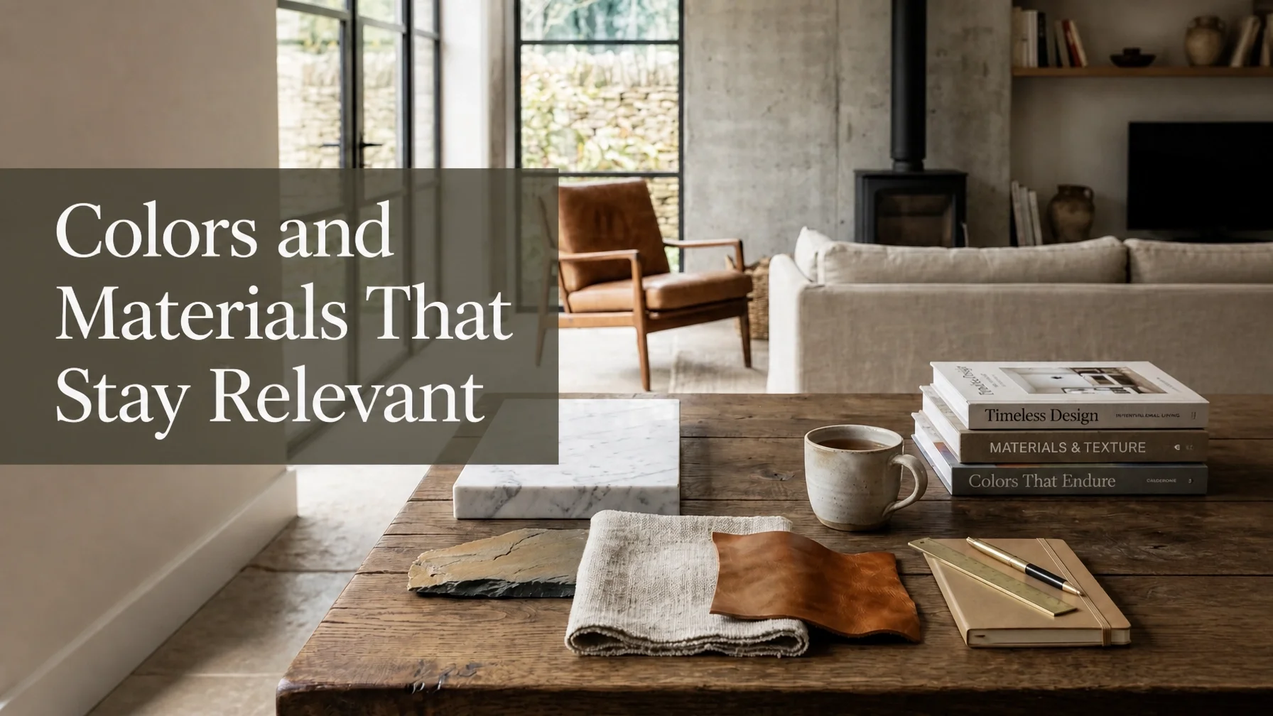
Timeless Design Part 1: Colors and Materials That Stay Relevant
Trends move quickly, but home renovations are designed to last. From a contractor’s perspective, the most successful remodels are not the ones that perfectly match current design trends. They are the ones that continue to feel intentional and well-designed for years to come.
In Salt Lake City, where lighting conditions change dramatically throughout the year, your choice of colors and materials plays a major role in how your home feels over time. Choosing timeless finishes can help your remodel stay attractive and adaptable as styles evolve.
Neutral Color Palettes That Adapt
Neutral does not mean boring. It means flexible. A neutral palette provides a backdrop that works with changing furniture, décor, and personal tastes without requiring constant updates.
What to Look For
Soft Whites and Off-Whites: Warm whites help spaces feel bright without creating a sterile appearance. They also pair well with the wood tones commonly found in Utah homes.
Greige, Taupe, and Deep Accent Colors: Greige and taupe bridge the gap between warm and cool color schemes. For contrast, navy blue or charcoal gray can add depth to islands, built-ins, or interior doors without dominating a space.
Why It Matters
A neutral foundation can help a remodel remain appealing as design trends change. It also gives homeowners more flexibility when updating furnishings and décor over time.
Natural Materials That Age Gracefully
Many manufactured materials are designed to imitate natural products, but natural wood and stone continue to be popular because of their durability and long-term appeal.
What to Look For
Classic Wood Tones: White oak, walnut, and versatile medium-tone stains have remained popular across multiple design styles. Avoid extreme color trends that may quickly feel dated.
Stone and Stone-Look Surfaces: Natural stone and quality stone-look materials provide durability while maintaining broad visual appeal. Honed or matte finishes are often more forgiving of everyday wear than highly polished surfaces.
Why It Matters
Natural wood and stone can often be refinished or repaired, helping them remain attractive for many years. Investing in quality materials can also reduce the need for major cosmetic updates in the near future.
Finishes That Balance Warmth and Contrast
Hardware and fixtures may seem like small details, but they have a significant impact on the overall feel of a home.
What to Look For
Warm Metallic Finishes: Satin brass and unlacquered brass add warmth without feeling overly decorative.
Classic Contrasts: Blackened steel, bronze, and brushed nickel tend to work well across both traditional and contemporary designs.
Why It Matters
These details are often among the first features people notice when evaluating how current a space feels. Mixing complementary finishes can create a layered look that feels collected and intentional rather than tied to a specific design trend or time period.
Planning for the Long Term
The secret to timeless design is not avoiding style. It is choosing carefully where to be bold. Save trend-driven choices for elements that are easy to update, such as paint colors, artwork, rugs, and accessories. Keep the foundational elements of your remodel rooted in durable materials, practical finishes, and versatile colors.
When planning a renovation, focus on the elements that are hardest and most expensive to replace. Those decisions often have the greatest impact on how well a home ages and adapts over time.
Next in this series, we’ll explore Part 2: Layouts That Continue to Work for Families and discuss how thoughtful floor plans can evolve alongside changing lifestyles.
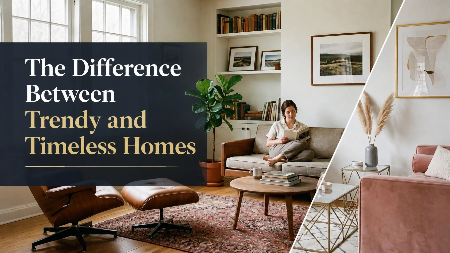
Remodel Features Worth Investing In - Part 3: Timeless Design
Timeless Design Part 3: The Difference Between Trendy and Timeless Homes
Walk into a house renovated in 2005 and you know it immediately. The heavy, dark oak cabinets, the multi-colored beige "Tuscan" backsplash, and the oversized oil-rubbed bronze hardware scream a specific era. It isn’t just old, it’s dated. This is the ultimate risk of chasing trends: your high-dollar renovation has a built-in expiration date.
In this final part of our series, we’re looking at the fundamental differences between homes that feel fresh for decades and those that feel tired in five years. From a contractor's point of view, it comes down to where you spend your money and when you choose to say "no."
Restraint Is a Design Superpower
Most homeowners feel the urge to fill every corner with "personality." In the construction world, we see this lead to cluttered, over-designed spaces that age poorly. Timeless design isn’t about being boring: it’s about restraint. It's about letting a few high-quality elements do the heavy lifting rather than crowding the room with "statement" pieces.
What to look for: Choosing one or two standout architectural features rather than a room full of competing trends.
Why it matters: When everything is loud, nothing stands out. A house with too many trends fighting for attention feels chaotic and loses its value quickly once those trends shift.
The action: Keep the "bones": your flooring, cabinetry style, and major tile: neutral and classic. If you want to experiment with a "color of the year," do it with paint or hardware, not your floor.
Choosing Focal Points That Last
A focal point should be architectural, not fashion-driven. A massive, intricately patterned tile wall in a hyper-specific color is a liability. A beautifully crafted fireplace, a custom-built window bench, or a well-placed window is an asset.
What to look for: Features that rely on scale, craftsmanship, and light rather than bold patterns or novelty materials.
Why it matters: Human eyes get tired of busy patterns and aggressive colors over time. We don't get tired of natural light or balanced proportions.
The action: Invest in permanent "character" like high-end millwork or better window placements. These are timeless home finishes that age well in Utah regardless of what’s currently trending on social media.
Investing in Layout and Lighting Over Novelty
Novelty features: like built-in specialized gadget docks or ultra-specific "hobby" rooms: often become obsolete as technology and family needs change. A great layout never does. We often see homeowners spend $15,000 on "smart home" tech while leaving a cramped kitchen layout that makes cooking a chore.
What to look for: Wide walkways, logical "work triangles" in kitchens, and layered lighting (ambient, task, and accent).
Why it matters: Proper lighting makes even modest materials look expensive. Poor lighting makes a luxury remodel look gloomy and dated.
The action: Prioritize the "unseen" quality. Spend the extra budget on recessed lighting, professional layout planning, and high-quality sub-structures. These are the renovations that actually pay off because they improve the actual utility of the home.
The Contractor’s Verdict
A trendy home is built for a photo; a timeless home is built for a life. When planning your home renovation in Salt Lake City, follow the 70/30 rule: put 70% of your budget into a timeless, high-quality foundation and 30% into the "now" elements like lighting fixtures and decor.
Design isn't about what's "in" right now: it's about creating a space that functions so well it never needs to be "out." Focus on the quality of the build and the logic of the layout. The rest is just noise.
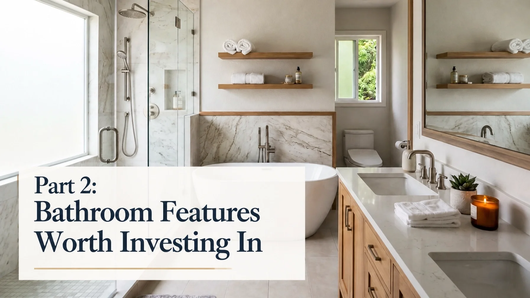
Remodel Features Worth Investing In - Part 2: Bathroom Upgrades
Remodel Features Worth Investing In - Part 2: Bathroom Upgrades
Bathrooms are high-moisture, high-traffic spaces where small design problems can lead to bigger maintenance issues over time. After covering kitchen upgrades in Part 1 of this series, we’re shifting focus to bathroom features that improve comfort, function, and long-term durability.
From a contractor’s perspective, the best bathroom remodels are not just stylish. They are designed to handle moisture properly, improve daily use, and stay functional for years to come.
Ventilation and Airflow: The Silent Protector
Moisture is one of the biggest long-term challenges in any bathroom. If your mirror stays foggy long after a shower, your bathroom may not be ventilating moisture effectively.
What to Look For
Exhaust fans sized appropriately for the bathroom
Humidity-sensing switches that automatically run the fan when needed
Timer switches that help remove moisture after showers
Why It Matters
Poor airflow can contribute to peeling paint, moisture damage, and conditions that allow mold to develop over time. Better ventilation also helps bathrooms feel cleaner and more comfortable while reducing the loud “jet engine” noise common in older fans.
Walk-In Showers and Smarter Layouts
Many Utah homeowners are moving away from oversized tubs and toward larger walk-in showers that improve both function and visual openness.
What to Look For
Curbless or low-threshold entries
Frameless glass panels that help the room feel more open
Built-in shower niches for organized storage
Why It Matters
Walk-in showers remain a highly desirable feature in many remodels because they improve accessibility, reduce visual clutter, and make bathrooms feel larger without necessarily increasing square footage.
Lighting and Mirror Upgrades
Lighting is often one of the weakest parts of older bathrooms. A single overhead fixture can create harsh shadows and make the room feel smaller and less functional.
What to Look For
Lighting mounted beside mirrors to reduce facial shadows
Dimmable lighting for better flexibility
Anti-fog mirrors or improved ventilation near mirrors
Why It Matters
Better lighting improves both comfort and functionality. It can also make a mid-range remodel feel far more polished and intentional without dramatically increasing the budget.
Practical Wisdom for Your Remodel
When planning a bathroom remodel, prioritize the features behind the walls before focusing on finishes and décor. Even a beautiful shower can become a problem if the plumbing, waterproofing, or ventilation is not handled properly.
Good bathroom remodeling is about more than appearance. Better airflow, smarter layouts, and improved lighting help create a bathroom that stays comfortable and functional long term.
Stay tuned for Part 3, where we’ll cover design choices that age well and continue adding value over time.
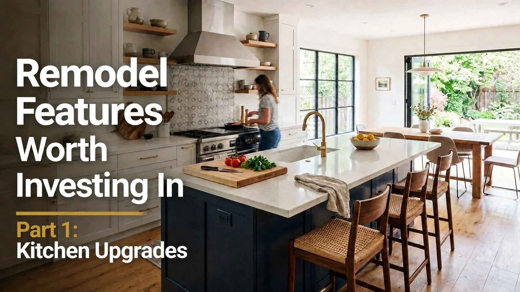
Remodel Features Worth Investing In - Part 1: Kitchen Upgrades
Remodel Features Worth Investing In - Part 1: Kitchen Upgrades
Most homeowners begin a remodel by focusing on aesthetic trends they see online. While appearance matters, focusing only on the "look" can sometimes lead to expensive choices that do not improve daily functionality. From a contractor’s perspective, the best renovations are the ones that solve problems, improve workflow, and make everyday life easier.
A beautiful countertop will not fix a kitchen with poor movement or limited storage. The upgrades homeowners appreciate most are usually the ones they notice every single day.
Better Kitchen Layouts That Improve Movement
Poor layout is one of the biggest reasons kitchens feel frustrating to use. If the path between the sink, stove, and refrigerator is blocked or spread too far apart, the kitchen quickly becomes less efficient.
When planning a remodel, focus on practical movement first.
What to Look For
Many well-functioning kitchens aim for roughly 42 to 48 inches of clearance in busy walkways, depending on the layout.
Prep areas work best when located near the sink, trash, and refrigerator.
Counter space near appliances makes loading and unloading much easier.
Why It Matters
A better layout improves how the kitchen functions every day. Good flow reduces congestion, makes cooking easier, and helps the room feel more comfortable overall.
Storage Upgrades That Reduce Clutter
Storage is one of the most valuable investments in a kitchen remodel. Traditional lower cabinets with fixed shelves are often less efficient than modern drawer-based storage systems because items get buried in the back.
What to Look For
Deep drawers for pots, pans, and larger kitchen items
Pull-out pantry systems that maximize narrow spaces
Storage solutions that keep frequently used appliances organized
Why It Matters
When everything has a designated place, countertops stay clearer and the kitchen becomes easier to maintain day to day.
Lighting Improvements That Make Kitchens Feel Larger
Lighting is often overlooked during remodeling, even though it has a major impact on how a kitchen feels and functions. Many kitchens rely too heavily on a single overhead fixture, which creates shadows and uneven lighting.
What to Look For
Under-cabinet LEDs to brighten workspaces directly
Evenly spaced recessed lighting for balanced coverage
Separate switches or dimmers for task and accent lighting
Why It Matters
Proper lighting can make a kitchen feel larger, brighter, and more welcoming while also improving visibility for cooking and cleaning.
Practical Wisdom for Your Next Kitchen Project
Kitchen remodeling is not about chasing perfection. It is about solving the problems you deal with every day.
Before investing in expensive finishes, focus on the parts of the kitchen that affect how you cook, clean, store items, and move through the room. Better layout, smarter storage, and stronger lighting often have a bigger impact on daily life than trend-driven upgrades.
Before starting your remodel, ask:
Does this make the kitchen easier to use?
Will it improve organization or workflow?
Is it designed to perform well long term?
Good kitchen design is not about showing off. It is about creating a space that works better every day.

Why Good Design Makes Everyday Life Easier
Why Good Design Makes Everyday Life Easier
Most people think home design is about picking out paint colors or choosing between quartz and granite. From a contractor's point of view, that’s only the surface. True design is about how your home functions when you’re running late, carrying groceries, or trying to get three kids out the door in a Salt Lake Valley snowstorm.
Good design quietly does the hard thinking for you. When a space is designed well, you don’t notice it. You only notice when it’s bad, like a kitchen cabinet that hits the fridge or a mudroom that’s too small for actual mud.
Storage That Makes Sense (Everything Has a Place)
In many Utah homes, from newer builds in Herriman to established neighborhoods in Sandy, storage is often an afterthought. Builders give you a closet and call it a day. But "storage" isn't just a hole in the wall; it’s a system to manage your life.
What to look for:
Point-of-use storage: Keeping the things you use exactly where you use them.
Specialized zones: A dedicated spot for the vacuum, a charging station for electronics, or a pull-out spice rack next to the stove.
Vertical space utilization: Using the full height of your walls, especially in laundry rooms and pantries.
Why it matters:
When everything has a specific home, you stop spending mental energy looking for things. It reduces small daily frustrations. A well-designed mudroom with hooks at the right height for kids means shoes and bags don't end up in the hallway. Good design recognizes human behavior instead of fighting it.
Better Movement Paths and Traffic Flow
The way you move through your home dictates your daily rhythm. A poorly planned layout forces you to take extra steps every single day. Over time, those extra steps and awkward movements become surprisingly frustrating.
What to look for:
The "Work Triangle": The distance between your sink, stove, and fridge should be tight and unobstructed.
Clearance zones: Ensuring doors and drawers can open fully without blocking a walkway.
Logical transitions: The path from your garage to your kitchen should be direct and easy to navigate with heavy bags.
Why it matters:
Efficient movement paths prevent "bottlenecks" where family members bump into each other. If you find yourself constantly saying "excuse me" just to get to the coffee maker, your layout may not be working as efficiently as it could. We see this often in cramped kitchens that were designed for aesthetics rather than actual cooking.
Cleaner Layouts and Visual Calm
Clutter isn't just a cleaning issue; it’s often a design issue. A "busy" room with too many competing angles, mismatched floor heights, or poor lighting creates visual noise that makes it hard to relax.
What to look for:
Symmetry and alignment: Lining up door frames, cabinetry, and windows to create a sense of order.
Integrated appliances: Hiding the clutter of small appliances behind specialized cabinetry, sometimes called appliance garages.
Consistent materials: Using a cohesive palette to help the eye move smoothly through the space.
Why it matters:
A cleaner layout helps a space feel calmer and easier to live in. Orderly spaces simply feel easier to navigate and more relaxing to spend time in. This is why a professional remodel often feels "lighter" even if the square footage hasn't changed. It’s about elevating design choices to prioritize peace of mind.
How Your Contractor Pros Handles the Details
At Your Contractor Pros, we don’t just swing hammers. We manage the entire process from the first sketch to the final coat of paint. We’ve seen enough outdated home layout decisions in the Salt Lake Valley to recognize many of the common layout and planning mistakes that create frustration later.
We focus on the longevity of your renovation. We help you decide where to spend vs. save so that you aren't just paying for a "look," but for a home that actually makes your life easier. Good design is an investment in daily comfort, functionality, and peace of mind.
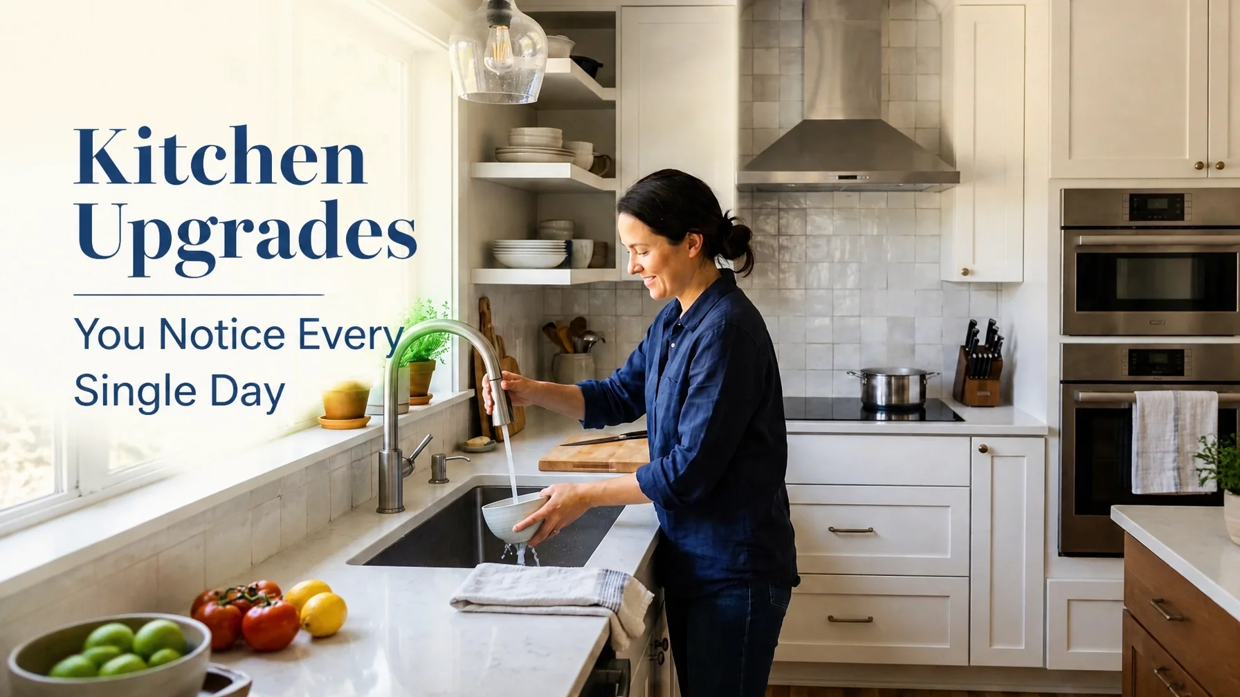
Kitchen Upgrades You Notice Every Single Day
Kitchen Upgrades You Notice Every Single Day
Most homeowners renovate their kitchens for the "wow" factor, like quartz countertops, designer backsplashes, or high-end ranges. But once the novelty wears off, you aren't living in a showroom. You’re living in a workspace. From a contractor's point of view, the most successful remodels aren't defined by what your neighbors think. They’re defined by how much less frustrated you feel during the Tuesday night dinner rush.
In the Salt Lake Valley, where kitchens often serve as the high-traffic hub for large families and frequent hosting, utility often matters more than homeowners expect. Here are the three upgrades that actually change your daily life.
Under-Cabinet Lighting: Beyond the "Mood"
Good lighting isn't just about making the room look pretty. It’s also a safety and efficiency upgrade. Most standard overhead lighting packages in older Salt Lake homes often leave prep surfaces unevenly lit or partially shadowed.
What to look for:
Color Temperature: Aim for 3000K to 3500K. Higher color temperatures can feel harsh in residential spaces, while very warm lighting may make colors and finishes appear dull.
Dimmability: You want bright task lighting for chopping vegetables, but a softer glow for late-night kitchen trips.
Placement: Mount the light strips toward the front edge of the cabinet instead of the back to help reduce backsplash glare and better illuminate the counter surface.
Why it matters:
When you reduce shadows, the kitchen feels easier to work in and often appears larger and cleaner. It’s the difference between guessing whether food is properly browned and clearly seeing texture and color. Avoid common lighting and design mistakes by planning your electrical layout early in the remodel process.
Better Storage Flow: Ending the Cabinet Dig
The "black hole" cabinet, where Tupperware lids and heavy mixers disappear into the back corner, is one of the most common frustrations in older kitchen layouts. A modern kitchen isn't about having more cabinets. It’s about having easier access to the storage you already have.
What to look for:
Deep Drawers vs. Lower Cabinets: Swapping lower cabinet doors for deep, heavy-duty drawers is usually far more convenient than kneeling to reach the back of a shelf.
Pull-Out Pantries: Especially in narrow Salt Lake bungalows, pull-out pantry systems can turn unused narrow space into functional storage for spices, oils, or canned goods.
Task-Based Zoning: Group items by function. Keep prep tools near the island, coffee supplies near the water source, and baking sheets close to the oven.
Why it matters:
Better storage flow means less time searching and less friction in your daily routine. If you're struggling with an outdated layout, strategic storage upgrades can dramatically improve functionality without requiring major structural changes.
Wider Workspace Layout: The Room to Breathe
Nothing kills the joy of cooking like a cramped kitchen where two people can't move around comfortably at the same time. If your kitchen feels tight, the problem is often layout efficiency rather than square footage.
What to look for:
The 42-Inch Rule: Many functional kitchen layouts aim for roughly 42 to 48 inches of clearance between islands and perimeter counters.
Removing Peninsulas: In some layouts, peninsulas create awkward dead ends in the kitchen flow. Replacing one with an island can improve movement and open additional pathways through the room.
Countertop Extension: Even an extra foot of uninterrupted prep space near the sink or stove can make cooking noticeably easier.
Why it matters:
A wider workspace helps the kitchen function better as a shared space. Whether kids are doing homework at the counter or someone is helping cook dinner, layout directly affects how the room feels to use every day. Improving kitchen flow is one of the most noticeable long-term quality-of-life upgrades you can make in a remodel.
Practical Wisdom for Your Remodel
A kitchen remodel shouldn't just follow the latest Instagram trend. It should solve the bottlenecks in your daily routine. Before selecting finishes or tile, spend a week paying attention to the little frustrations in your current kitchen. Is the lighting too dim? Is prep space limited? Does storage feel inconvenient during busy evenings?
Focusing on those daily touchpoints helps ensure your remodel still feels functional and comfortable years later. If you're ready to stop fighting your kitchen and start enjoying it, let’s look at your layout and flow to find solutions that fit your Salt Lake home.
Bathroom Remodel ROI: What Actually Pays Off
Bathroom Remodel ROI: What Actually Pays Off
Most homeowners remodel their bathrooms for two reasons: they’re tired of looking at dated fixtures, or they’re prepping for a sale. If you’re looking at it from a contractor’s point of view, the goal is simple: maximize the impact while minimizing wasted capital.
The reality of remodeling ROI is often misunderstood. You aren't going to get back every dollar you spend. However, a strategic bathroom update remains one of the highest-value projects you can take on in the Salt Lake City market.
The ROI Reality: Mid-Range vs. Luxury
In the world of resale, mid-range remodels almost always outperform luxury ones. Industry reports often show mid-range bathroom remodels recouping a significant portion of their cost, commonly in the 60–70% range depending on the market and timing. High-end, upscale remodels involving imported marble and highly customized features can see lower returns relative to their cost, especially when upgrades become too personalized or luxury-focused.
What to look for: A focus on functional upgrades and clean, modern aesthetics rather than high-ticket custom features.
Why it matters: Many buyers prioritize clean, functional spaces over highly personalized luxury features that may not match their taste.
For a deeper dive into how to allocate your funds, check out our guide on remodel budget spend vs. save in Salt Lake City.
Upgrades That Boost Value Most
Not all updates are created equal. If you want the best return, focus on these specific areas:
Walk-In Showers: Replacing a cramped tub-shower combo with a sleek walk-in shower is often viewed as a desirable modern upgrade. Glass enclosures can also help the room feel larger and brighter.
Double Vanities: If the space allows, adding a second sink is a game-changer for master suites.
Modern Lighting: Good lighting helps a space feel brighter, cleaner, and more polished while highlighting finishes and layout features. It’s also one of the most affordable ways to dramatically improve how a bathroom feels.
Water-Efficient Fixtures
Buyers in Utah are increasingly conscious of utility costs. High-efficiency toilets and showerheads are smart, practical upgrades that can appeal to cost-conscious homeowners.
What to look for: Neutral color palettes and timeless home finishes that age well.
Why it matters: Trendy choices can become material regrets within just a few years, forcing the next owner to factor in the cost of another renovation.
Avoiding the "Over-Improvement" Trap
The fastest way to lose money on a remodel is to ignore your neighborhood's price ceiling. If the average home in your area is valued at $450,000, putting $60,000 into a master bath can be difficult to justify financially. It can be very difficult to recoup that level of investment at resale.
This is what we call an overbuilt space. To maximize ROI, many homeowners aim to keep bathroom remodel spending within a reasonable percentage of the home's value, often somewhere around 5% to 10%, depending on the neighborhood and long-term plans.
Mid-Range is the Sweet Spot
Think of a mid-range remodel as "high-impact, low-risk." It involves replacing the essentials: vanity, flooring, lighting, and tile, without moving the plumbing or knocking down walls.
Move-in ready appeal: Move-in-ready homes are often more attractive to buyers because they reduce the need for immediate repairs or updates.
Efficiency over excess: Focus on better storage and smarter layouts rather than expanding the footprint.
Remodeling for ROI isn't about creating a showroom. It's about removing friction for the next buyer while improving your daily life. Keep it clean, keep it functional, and keep it within the context of your neighborhood. That’s how you actually maximize the value of your investment.
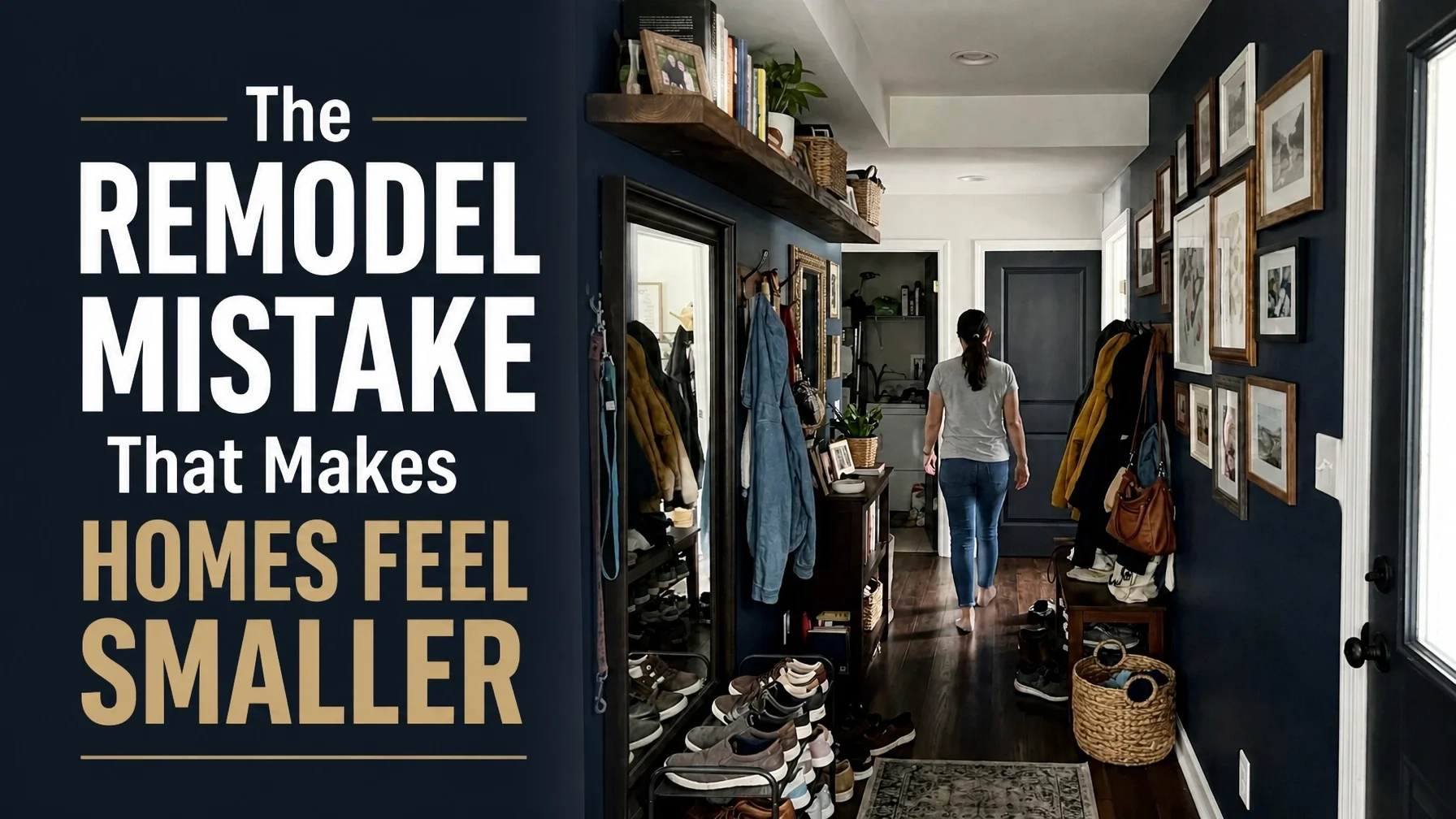
The Remodel Mistake That Makes Homes Feel Smaller
The Remodel Mistake That Makes Homes Feel Smaller
You spend months planning a renovation. You pick the most expensive tile, the trendiest cabinets, and the exact shade of "greige" you saw on Instagram. Then the drywall goes up, the furniture moves in, and reality hits and the room feels half the size it used to be.
It is a brutal realization.
Most homeowners in Salt Lake City think that "bigger" is a matter of square footage. It isn't. Space is a matter of perception. You can add 500 square feet to a house and still have it feel like a series of cramped tunnels if you fall into the common traps of poor design execution. From a contractor’s point of view, we see these mistakes constantly. People focus on the what (the materials) but ignore the how (the scale and flow).
If your home feels like it’s shrinking despite the money you’re pouring into it, you’re likely making one of these five critical mistakes.
1. The Scale Trap: Oversized Furniture
The most common way to ruin a perfectly good remodel is to buy furniture that belongs in a warehouse for a bungalow in Sugar House. When you see a massive sectional in a 10,000-square-foot showroom, it looks proportional. Put that same piece in a standard Utah living room and it swallows the floor plan whole.
What to look for:
Furniture that blocks natural walkways or forces you to walk "around" the room to get through it.
Pieces that dominate the room and leave very little open floor space.
Backs of sofas that sit higher than the window sills, blocking natural light.
Why it matters:
Visible floor space plays a major role in how open a room feels. When you cover the floor with a massive rug and an even more massive sofa, the visible area of the room shrinks dramatically. It creates a sense of claustrophobia that no amount of white paint can fix.
The Action:
Measure twice, buy once. Before purchasing furniture for your newly remodeled space, tape out the dimensions on the floor with blue painter's tape. If you can’t walk comfortably around the perimeter, the piece is too big. You want breathing room between your walls and your furniture.
2. Visual Barriers: Low-Hanging Fixtures
Lighting can either open a room up or act as a visual ceiling. In many Utah homes, especially older ones with standard 8-foot ceilings, homeowners often choose "statement" lighting that hangs far too low.
What to look for:
Pendants over a kitchen island that sit at eye level, blocking the view into the next room.
Chandeliers in the dining room that dominate the vertical space.
Ceiling fans with long downrods in rooms with low clearance.
Why it matters:
Low-hanging fixtures create a false ceiling. Your eyes stop at the light fixture instead of traveling to the back of the room. This effectively cuts the perceived height of your walls by a foot or more. It’s a subtle mistake that makes a space feel heavy and compressed.
The Action:
Stick to recessed lighting or flush-mount fixtures if your ceilings are under nine feet. If you must have a pendant, ensure it is hung high enough to keep the sightline across the room clear. Check out our guide on lighting and color design mistakes for more on how to avoid these common pitfalls.
3. The Mood Killer: Dark Ceilings
There is a trend right now toward dark, moody rooms. While a dark accent wall can add depth, painting a ceiling a dark color in a standard-sized home is a recipe for a cave effect.
What to look for:
Ceilings painted the same dark color as the walls.
Heavy, dark wood beams that feel like they are pushing down on the room.
Inadequate lighting that leaves corners dark, making the ceiling feel lower than it is.
Why it matters:
Light colors reflect; dark colors absorb. A white or off-white ceiling reflects light back down into the room, making the vertical space feel more open. A dark ceiling absorbs that light and draws the eye downward, making the room feel shorter. Unless you have 12-foot ceilings and a massive amount of natural light, keep the ceiling light.
The Action:
If you want drama, use it on the floor or a single accent wall. Keep your ceilings bright. In basement remodels, which are common throughout the Salt Lake Valley, this is non-negotiable. Basements already struggle with height; don't make it worse with dark finishes. We see this often in failed solutions for dark living spaces.
4. The Obstacle Course: Bad Traffic Paths
A remodel should improve how you move through your home, not make it more difficult. A common mistake is a layout that ignores human flow. This is usually the result of trying to pack too many features, like islands, built-ins, or breakfast nooks, into a space that can’t support them.
What to look for:
"The Shuffle": Having to turn sideways to pass between a kitchen island and the counter.
Dead ends: Layouts where you have to backtrack to get out of a room.
Blocked entryways: Doors that can't open all the way because they hit furniture or cabinetry.
Why it matters:
If a room is hard to navigate, it feels small. Period. Your brain registers friction as a lack of space. A 200-square-foot kitchen with a clear 42-inch walkway often feels much more open than a 300-square-foot kitchen where you’re constantly bumping into corners.
The Action:
Prioritize the work triangle and clear walkways. Many building standards use roughly 36 inches as a minimum walkway guideline, but for a high-end feel, aim for 42 to 48 inches. If a kitchen island makes your walkway 30 inches, skip the island. It’s a home layout flow pitfall that will haunt you daily.
5. Visual Noise: Too Many Competing Finishes
Consistency is the secret to making a home feel expansive. When you use different flooring in every room, or five different types of tile in one bathroom, you are creating visual stops.
What to look for:
A transition strip between the kitchen tile and living room wood that cuts the house in half.
Busy wallpaper paired with a busy backsplash and a bold floor pattern.
Too many different metal finishes (gold, black, chrome, nickel) in a small area.
Why it matters:
Your eyes need a place to rest. When there are too many competing finishes, the eye jumps from one thing to another, never taking in the full scale of the room. This visual noise clutters the space just as much as physical mess does. It segments the house into tiny boxes rather than allowing it to feel like one continuous, airy environment.
The Action:
Choose a hero element and let everything else be the supporting cast. If you want a bold, patterned floor, keep the walls and cabinetry simple. Use consistent flooring throughout the main level of your home to blur the lines between rooms. This is a hallmark of timeless home finishes that age well.
The Contractor’s Perspective: Thinking Ahead
Small homes don't have to feel small. We’ve seen 900-square-foot cottages in Liberty Wells that feel more spacious than new-build mansions in Draper because the owners understood scale and light.
Avoiding these mistakes isn't about spending more money; it’s about smarter planning. It’s easier to catch a bad traffic path on a blueprint than it is to move a load-bearing wall after the cabinets are installed. This is why professional oversight matters. A general contractor isn't just there to manage construction; they’re there to spot layout and flow issues before they become expensive problems.
If you’re feeling cramped in your current space, don't jump straight to an addition. Sometimes, the fix is as simple as thinning out the visual noise, raising the fixtures, and fixing the flow.
Smart Planning Tips for Your Next Project
Audit your furniture: Before the remodel begins, decide what stays and what goes.
Lighting layers: Use recessed lights for general illumination and save the pendants for very specific, high-ceiling areas.
Unified flooring: Pick one high-quality material and run it as far as you can. It helps the entire level feel more open and connected.
Consult a pro early: We often see layout issues that could have been fixed in five minutes during the design phase but would cost thousands to fix later.
Ready to stop guessing and start planning? Whether you're dealing with cramped kitchens or just a general sense that your house is closing in, the right layout makes all the difference.
Good remodeling isn't about how much you can fit into a room; it’s about how much room you can create for your life. Keep it simple, keep it consistent, and for the love of your shins, leave enough space to walk through your own kitchen.
This is the reality of smart renovation in Salt Lake City. It’s not just about the square feet; it’s about the sense of freedom you feel when you walk through the front door. Plan for flow, and the space will follow.
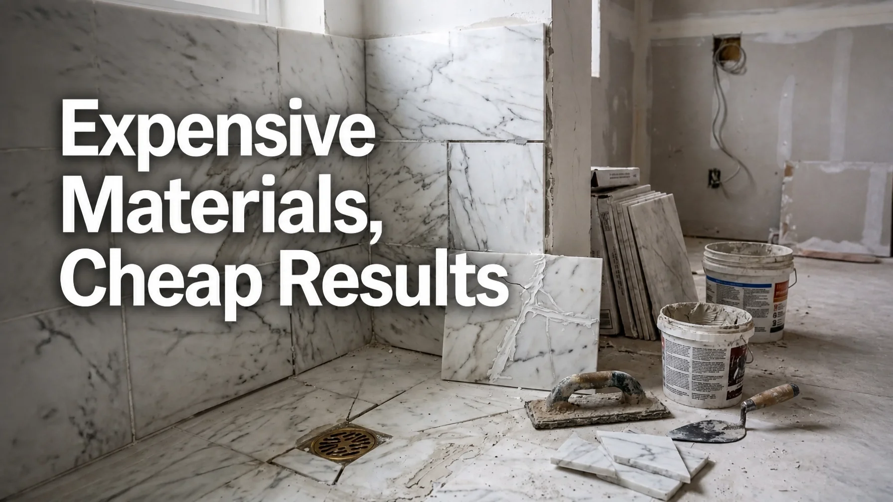
Expensive Materials, Cheap Results
Expensive Materials, Cheap Results
Higher price tags do not automatically guarantee better results.
You can walk into a showroom in Salt Lake City, spend a fortune on Italian marble and custom-milled white oak, and still end up with a remodel that feels underwhelming because the installation quality never matched the materials themselves.
From a contractor's point of view, it’s frustrating to see high-end materials lose their impact because of poor installation or rushed execution.
Luxury isn't just about what you buy; it’s about how it’s installed. When craftsmanship doesn’t match material quality, even beautiful products can fail to deliver the finished look homeowners imagined.
If you are planning a renovation, it’s important to understand where the “cheap” feeling often comes from. In many cases, it isn’t the material itself. It’s the overlooked details during installation.
The Tile Trap: When Premium Stone Falls Flat
Tile is one of the most common places where expensive projects lose their impact.
You may choose beautiful large-format porcelain, handcrafted Zellige tile, or natural stone. But if the installer doesn’t properly prepare the substrate or carefully plan the layout, the finished product can quickly feel uneven or rushed.
What to look for
Lippage: one tile edge sitting higher than the next
Inconsistent grout spacing across the same surface
Poorly planned cuts resulting in tiny slivers of tile at edges or corners
Grout haze left behind on finished surfaces
Why it matters
In high-end work, installers work carefully to minimize lippage as much as possible. Uneven tile surfaces not only affect the appearance of the room but can also collect dirt more easily and create subtle trip hazards in some situations.
Improper substrate preparation or movement accommodation can also increase the likelihood of cracking over time, especially in climates like Utah where seasonal movement and temperature shifts affect homes throughout the year.
When homeowners invest heavily in premium tile, they are usually expecting a clean, intentional, seamless appearance. Inconsistent spacing and poor layout decisions disrupt that effect immediately.
Cabinetry Calamity: Misalignment Changes Everything
Cabinetry is one of the most visually dominant elements in kitchens and bathrooms. Even expensive custom cabinets can feel “off” if installation details are rushed.
What to look for
Uneven gaps between doors and drawers
Misaligned handles or pulls
Visible shims or unfinished gaps near floors and walls
Doors or drawers that drift open on their own
Why it matters
Poorly installed cabinetry can contribute to premature wear on hinges, slides, and hardware over time.
If cabinet boxes are not properly leveled or aligned, stress can build throughout the installation. Over time, cabinetry or finish materials may experience movement, shifting, or visible inconsistencies.
High-end cabinetry is an investment in both function and appearance. Installation quality directly affects both.
Trim and Finish Work: The Details People Notice First
Trim work is what ties a room together. Baseboards, crown molding, door casings, and transition details help create clean visual lines between materials and surfaces.
In a high-end home, those transitions should appear clean, consistent, and intentional.
What to look for
Open miter joints at corners
Excessive caulking used to hide poor cuts
Inconsistent trim reveals around doors and windows
Visible nail holes or unfinished touch-up work
Why it matters
Wood naturally expands and contracts with seasonal humidity changes. If trim joints already have noticeable gaps during installation, seasonal movement can make those gaps even more visible over time.
Professional finish work requires patience, precision, and planning. Even expensive hardwood trim can look unfinished if the details are rushed.
Why Cheap Results Happen on Expensive Projects
Most homeowners don’t intentionally choose a poor result. They often research materials carefully, invest heavily, and hire experienced professionals.
The disconnect frequently happens during the bidding and installation process.
When one proposal comes in dramatically lower than the others, compromises are often being made somewhere. Sometimes those compromises involve rushed timelines, reduced supervision, or less attention to finish-detail coordination.
High-end results often come down to attention to detail and consistency during installation.
The Problem with Poor Coordination
Some contractors rely heavily on subcontracted labor without maintaining close oversight during installation.
In busy construction markets like the Salt Lake Valley, speed and scheduling pressures can sometimes outweigh finish-detail coordination if projects are not managed carefully.
This is where many avoidable errors happen:
Tile layouts approved too late
Cabinet alignments not verified before countertops arrive
Lighting and outlet placement conflicting with final design details
Small mistakes become much harder and more expensive to fix once installation moves forward.
How to Protect Your Investment
If you are investing in high-end materials, it’s important to invest in the planning and craftsmanship behind them as well.
Verify Layouts Before Installation
Before tile or flooring work begins, review layout plans and cut locations carefully. Small layout decisions have a major visual impact once the room is complete.
Check for Level Early
Before countertops are installed, cabinet runs should be checked for flatness and alignment. Uneven cabinet installation can place additional stress on stone countertops and may contribute to long-term issues.
Prioritize the Invisible Work
Wall straightening, floor leveling, framing corrections, and substrate preparation are rarely glamorous, but they are often what separate average remodels from exceptional ones.
Focus on Long-Term Performance
Utah’s climate can be hard on building materials. Dry summers, winter moisture, and seasonal expansion all affect how finishes age over time.
If hardwood flooring is not properly acclimated before installation, gaps and movement may become more noticeable later. Exterior materials that are poorly flashed or improperly sealed may also experience premature wear from moisture exposure.
The Reality of High-End Construction
The difference between an average remodel and a truly refined one often comes down to tiny details most homeowners never consciously notice.
It’s the extra time spent aligning cabinet faces. It’s the carefully planned tile layout. It’s the perfectly consistent trim reveal around a doorway.
Luxury is often found in the things you don’t notice because they were executed correctly.
You shouldn’t be distracted by uneven grout lines or awkward cabinet gaps. You should simply feel like the space works visually and functionally as a whole.
Expensive materials are only part of the equation. Craftsmanship is what brings them to life.
If you’re planning a remodel in the Salt Lake Valley, make sure the execution quality matches the investment you’re making in the materials themselves.
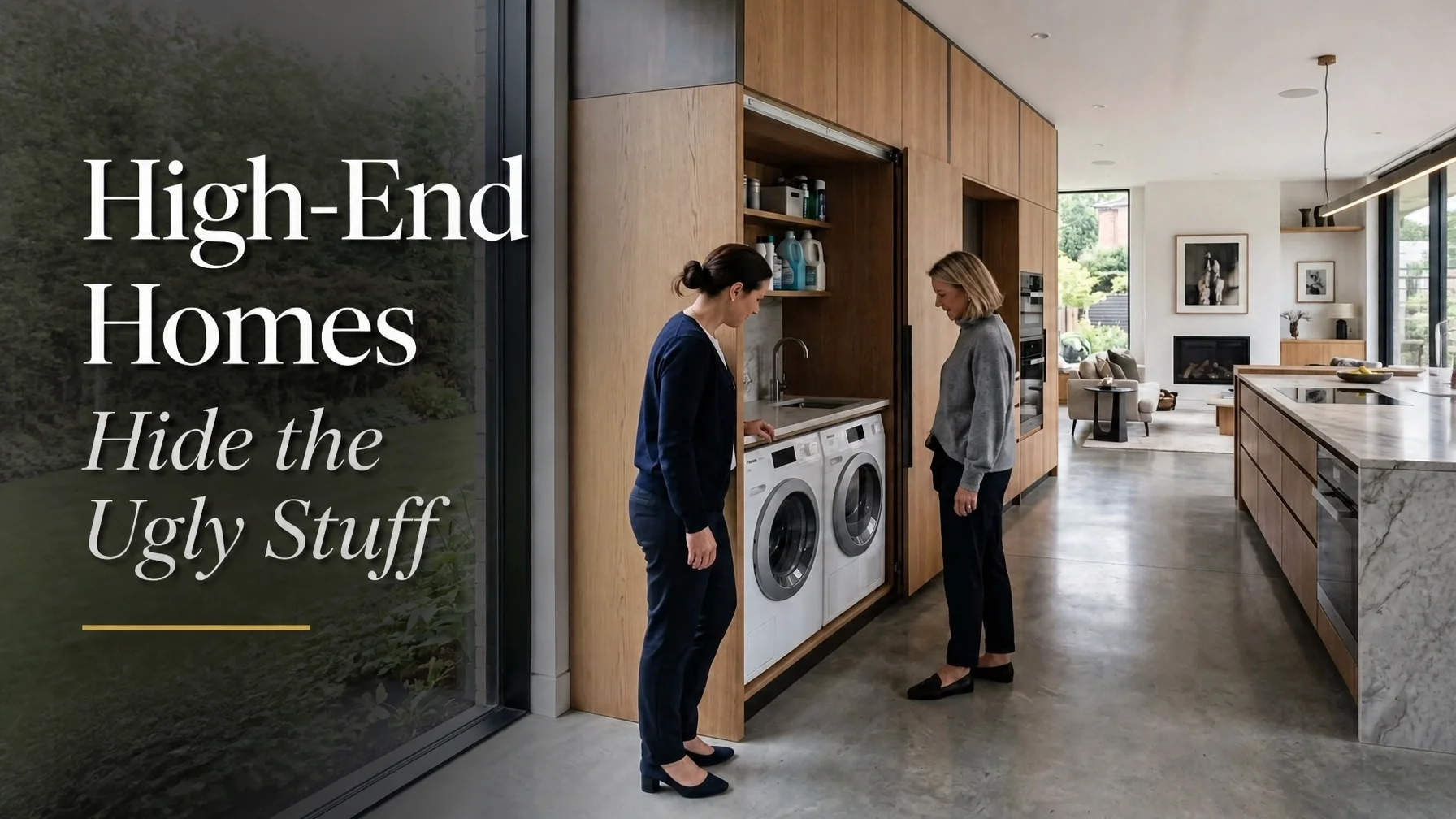
High-End Homes Hide the Ugly Stuff
High-End Homes Hide the Ugly Stuff
A luxury home isn’t defined by how much marble you put on the island. In the Salt Lake Valley, we see plenty of expensive remodels that still feel "off" because the homeowner focused heavily on finishes while overlooking the planning and infrastructure behind the scenes.
True high-end design is often about what you don’t see. It’s the absence of visual noise. It’s the reduction of friction in daily life. When you walk into a professionally designed custom home, your eyes aren't drawn toward tangled cables under the television or a bulky refrigerator sticking several inches past the cabinets.
From a contractor’s point of view, much of what makes a home feel high-end happens behind the scenes. It’s the result of thoughtful planning during the framing, electrical, and rough-in stages. If you want your home to feel elevated, you have to think beyond the visible finishes.
The Kitchen: From Clutter Hub to Integrated Space
The kitchen is one of the hardest rooms in the house to keep visually clean, not just because of cooking, but because of countertop clutter. Coffee makers, mixers, paper towels, spice racks, and charging stations all compete for limited space.
High-end kitchen remodeling contractors address these issues long before the cabinets are installed.
Appliance Garages and Hidden Zones
The goal is to clear the horizontal surfaces as much as possible. Appliance garages, hidden cabinets, and secondary prep areas allow appliances to remain accessible while keeping visual clutter contained when not in use.
Pocket doors, lift-up panels, and concealed storage help kitchens feel calmer and more intentional.
Panel-Ready Appliances
Large stainless appliances can interrupt the visual flow of cabinetry. In many high-end Salt Lake City remodels, homeowners are shifting toward panel-ready appliances fitted with custom cabinet fronts.
When properly integrated, these appliances blend much more seamlessly into the surrounding cabinetry.
What to look for
Counter-depth or integrated refrigerators that sit flush with cabinetry
Hidden outlets or under-cabinet power systems that reduce backsplash clutter
Toe-kick drawers for flat storage items like baking sheets or pet bowls
Why it matters
Reducing visual clutter can make kitchens feel cleaner, calmer, and more spacious. It allows the architecture and material choices to take center stage instead of the appliances and accessories.
Eliminating the “Rat’s Nest”: Advanced Cable Planning
Nothing disrupts a clean living room faster than exposed cords and poorly placed outlets. In higher-end homes, cable management is planned before drywall ever goes up.
As a general contractor in Salt Lake City, we often see homeowners trying to solve these problems after construction is complete, which usually makes the process more invasive and expensive.
The Low-Voltage Plan
Thoughtful low-voltage planning often includes:
In-wall conduit systems that allow future cable replacement or upgrades
Recessed media boxes behind mounted televisions
Hidden speaker wiring integrated into walls or ceilings
What to look for
Excessively visible wires or extension cords
Poorly placed outlets interfering with furniture layouts
Entertainment systems without dedicated cable-routing paths
Why it matters
Technology changes quickly. Thoughtful low-voltage planning can make future technology upgrades much easier and less invasive while helping the space maintain a clean appearance over time.
Integrated Organization: Architecture as Storage
In many homes, storage becomes an afterthought. Plastic bins, exposed shelving, and temporary furniture solutions slowly create visual clutter throughout the space.
In a high-end home renovation, storage is integrated directly into the architecture.
The Hidden Pantry
Hidden pantries and secondary prep spaces have become increasingly popular in higher-end Utah remodels. These areas allow homeowners to move appliances, food storage, recycling bins, and prep messes out of the primary kitchen.
The result is a cleaner, more streamlined main living space.
Built-In Mudrooms
Utah winters are rough on entryways. Wet shoes, coats, backpacks, and sports gear can quickly overwhelm a home’s front entrance.
Built-in mudroom cabinetry helps conceal that clutter through dedicated lockers, hidden storage, and integrated seating.
What to look for
Hidden charging stations near garage entries
Full-height cabinetry with integrated storage
Clean transitions between cabinetry and ceilings or flooring
Why it matters
Clutter creates visual stress. Integrated storage helps create a home that naturally supports cleaner organization and reduced visual noise.
Hiding the Mechanicals: Efficiency Without the Eyesore
The “ugly stuff” isn’t limited to appliances and cables. Furnaces, water heaters, condensers, and electrical equipment all affect how refined a home feels.
Tankless Water Heaters
Replacing a large tank water heater with a properly sized tankless unit can free up valuable space while providing a continuous supply of hot water for many households.
Wall-mounted systems can also allow for cleaner utility room layouts and more efficient use of storage space.
Exterior Planning
Exterior mechanical placement matters too. Air conditioning units, utility boxes, and meters can significantly affect curb appeal if poorly positioned.
During full-service remodel planning, we look carefully at how these systems interact with patios, windows, walkways, and outdoor living areas.
Mechanical equipment may be relocated, screened with landscaping, or integrated more thoughtfully into the overall exterior design.
What to look for
Mechanical equipment placed directly beside outdoor gathering spaces
Utility equipment dominating the front elevation
Noisy systems located near bedrooms or patios
Why it matters
Curb appeal isn’t just about landscaping. Thoughtful placement of utilities and mechanical systems plays a major role in how polished and intentional a home feels.
The Professional Difference: Design and Coordination
Hiding the ugly stuff requires coordination across every stage of construction. It cannot be improvised halfway through the project.
It requires:
A detailed design phase where appliances, outlets, and storage are planned in advance
Pre-construction coordination between trades
Cabinetry and millwork designed around real-life functionality
This is where thoughtful integration and detailing become especially important.
If you are planning a high-end remodel and want to move beyond builder-grade solutions, you need a team that looks beyond surface finishes alone.
At Your Contractor Pros, we focus on the details that make homes feel intentional, functional, and refined. We don’t just build rooms; we help create spaces where modern living feels streamlined and visually calm.
Whether you're looking for a kitchen remodeling contractor who understands integrated design or a general contractor to renovate your Salt Lake Valley home, we can help you create a space that works beautifully behind the scenes as well as in front of them.
Ready to start your next renovation project?
Explore our Remodel Insights or contact Your Contractor Pros today to discuss your goals. We handle the design, coordination, permits, and construction so you can enjoy a finished space that feels organized, intentional, and functional.
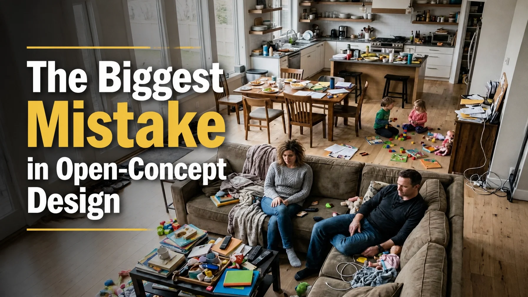
The Biggest Mistake in Open-Concept Design
The Biggest Mistake in Open-Concept Design
For the last two decades, the open-concept floor plan has been one of the most popular trends in home renovation in Salt Lake City. Homeowners want to knock down walls and create the airy, expansive spaces they see online and on television.
But from a contractor’s point of view, there is a major difference between a home that feels open and a home that functions well.
The biggest mistake people make isn't removing a wall; it’s failing to plan for what happens after the wall is gone. When aesthetics take priority over functionality, you can end up with a space that feels noisy, cluttered, and difficult to use comfortably.
Here’s why the "wall-less" dream sometimes falls apart and how a professional general contractor in Salt Lake City can help you avoid the most common pitfalls.
1. The Death of Silence: No Sound Separation
One of the most common complaints we hear after major open-concept remodels is noise. When you remove the barriers between kitchens, dining rooms, and living spaces, sound can travel much more freely throughout the home.
What to look for
Large expanses of hard surfaces like hardwood, tile, and stone
Appliance noise competing with TVs or conversations
Workspaces or reading areas located directly beside active living zones
Why it matters
Without physical separation, sounds from one activity can easily spill into another part of the home. Someone making a smoothie in the kitchen may not seem loud until another person is trying to watch a movie or take a work call nearby.
This can make it more difficult for family members to comfortably engage in different activities at the same time.
The Fix
Strategic "broken-plan" elements can help preserve openness while improving functionality. Instead of removing every wall, homeowners may benefit from features like partial dividers, glass partitions, built-ins, or acoustic treatments, depending on the structure and layout of the home.
It’s about creating quieter, more functional zones without completely sacrificing visual openness.
2. The Disorganized Sea: Awkward Furniture Zones
In a traditional floor plan, walls naturally help define where furniture belongs. Once those walls disappear, many homeowners realize they no longer have clear visual anchors for the room.
What to look for
Furniture floating awkwardly in large open spaces
Walkways cutting directly through seating areas
Oversized "great rooms" that feel undefined or disconnected
Why it matters
A space without clear zones can feel unsettled. If furniture placement doesn’t create structure, the room may lose its sense of scale and comfort. This is one of the most common layout and flow issues we see in open-concept remodels.
Poor zoning can make even an expensive renovation feel less intentional or cohesive.
The Fix
Successful open layouts rely heavily on zoning through design. Kitchen islands, lighting placement, ceiling details, furniture orientation, and area rugs can all help visually define different activity zones without relying on traditional walls.
Oversized pendant lighting, tray ceilings, or subtle floor transitions can also help create separation while maintaining an open feel.
3. The Visual Clutter Hub: Kitchens on Display
In an open-concept layout, the kitchen is no longer tucked away as a utility space. It becomes one of the main visual focal points of the home.
That sounds great in theory, but it also means the kitchen needs to function differently.
What to look for
Dirty dishes visible from the living room or entryway
Small appliances constantly sitting on countertops
Mail, backpacks, and everyday clutter accumulating on the island
Why it matters
When the kitchen is fully exposed to the rest of the home, everyday messes become much more noticeable. Without proper storage and planning, visual clutter can begin to affect how clean and relaxing the space feels day to day.
The Fix
We’re seeing growing interest in secondary prep spaces and walk-in pantry designs throughout the Salt Lake Valley. By relocating coffee stations, dishwashers, appliances, or food prep areas into a hidden pantry or secondary workspace, homeowners can keep the primary kitchen cleaner and more visually streamlined.
How to Do Open Concept the Right Way
Successful open-concept design isn't about removing as much as possible. It’s about balancing openness with functionality.
In many homes, walls also serve structural purposes, which is why open-concept renovations should always involve proper planning and professional evaluation before demolition begins.
If you're planning a remodel, don't just ask your contractor to "open it up." Ask questions like:
How will sound travel throughout the space?
Where will the primary traffic paths go?
How will furniture zones be defined?
What storage solutions will help control visual clutter?
Planning Your Salt Lake Valley Renovation
Open-concept living can absolutely work, but it usually requires more planning, not less. In highly open layouts, every design choice becomes more noticeable.
At Your Contractor Pros, we focus on more than just demolition and construction. We look at traffic flow, acoustics, storage, lighting, and long-term livability to help homeowners create spaces that work in real life, not just in photos.
Whether you're in Salt Lake City, Draper, or Herriman, we help homeowners navigate the balance between beautiful design and everyday functionality.
Thinking about reworking your floor plan? Let’s build a space that feels open, functional, and comfortable for the way you actually live.

Luxury Features That Age Poorly
Luxury Features That Age Poorly
Expensive doesn’t always mean enduring. In the world of high-end home renovation in Salt Lake City, it is remarkably easy to spend a fortune on a feature that can feel dated far sooner than expected. True luxury isn’t just about the price tag of the materials; it is about the longevity of the design and the functional value it adds to your daily life.
From a contractor's point of view, we see the cycle of trends clearly. We are often called in to tear out "luxury" upgrades that were installed only a few years prior because the homeowner is already tired of them or, worse, they have become a maintenance headache. If you want to avoid the "renovation regret" that comes with chasing the wrong trends, you need to understand which features age poorly and why.
Gray-Everything Interiors: The "Millennial Gray" Fatigue
For a decade, gray was the king of the Salt Lake Valley. From "Agreeable Gray" walls to weathered oak flooring and charcoal cabinetry, it was the safe, sophisticated choice. But we have reached a tipping point. What once felt clean and modern now often feels cold, sterile, and increasingly dated.
What to look for
Monochromatic palettes: Every surface, floors, walls, and trim, falling into the same narrow spectrum of cool gray.
Cool-toned LED lighting: Light that mimics an office building rather than a comfortable home.
Faux-weathered textures: Luxury vinyl plank flooring or tile designed to resemble gray-stained wood without natural variation.
Why it matters
The primary issue with the "gray-everything" approach is its lack of depth. When a room is entirely gray, there is little contrast to guide the eye. In Utah’s long winter months, a cool-gray interior can sometimes feel cold or uninviting, especially when natural light is limited.
Furthermore, because the trend became extremely common across many flips and production-built homes, it has lost much of its association with high-end luxury. If you are investing in a premium home renovation in Salt Lake City, you want a palette that feels curated rather than mass-produced.
Hyper-Minimal Kitchens: When "Sleek" Becomes "Stark"
We have seen a massive push toward hyper-minimalist kitchen design. This often involves clutter-free spaces where everything is hidden behind flush panels, hardware is nearly invisible, and open shelving replaces upper cabinets. On Instagram, it can look like a museum. In a functioning Salt Lake City home, it can become frustrating over time.
What to look for
Push-to-open hardware: Cabinets without handles or pulls that rely on spring-loaded latches.
Extensive open shelving: Replacing standard storage with floating shelves that require constant organization.
Monolithic islands: Oversized, single-material blocks with little visual or functional separation.
Why it matters
As a kitchen remodeling contractor, we focus heavily on workflow. Hyper-minimalism can sometimes work against the cook. Push-to-open cabinet hardware can require more maintenance and adjustment over time than traditional pulls and handles. They can also leave fingerprints and smudges on cabinet faces because of the constant contact.
Open shelving is another "luxury" feature that can age poorly because it demands regular upkeep to maintain the intended look. Without careful organization, shelves can quickly begin to feel cluttered or collect dust. A kitchen should function as a workspace first and a showroom second.
When you remove too much texture, hardware, and visual warmth, the room can begin to feel sterile rather than sophisticated.
Overly Trendy Lighting Fixtures: The Fastest Way to Date a Room
Lighting is the jewelry of the home, but just like fashion, lighting trends move quickly. What feels bold and modern today can quickly make a space feel tied to a very specific design era.
What to look for
Niche geometric shapes: Fixtures built around aggressive or highly stylized silhouettes.
Exposed Edison bulbs: While they had their moment, they often provide warmer, dimmer light that may not work well for every task-oriented space.
Low-quality finishes: Gold or brass coatings that appear overly shiny or begin to tarnish and peel over time.
Why it matters
The problem with overly trendy lighting is that it dominates the visual field. A large, hyper-stylized fixture can unintentionally date an otherwise timeless room. Replacing these fixtures often involves more than simply swapping the light itself; mounting changes, drywall repair, or electrical adjustments may also be required.
Instead of chasing the "light of the moment," smart homeowners often focus on layered lighting design: ambient, task, and accent lighting working together to create flexibility and comfort.
The High Cost of "Fast Architecture"
We are seeing a rise in what we call "fast architecture": features that look impressive in renderings but create problems in daily life. This is especially common in high-end remodels where the goal is an immediate visual "wow" factor.
What to look for
Vessel sinks: Stylish statement pieces that can require more cleaning around the base and may increase splashing depending on faucet placement and sink depth.
Barn doors in inappropriate places: Using barn doors in bathrooms or bedrooms where privacy and sound control are priorities.
Non-standard plumbing fixtures: Boutique fixture brands that may have limited replacement part availability compared to more established manufacturers.
Why it matters
Luxury is as much about peace of mind as aesthetics. Features that are difficult to maintain or repair can quickly become frustrating once the novelty wears off. A knowledgeable general contractor in Salt Lake City will usually tell you that the most valuable renovations are the ones that continue to look and function well years down the road.
This is the difference between spending money and investing it.
How to Choose for Longevity
Building timeless value isn't about being boring. It’s about being intentional. If you want a luxury home that still feels refined years from now, follow these contractor-approved principles.
Prioritize Natural Materials
Natural stone, real hardwood, and high-quality metals tend to age gracefully. They develop character and patina rather than simply looking worn out.
Focus on the Bones
Spend your budget on things that are difficult to change later, like layout improvements, insulation, window quality, and lighting infrastructure. These upgrades improve how the home functions regardless of design trends.
Use Trends in Small Doses
If you love a trendy color or fixture, incorporate it in ways that are easier to update later, such as paint, décor, or a single accent fixture.
Think About Daily Use
Before committing to a hyper-minimal design, ask yourself how the space will function during normal life, not just in a staged photo.
Your Partner in Smart Renovation
At Your Contractor Pros, we don't just build what's on the page. We help homeowners navigate the decisions that lead to long-term satisfaction. We've seen too many homeowners regret expensive features that looked impressive initially but failed to stand the test of time.
Our goal is to provide expert project management and construction that results in a home that feels as good as it looks.
If you’re planning a home renovation in Salt Lake City and want to ensure your investment adds true, timeless value, let's talk. We can help you sort through the trends to find the features that truly fit your lifestyle and your home’s future.
Planning a project? Start by exploring our remodel insights to see how we approach design and construction differently.
Real luxury isn't a trend. It's quality that lasts.
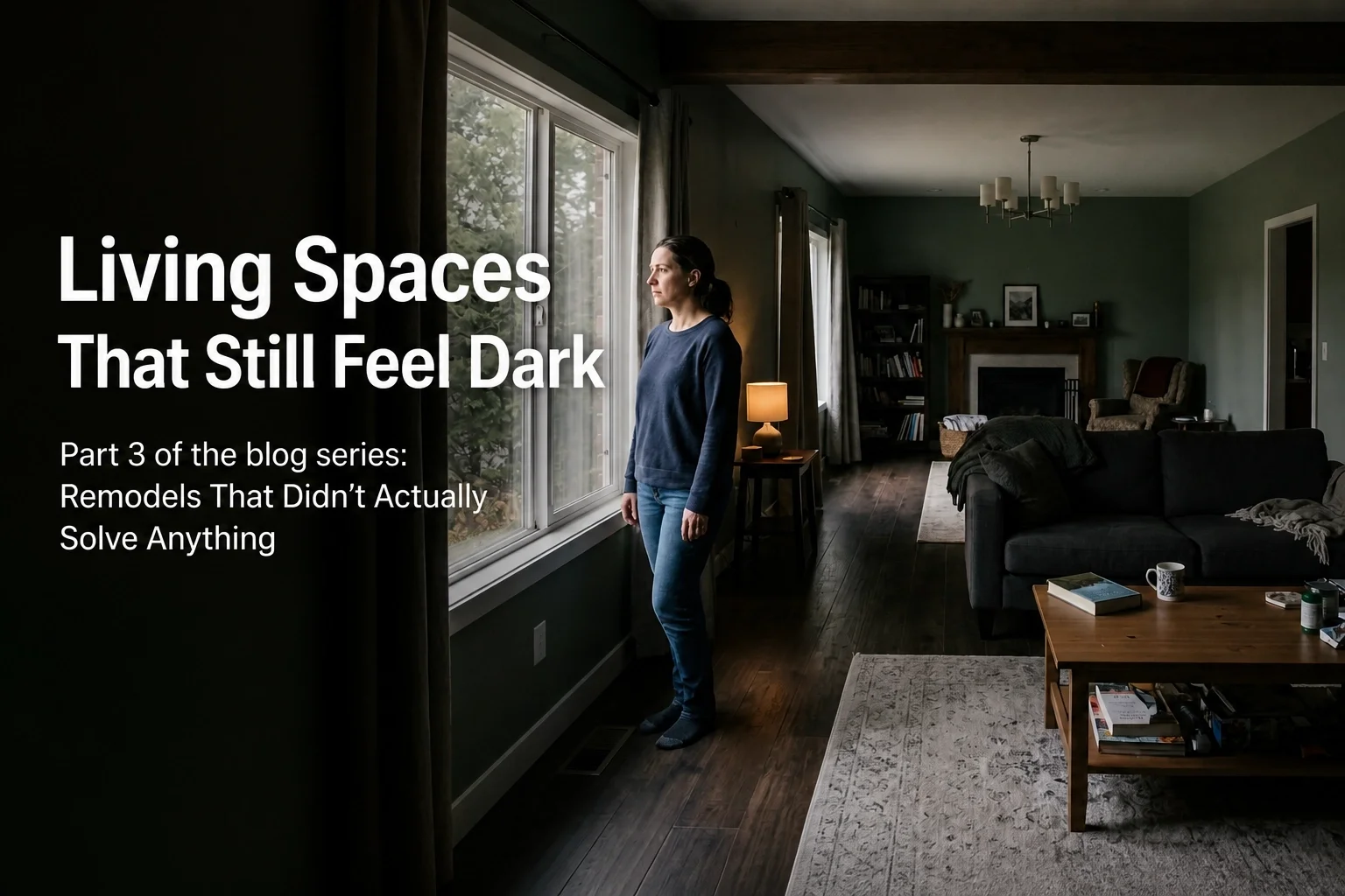
Remodels That Didn’t Actually Solve Anything Part 3: Living Spaces That Still Feel Dark
Remodels That Didn’t Actually Solve Anything Part 3: Living Spaces That Still Feel Dark
A living room renovation should feel like an exhale. It’s the space where you spend the most time, yet it’s often one of the most disappointing results of a home renovation in Salt Lake City. You spend fifty thousand dollars on new floors, fresh paint, and high-end furniture, only to realize you still want to leave the room by 4:00 PM because it feels gloomy.
From a contractor's point of view, "darkness" isn't just about a lack of windows. It’s often the result of multiple design choices working against each other. If your remodel didn't address the layout, lighting strategy, and material choices affecting how light moves through the space, the room may still feel dim even after a major renovation.
Here is why your living space still feels dark after the dust has settled.
1. Lighting Design Wasn’t Layered
One of the most common mistakes we see in Salt Lake Valley remodels is relying too heavily on a single overhead light source. Homeowners often install one large fixture or a series of recessed lights and expect the entire room to feel balanced and inviting.
In reality, relying on overhead lighting alone can create uneven shadows and leave parts of the room feeling flat or underlit. Without a combination of ambient, task, and accent lighting, the space can feel harsh in some areas and dim in others.
What to look for:
Deep shadows in corners even when the lights are on.
Glare on televisions or reflective surfaces while other areas remain dark.
Eye strain or visual fatigue after spending long periods in the room.
Why it matters:
Light interacts with ceilings, walls, flooring, and furnishings differently depending on placement and intensity. Layered lighting helps distribute brightness more evenly throughout the room and creates a more comfortable atmosphere overall.
This is why lighting and color design mistakes can dramatically affect the final feel of a remodel. Planning for sconces, integrated lighting, floor lamps, or accent lighting early in the renovation process usually creates much better long-term results.
2. Natural Light is Being Blocked or Wasted
You can have large windows and still end up with a room that feels dark if the layout and furnishings interfere with how natural light moves through the space.
Heavy window treatments, oversized furniture placement, and obstructed sightlines are some of the biggest culprits. We often see beautiful Salt Lake City remodels where expensive architectural features are unintentionally covered or blocked.
What to look for:
Curtain panels covering part of the glass even when fully open.
Large furniture placed directly in front of windows.
Older window openings that limit how much daylight enters the room.
Why it matters:
Natural light plays a major role in how open and spacious a room feels. In some homes, adjusting layouts, changing window treatments, or improving sightlines can make a noticeable difference without requiring major structural changes.
More extensive renovations, such as enlarging openings or modifying layouts, may also improve how light moves through the home depending on the structure and budget of the project.
3. Finishes Absorb More Light Than They Reflect
This is where trends can sometimes work against the room. Dark, heavily matte finishes may look dramatic in showrooms or online inspiration photos, but in lower-light environments they can make a room feel significantly heavier and darker.
Different materials reflect and absorb light differently. Gloss, satin, and lighter-toned finishes generally reflect more light back into the room, while darker and heavily textured materials absorb more of it.
What to look for:
Large amounts of matte or dark finishes throughout the room.
Dark flooring combined with limited natural light.
Low-contrast color palettes that visually flatten the space.
Why it matters:
Many homeowners run into home remodel material and finish regrets because showroom lighting conditions are very different from real residential environments. A finish that looks warm and balanced under bright commercial lighting may appear much darker in a Salt Lake City living room during winter months or evening hours.
When selecting materials, it’s important to consider how they will perform under the actual lighting conditions inside your home.
The Contractor’s Bottom Line
A living room that still feels dark after a remodel usually means the renovation focused more on surface-level updates than on how the space actually functions and feels.
It often isn’t about adding more light fixtures. It’s about using light more effectively.
It isn’t always about larger windows. It’s about allowing natural light to move through the room.
And it isn’t simply about painting everything white. Material choice, contrast, reflectivity, and layout all play a role.
If you are planning a project and want your investment to genuinely improve the feel of your home, it helps to work with a contractor who understands how lighting, layout, and finishes interact together.
At Your Contractor Pros, we specialize in renovations that solve the underlying challenges of Utah homes. Whether it’s improving sightlines, reworking layouts, or creating a better lighting plan, we focus on making spaces feel as functional and comfortable as they look.
Don’t settle for a remodel that still leaves the room feeling gloomy. Reach out to us today to plan a space that works for your lifestyle and your home’s unique layout.